The Maven Denver: A Hotel That Leads With Local Art
A boutique hotel's website should lead with the one thing a chain cannot copy, and at The Maven that thing is the people who make Denver. The Maven is the hotel inside Dairy Block, a restored block in LoDo one block from Union Station, with local art in the rooms and a staff that would rather send you to a neighbor's shop than to the minibar. In 2017 we designed its website to open on a Denver maker, not a room grid: an artist, a photographer or a designer, full bleed, with the hotel's script signature across the photograph and the booking bar tucked under it. The site took IAC Best Hotel and Lodging Website, an HSMAI Adrian Gold and a W3 Silver that year. We read the live site on 1 October 2026. It is a later build, not ours. The thesis survived, moved to its own page, and picked up numbers we never had. Below: the decisions, what the hotel kept, and what it changed.
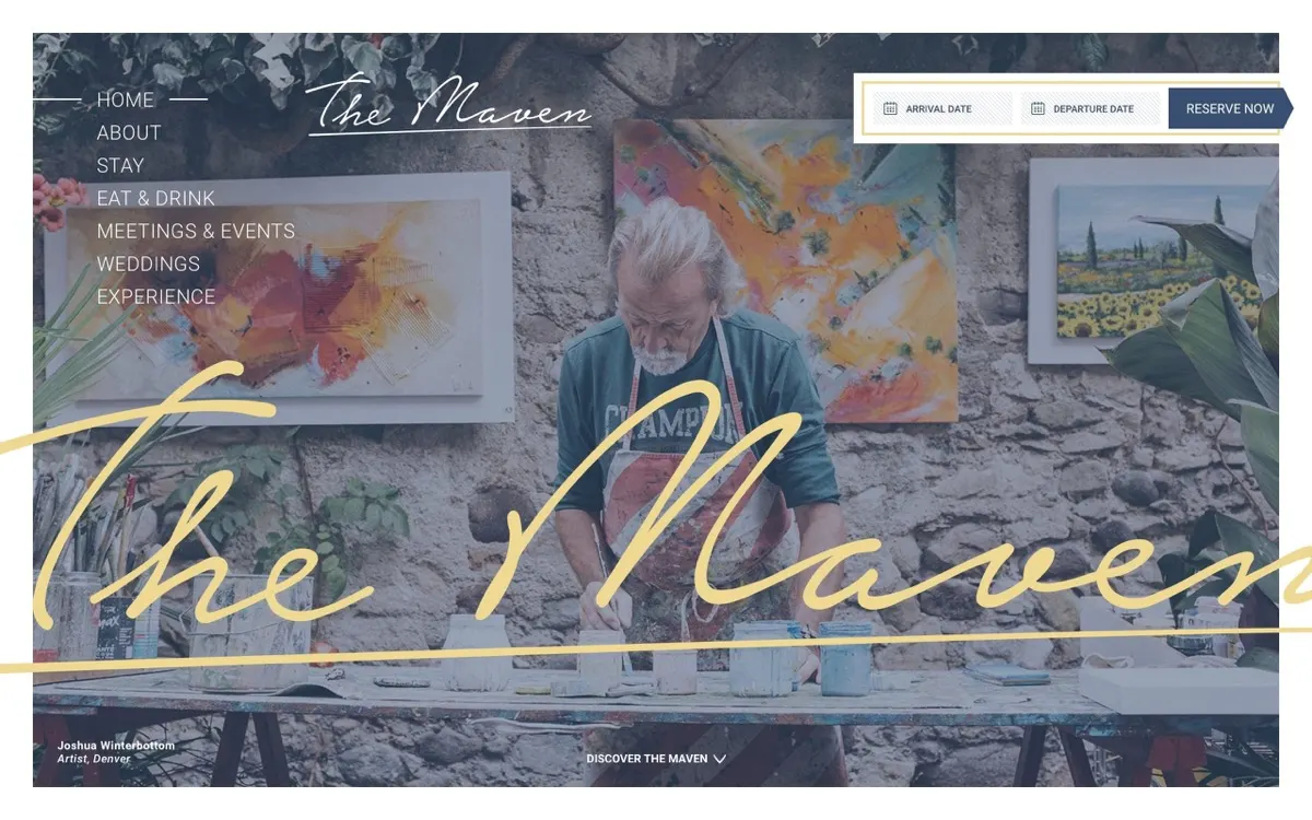
The property, in one sentence
The Maven is the independent hotel inside Dairy Block, the old Windsor Dairy block in downtown Denver, managed by Sage Hospitality, where the block's shops, restaurants and bars are part of the stay and the art in the rooms comes from people who live along the Front Range. That sentence does not fit a room card and an amenity grid, which is what the hotel had before.
The brief
A site that felt like the building: industrial and warm, art first, generous type, photography with enough room that the makers can breathe. And a booking path short enough that the story never gets in the way of a reservation. Our role was creative strategy, art direction, user experience and web design.
The decisions
Open on a maker, not a room. The homepage had three variants, an artist, a photographer and a designer, and every visit opened on a different face. The credit sits in the corner of the frame the way it would in a magazine: name, trade, city. The hotel's script wordmark runs across the photograph like a signature on a canvas, and "Discover the Maven" is the only cue. The rooms come later, once the visitor knows what kind of place this is.
Sign the work, and pull the palette from the block. A handwritten wordmark does the signing. A clean sans does the quiet work underneath. The colors are Dairy Block itself: ink and denim, brass and sand, warm metal over industrial black.
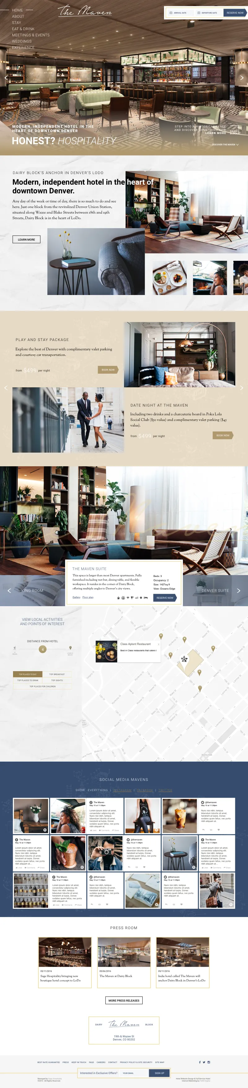
Keep the booking bar in the header, on every template. Arrival date, departure date, Reserve Now, top right, from the hero to the footer. The page below it is free to be editorial because the one thing a guest came to do is never more than a glance away. Which engine takes over after that is a separate decision; our hotel booking engines comparison covers the candidates.
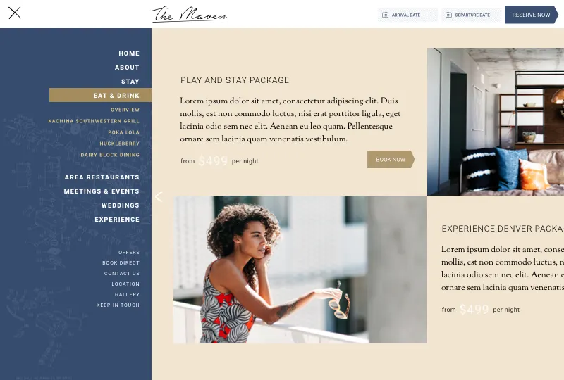
Make the neighborhood an amenity. Dairy Block got its own page, written as a place rather than a list of distances: one block from Union Station, along Wazee and Blake between 18th and 19th, with the block's shops, restaurants and studios as part of the hotel's story. A guest choosing between downtown hotels is choosing a neighborhood as much as a bed.
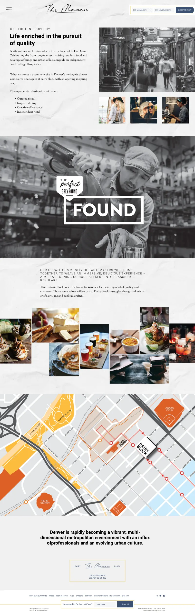
Put the restaurants in the menu. The opened navigation listed Kachina Southwestern Grill, Poka Lola, Huckleberry and Dairy Block dining under Eat and Drink, beside Stay, Meetings and Events, Weddings and Experience, with Offers, Book Direct, Location and Gallery as the second tier. A menu is a map of what the property has, and this property had restaurants worth naming.
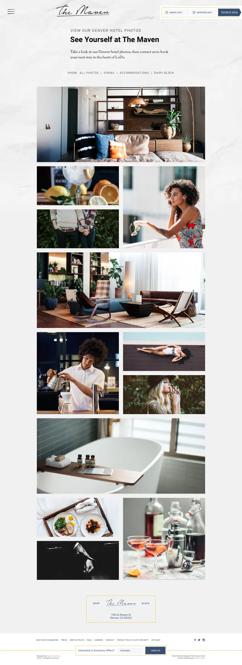
A gallery of local art, not stock. The gallery page is a masonry grid of the collection and the property, in the same voice as the rest of the site. Hotel galleries usually show the pool from four angles. This one showed what was on the walls.
What this is, and is not
These are the screens as designed and shipped in 2017, produced with a hospitality agency team at the time. Package prices such as "from $499 per night" and some paragraphs in the comps are placeholders from the design file. The hotel's booking figures were theirs and we never published them, so there is no conversion claim here. The awards are the site's: IAC Best Hotel and Lodging Website, HSMAI Adrian Gold, and a W3 Silver, all 2017.
What the live site looks like today
We read themavenhotel.com on 1 October 2026. The hotel is still independent; the footer reads "Managed by Sage Hospitality". The site is a later build, not ours.
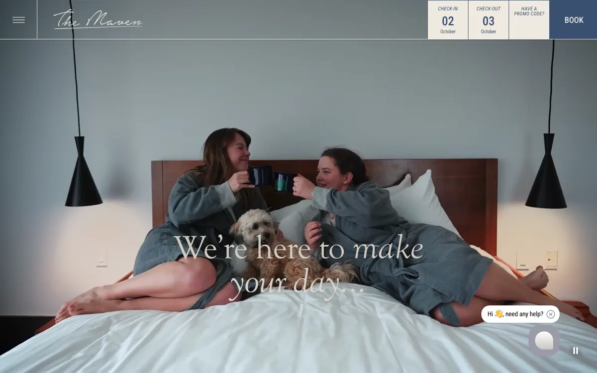
The header survived. The script wordmark on the left, a hamburger menu, and check-in, check-out, promo code and Book on the right, fixed on every page. The hero is now a video: two guests in robes, a dog, and the line "We're here to make your day". The makers are no longer on the homepage.
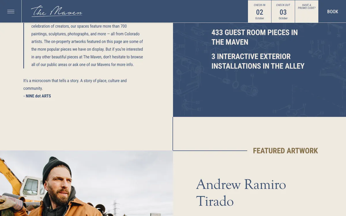
The art got its own page, and numbers. The Art at Dairy Block page, curated with NINE dot ARTS, puts figures on what we argued with a photograph: 31 artists, every one in Denver or along the Front Range, 715 pieces, 275 commissions, 433 pieces in the guest rooms, and three interactive installations in the alley. It names and links the artists: Andrew Ramiro Tirado, Collin Parson, Karen Fisher, Travis Hetman. This is the 2017 thesis with receipts attached, and it is the strongest page on the site.
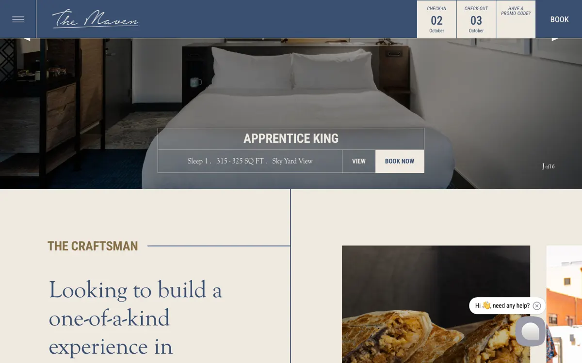
The rooms took on the maker story. A sixteen-slide carousel on the homepage runs through Apprentice King, Journeyman King, Craftsman Two Queens, Master King, Innovator Suite, Maven's Loft and Maker's Suite, each card with sleeps, square footage and view. The craft ladder became the room ladder. Nobody at the hotel needed us for that; it is what happens when the identity is clear enough that the next team can extend it.
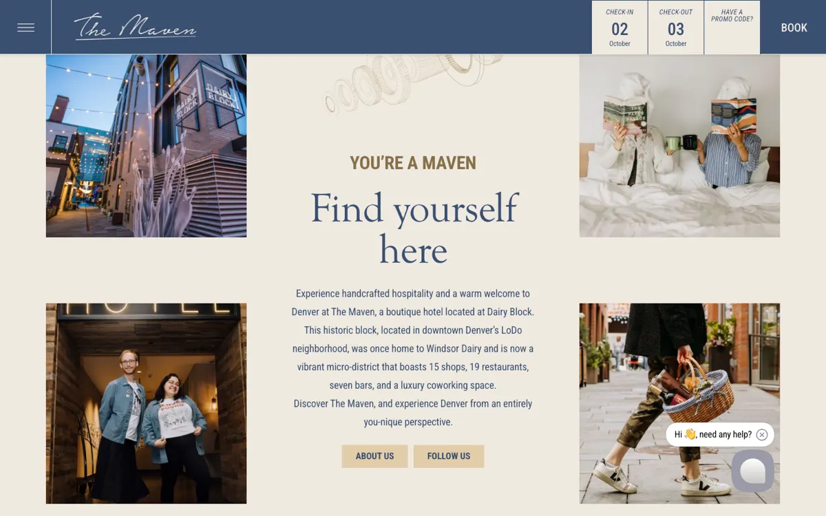
The neighborhood is still the pitch. The intro under the video reads "You're a Maven. Find yourself here" and describes Dairy Block as the former Windsor Dairy, now 15 shops, 19 restaurants, seven bars and a coworking space. The sections are Stay, Dine, Experience, Gallery, Meetings and Events, Weddings and About, which is our map with Eat and Drink renamed Dine.
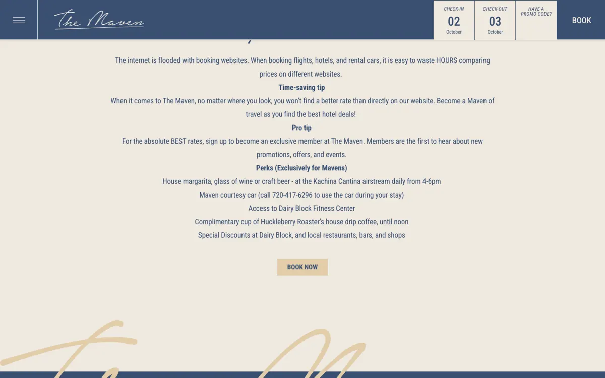
Book direct has a reason attached. Our menu had a Book Direct item. The live site has a Why Book Direct page with the reasons listed: a house margarita, wine or craft beer at the Kachina Cantina airstream from 4 to 6pm, a courtesy car, the Dairy Block fitness center, Huckleberry Roasters drip coffee until noon, and discounts around the block. That is the right answer to why Booking.com looks cheaper than the hotel website: not a rate match, a list of things the OTA cannot give.
What carries to any independent
- Lead with what cannot be copied, then count it. We opened on a maker. The hotel now opens its art page on 31 artists and 715 pieces. A number beside the claim is what a guest, and a search engine, can repeat.
- Name things in the brand's vocabulary. Apprentice, Journeyman, Craftsman, Master. At Bisha the rooms carried Norse names. "Deluxe King" tells a guest nothing about where they are.
- Keep the booking bar in the header and the engine behind it. Nine years and at least one redesign later, the bar is in the same corner. That is the part of a hotel site that should never move.
- Give direct booking a reason, as a list. Perks a guest can picture beat a best-rate badge. The page exists so the front desk and the website say the same thing.
Where we fit
We sell this work on published prices: the hotel website design tiers are $12,000 on our Aurelia template, from $30,000 for a custom design, and from $75,000 for a multi-property platform. If the identity needs work before the site does, we compared eleven hotel branding agencies on scope and price. And if the question is how to make a story like this one carry across every page, storytelling in hospitality website design is the long version.
The full case study is at The Maven. The other properties in this series: The London West Hollywood, whose menu grew two doors in eight years, The Resort at Pedregal, Brush Creek Ranch, Hotel El Ganzo, and Bisha Toronto, whose site survived a move into Marriott's Luxury Collection.
Have a product idea?
Designed, built, and shipped in about 5 days.