Bisha Toronto: Luxury by Taste, Then a Chain Flag
An independent hotel's website is its taste made public, and the test of whether it was designed well is what survives when the hotel changes hands. Bisha is a 44-storey hotel in Toronto's entertainment district with a floor of rooms designed by Lenny Kravitz, interiors by Studio Munge, Akira Back on the roof and four restaurants. We designed its website as an editorial magazine, not a booking funnel. Then Sunray Group acquired it, and on 1 March 2025 it became BISHA, a Luxury Collection Hotel, Toronto, which the trade press reported as Canada's first property in Marriott's Luxury Collection. We checked on 25 September 2026. The site is a later build, not ours, yet most of what we designed is still there, now with a Marriott Bonvoy badge. The .com with the hotel's name on it is another story. Below: the decisions, what survived the flag, and what a hotel should do with the domain it leaves behind.
The property, in one sentence
Bisha sold taste, not a standard. Charles Khabouth, whom the hotel's own site calls the visionary behind the Bisha brand, built a hotel where the rooms were lacquered wood, crushed velvet and deep blue, the art was hand-picked, the in-room amenities came from BYREDO, and the draw was the names attached: Kravitz Design on one floor, Alessandro Munge on the interiors, Akira Back upstairs. None of that fits a room card and an amenity grid, which is what the previous site gave it.
The decisions
Our role was creative strategy, art direction, UX research, and UX and UI design.
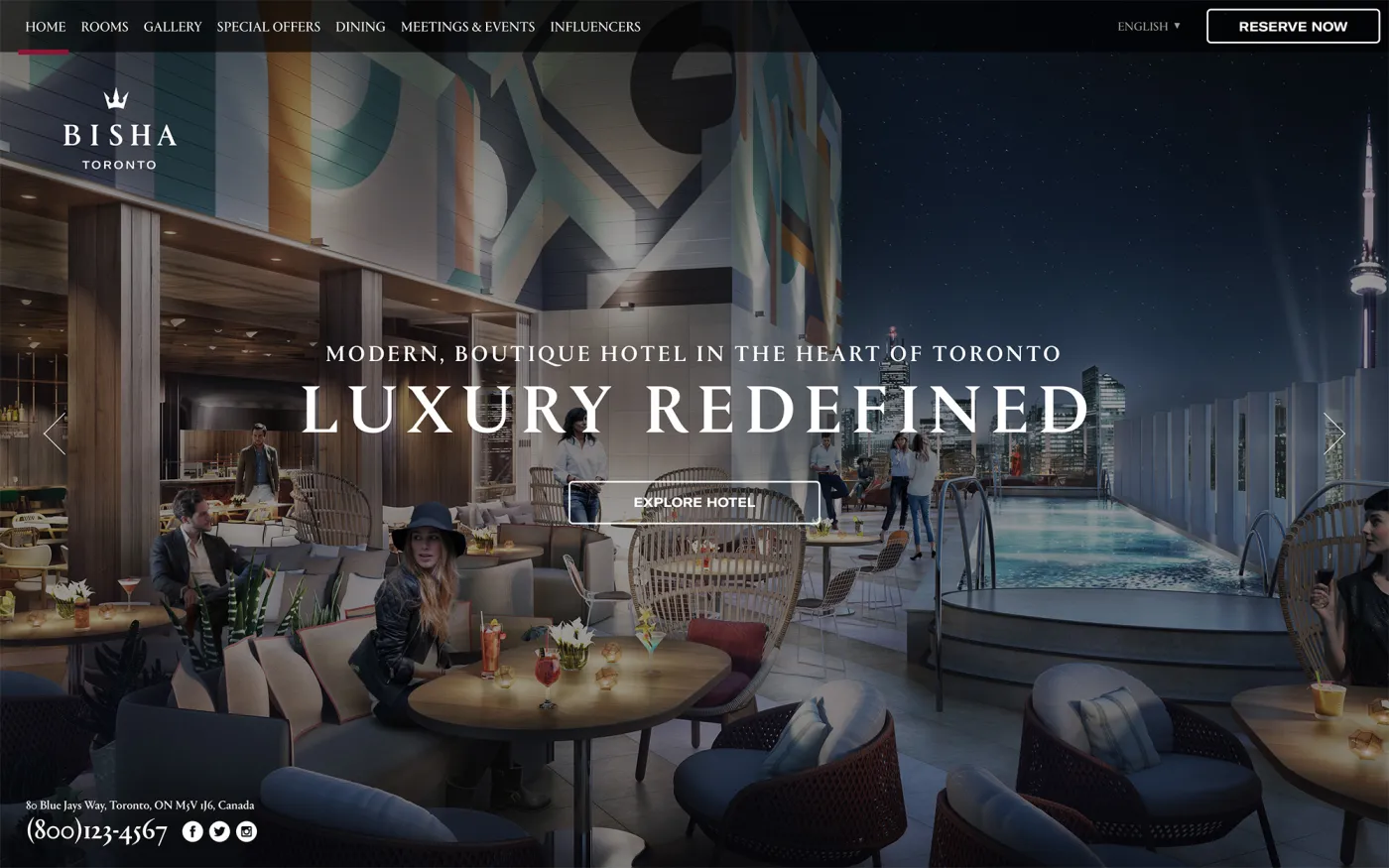
Treat the homepage like a magazine cover. Full-bleed photography, the crown and wordmark set large, "Luxury Redefined" over the rooftop pool at night with the CN Tower behind it. The property is loud; the layout gave it room and let the photography carry the claim.
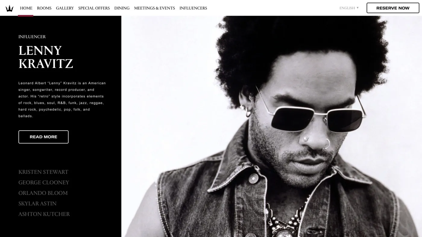
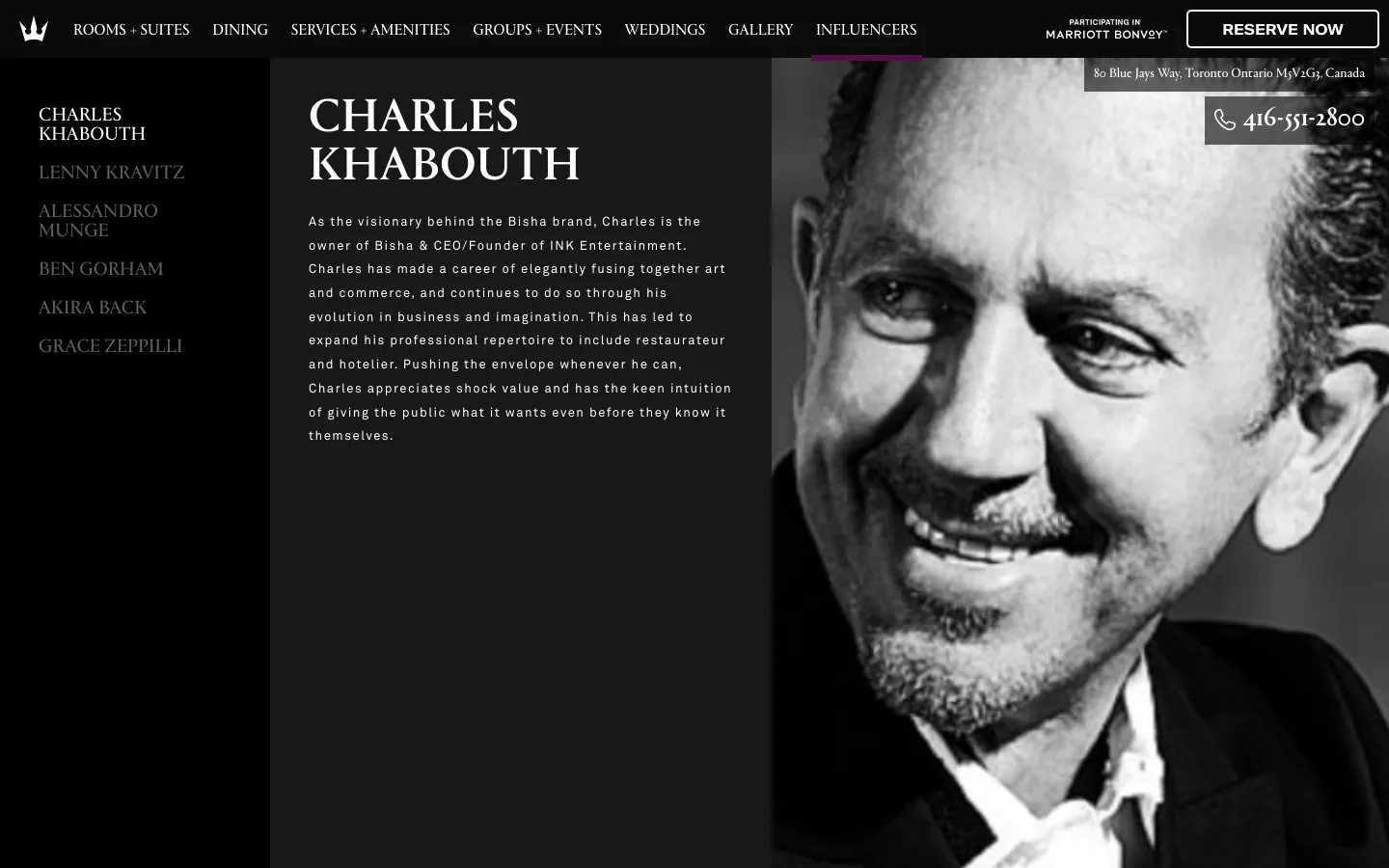
Sell the people, not the amenities. The Influencers section gives each name behind the hotel a page: Khabouth, Kravitz, Munge, Ben Gorham of BYREDO, Akira Back, Grace Zeppilli. Each page had a portrait, a short biography, and its own soundtrack, a playlist chosen by or for that person. A guest deciding between luxury hotels on a phone does not compare thread counts. They compare who made the place, and this section is where that comparison happens.
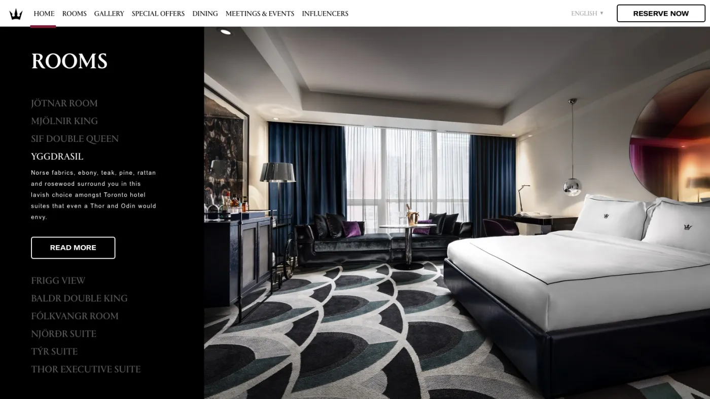
Name the rooms like the building does. The rooms page lists Jötnar, Mjölnir, Sif, Yggdrasil, Frigg, Baldr, Fólkvangr, Njörðr, Týr and Thor, each opening beside full-bleed photography of the suite. The Norse names were the hotel's own; the design took them seriously instead of flattening them into "Deluxe King."
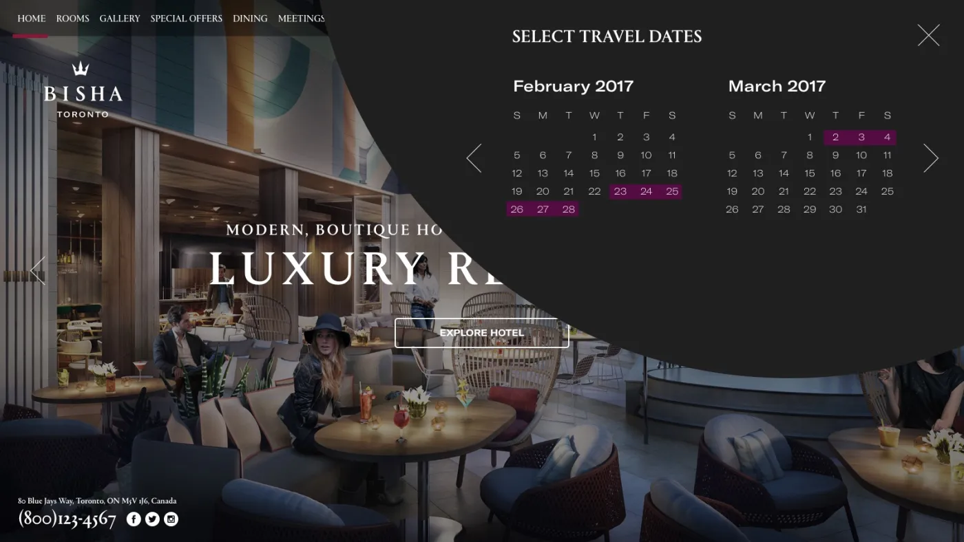
Keep the booking funnel short and keep it in the brand. Reserve Now opens a dark sheet that sweeps over the page with the calendar, then a second step with rate, rooms and guests. The guest never lands on a grey third-party form mid-decision. The engine takes over after that, which is the normal and correct split; our hotel booking engines comparison covers which one to run behind it.
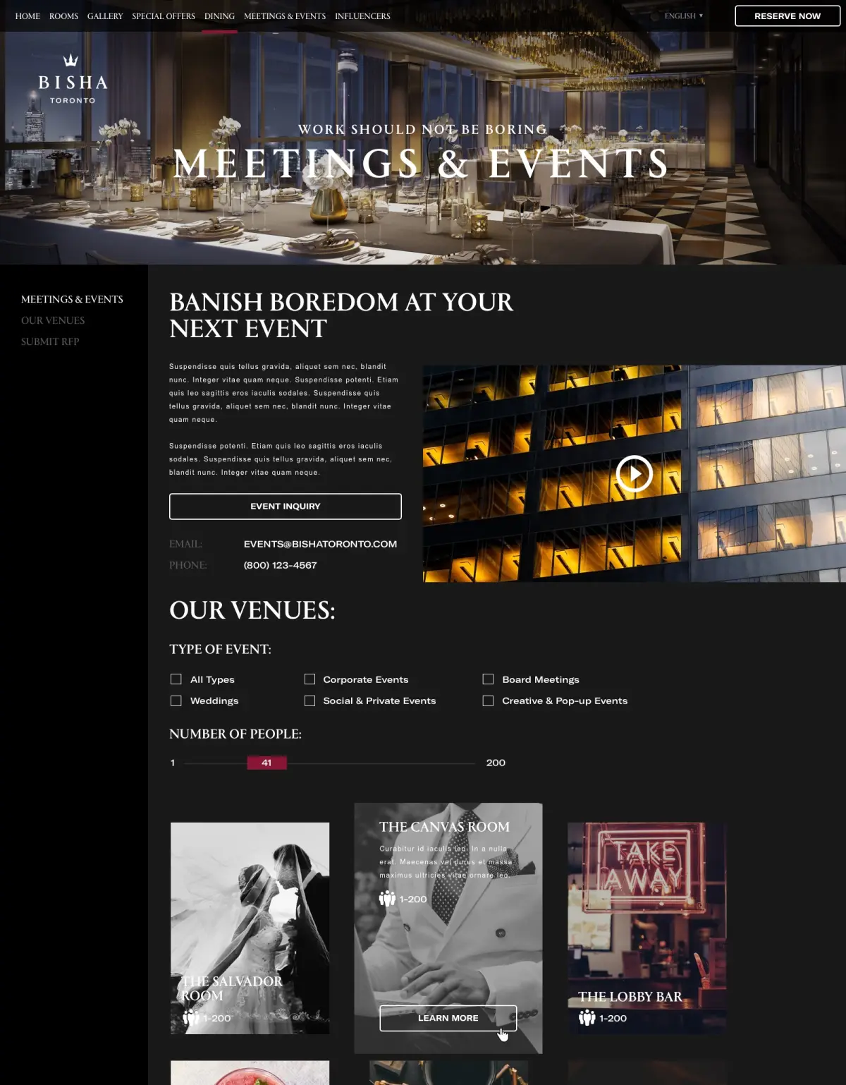
Give groups their own funnel. Meetings and events at a hotel like this are a separate purchase with a separate buyer, so they got an RFP flow: event type, headcount, and the venues that fit, before anyone fills in a form.
What this is, and is not
These are the screens as designed and shipped, produced with a hospitality agency team at the time. The property's booking figures were theirs and we never published them, so there is no conversion claim here. Some phone numbers and details in these comps are placeholders from the design file.
What survived the chain flag
We read the live site on 25 September 2026.
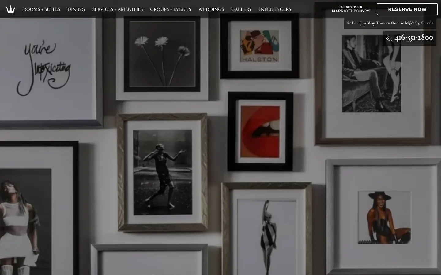
Almost all of it. The crown, the black, the editorial photography. The navigation now reads Rooms and Suites, Dining, Services and Amenities, Groups and Events, Weddings, Gallery, and Influencers, which is our information architecture with two sections added. The Influencers page is still there with the same six names, the same list on the left and portrait on the right.
What the flag added is small and specific: a "Participating in Marriott Bonvoy" badge beside Reserve Now, and a Marriott Bonvoy app download in the footer. That is how a soft brand like the Luxury Collection works, and it is the best case for an independent joining one: the hotel keeps its name, its look and its story, and gains a distribution and loyalty engine. The website is where you can see whether the independent identity survived the deal. Here it did.
What the flag left behind
The hotel's website lives at bishahoteltoronto.com. The plain .com with its name, bishahotel.com, registered in 2010, served this on 25 September 2026:
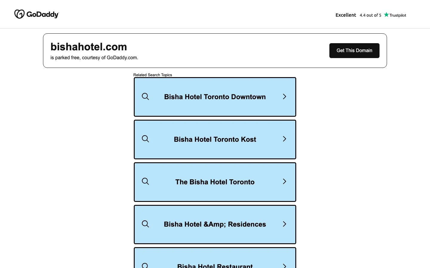
A registrar parking page, with sponsored search boxes for "Bisha Hotel Toronto Downtown," "Bisha Hotel Toronto Kost" and "Bisha Hotel Rooftop." Anyone who types the hotel's name followed by .com, and any old link that points there, lands on a page selling ad clicks against the hotel's own name. We do not know who holds the domain, whether the hotel ever used it, or why it is parked, and it may be a deliberate choice. But the general point stands for any hotel changing its name, owner or brand: the old domain is an asset, not a leftover. Keep the names guests will type registered and pointed at the live site, and send every old URL to its new equivalent with a permanent redirect. A parked page hands the traffic to whoever buys the ad.
That is the same discipline as a website migration without losing rankings, and it matters more for a hotel, because guests search the name and type it straight into the address bar.
What carries to any independent
- Design the identity so it survives a flag. Soft brands (Luxury Collection, Autograph, Curio, Tribute) let a hotel keep its name and look. A site built around the hotel's own story, its people and its rooms, is the part that transfers. A site built around generic booking modules is the part that gets replaced.
- Sell the names behind the place. If a designer, a chef or a founder is the reason people choose the hotel, they deserve pages, not a line in the About section.
- Keep the booking step in the brand. The engine can be anyone's; the moment before it should be yours.
- Own the obvious domains, and redirect them. Every address a guest might type or an old link might hold should land on the live site. A domain change is a migration; treat it as one.
Where we fit
We sell this work on published prices: the hotel website design tiers are $12,000 on our Aurelia template, from $30,000 for a custom design, and from $75,000 for a multi-property platform. If the brand itself is the question, we compared eleven hotel branding agencies on scope and price. And if your hotel is moving domains, owners or flags, the Website Migration is the product that keeps the old links working.
The full case study is at Bisha. The other properties in this series: The Resort at Pedregal, Brush Creek Ranch, and Hotel El Ganzo, whose live site kept our structure and removed the rates from the room cards.
Have a product idea?
Designed, built, and shipped in about 5 days.