Case study · Hospitality · Website design
Bisha
Toronto.
Lenny Kravitz designed a floor. Studio Munge did the interiors. Akira Back runs the roof. The website had to keep up.
The homepage in motion: sound off, spell intact
44
Storeys above Toronto's entertainment district
91
Luxury rooms: 11 of them signature suites
1
Floor of rooms designed by Lenny Kravitz
6
Influencer pages, each with its own soundtrack
5
Velvet hues in the brand palette: all on black
The previous site flattened Bisha into a generic luxury booking flow: the same room cards you'd find on any chain microsite. So we treated the homepage like the cover of a magazine and built the navigation around the story, not the funnel.
01 · The brief
Not luxury by chain
standards. Luxury by taste.
A 1970s-inspired property in the entertainment district where lacquered wood, crushed velvet, marble, and deep blues do the talking, with BYREDO in the bathrooms and hand-picked art on the walls. This is the hotel where you stay like a rockstar.
The brief was a website that matched that confidence: full-bleed photography, generous type, rhythm that lets the rooms, the restaurants, and the design partners breathe, and a booking funnel kept ruthlessly simple at every entry point so it never breaks the spell.

02 · The rooms
Rooms named for Norse gods,
sold like album covers.
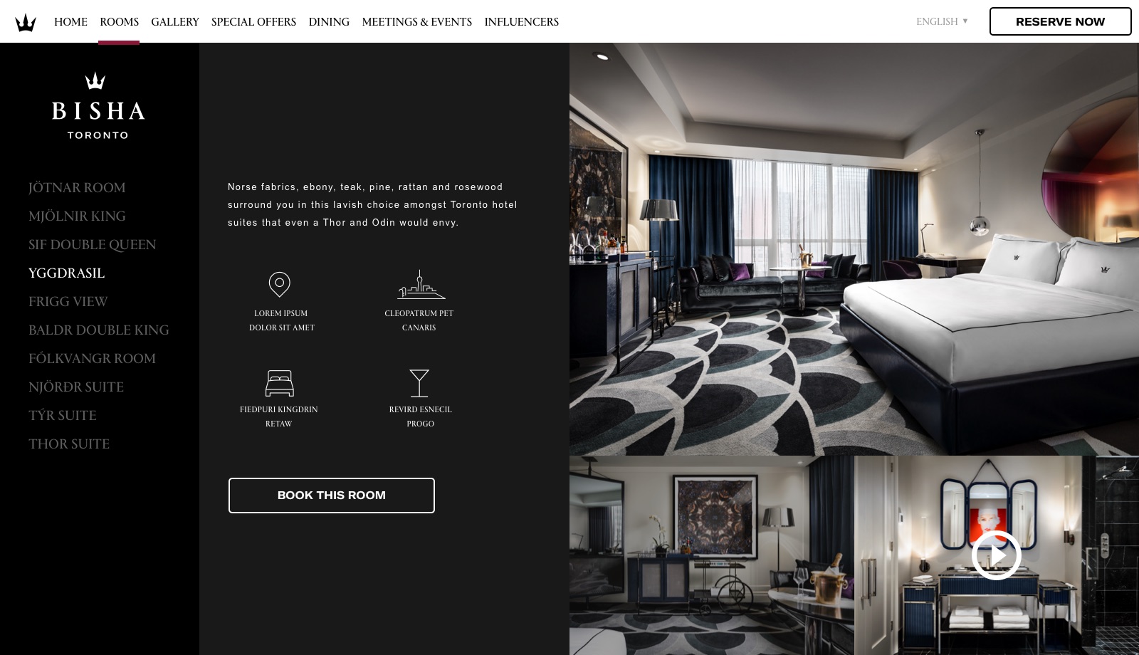
Jötnar, Mjölnir King, Yggdrasil, the Thor Executive Suite, every room carries a name, a story, and photography with a point of view. The room page reads like a tracklist; each detail view books in one step.

03 · The influencers
Six muses. Each page
ships with a soundtrack.
Kravitz, Stewart, Clooney, Bloom, Astin, Kutcher: the people who shaped the property got magazine-profile pages with an embedded Spotify player. Open Lenny's page and Lenny plays. No hotel template has a section like this, which was exactly the point.


04 · The booking
Booking that never
breaks the spell.
No jump to a beige booking engine. A dark sheet sweeps over the page in a curve (dates, rate, party size, Reserve Now) two steps, wine-highlighted, and the homepage is still visible underneath the whole time.
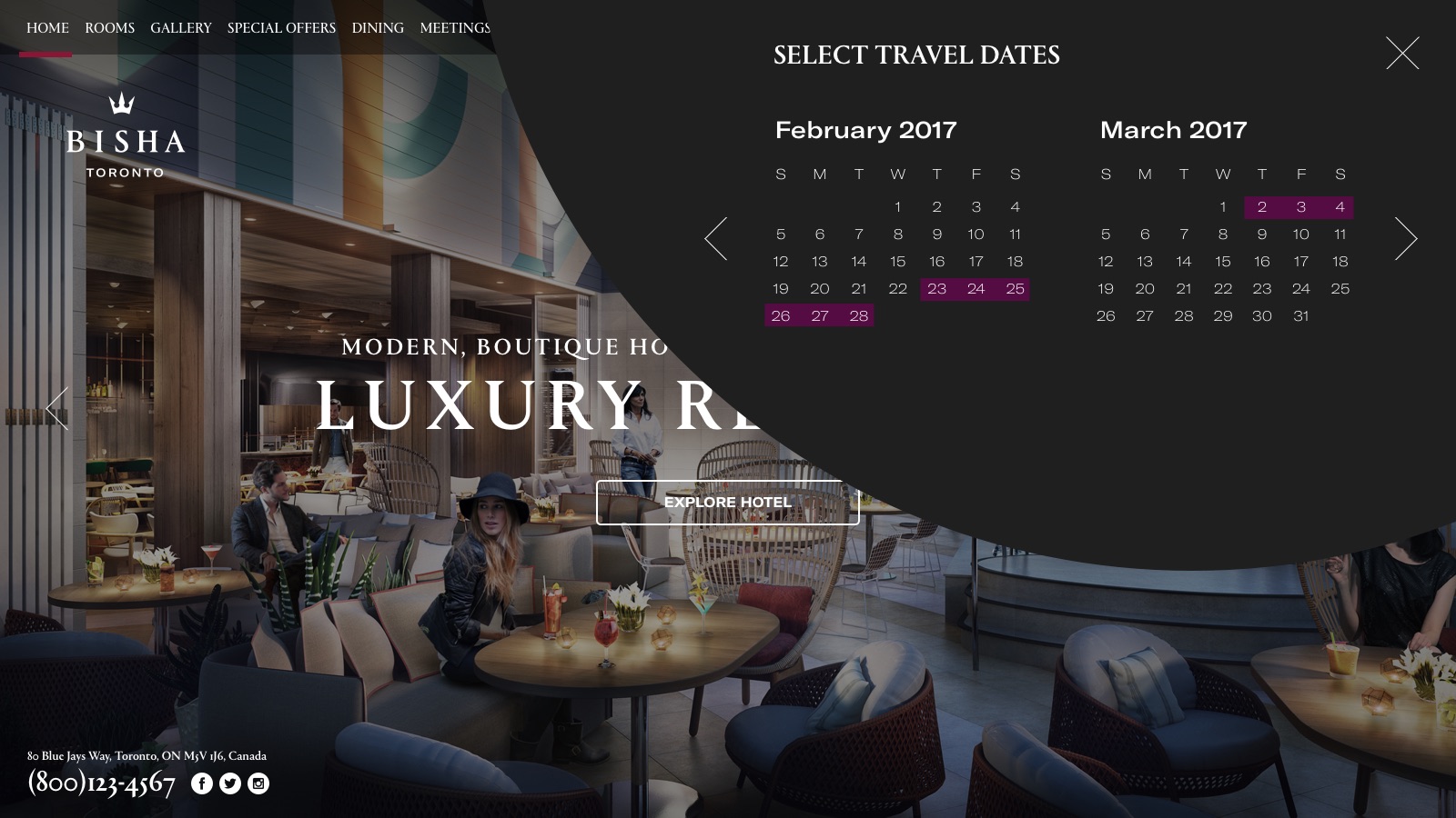
Step one. Pick the dates
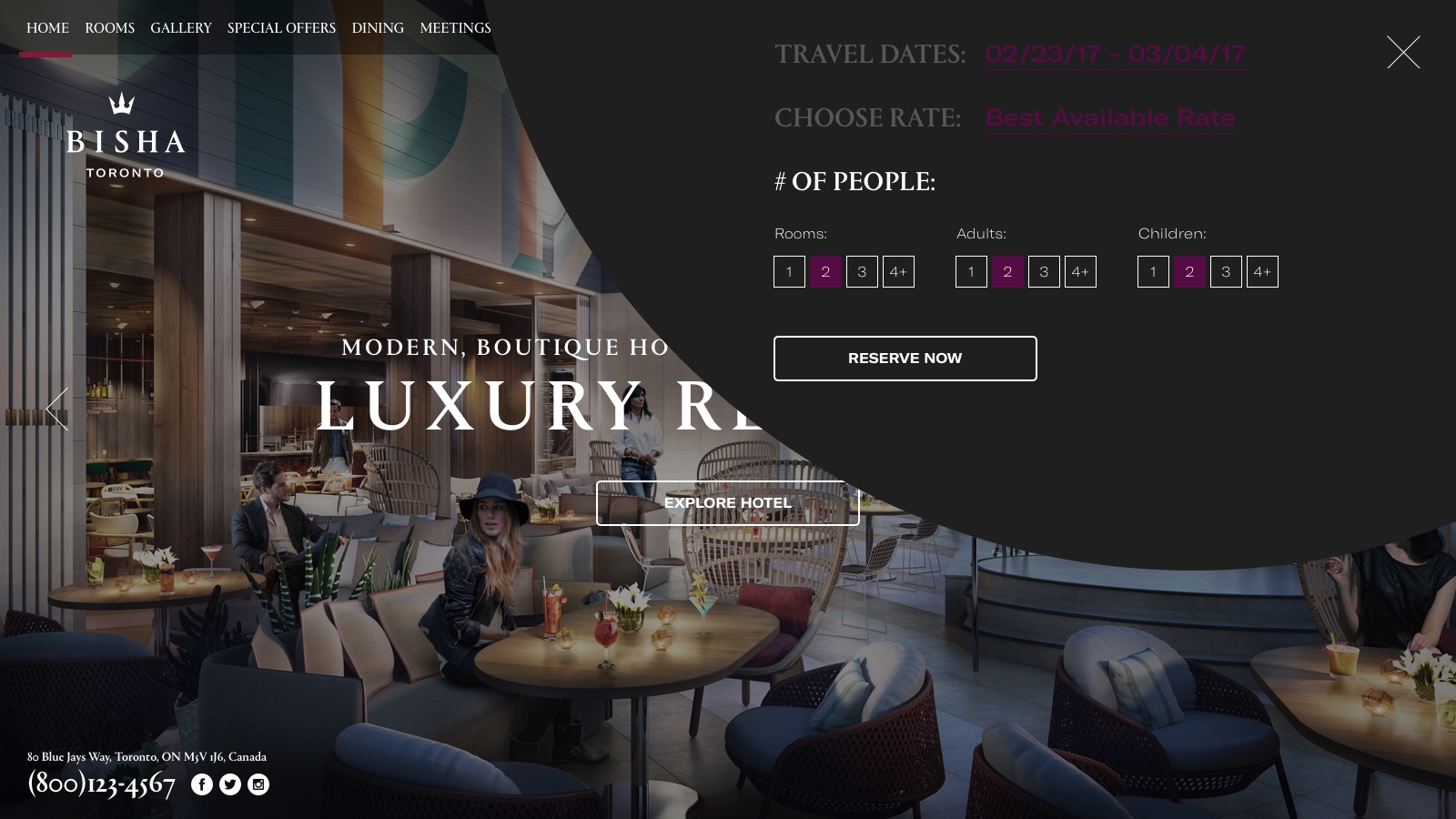
Step two: rate, party, reserve
05 · Dining & events
KŌST on the 44th floor.
Meetings that banish boredom.
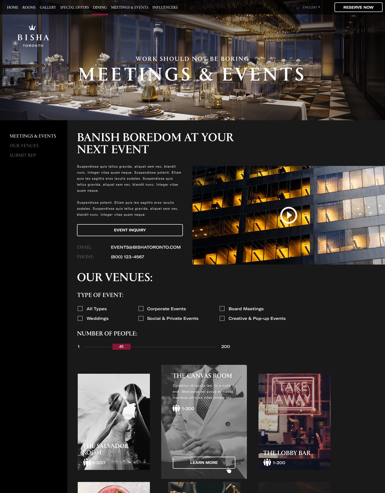
Hover either page and it scrolls. Six food-and-drink venues each get their own scene: hours, highlights, a table reservation in reach. The events page runs an RFP funnel with event-type filters and a headcount slider under the promise “work should not be boring.”

hover to scroll
Dining: KŌST, Baja flavours over the skyline
hover to scroll
Meetings & events: filters, slider, RFP
06 · The system
The attitude holds: offers,
gallery, even the map.
Every template keeps the editorial voice: art photography where stock would have gone, video mixed into the gallery masonry, and a location map redrawn in brand black and white with a crown for a pin.
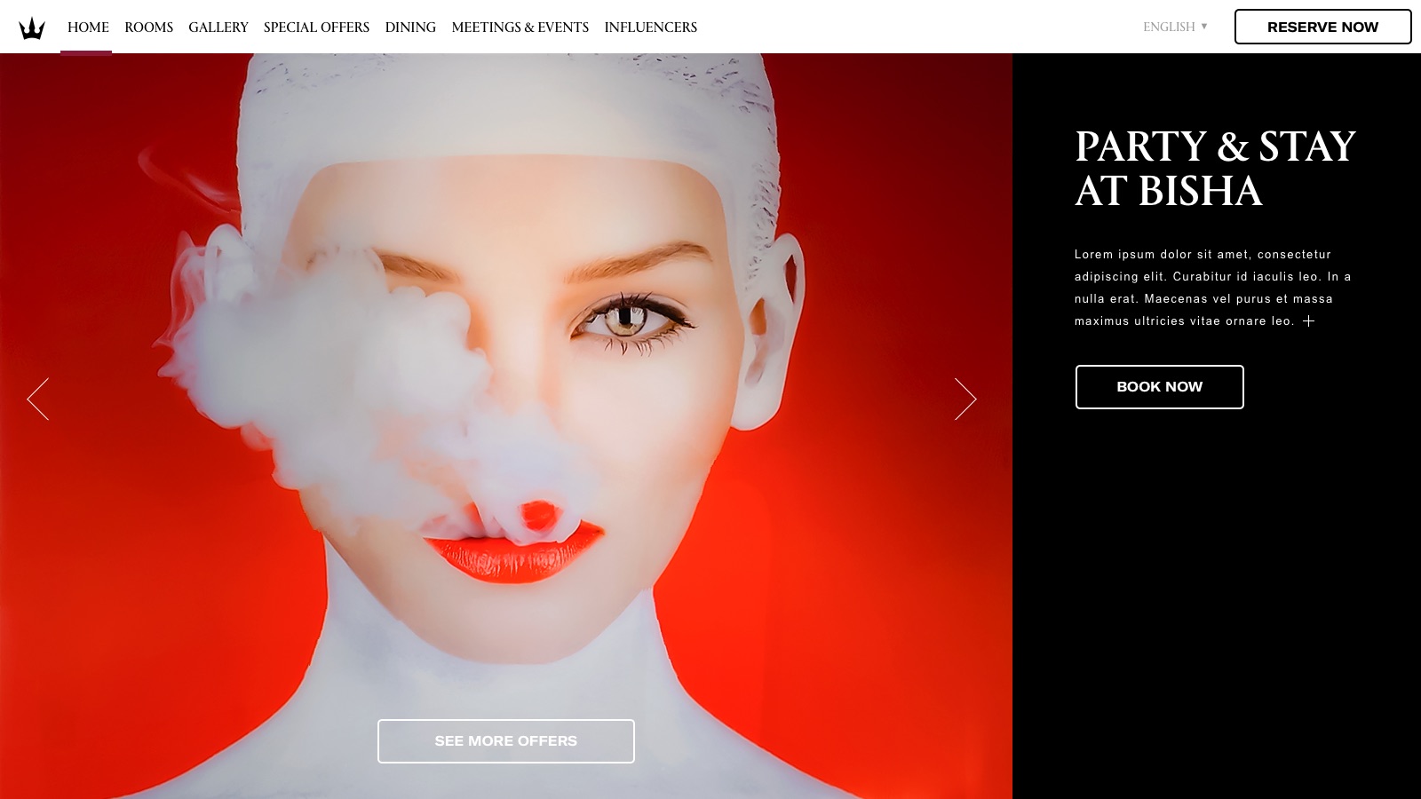
Special offers
Art photography where stock would have gone

The gallery
Photo and video tiles in one masonry
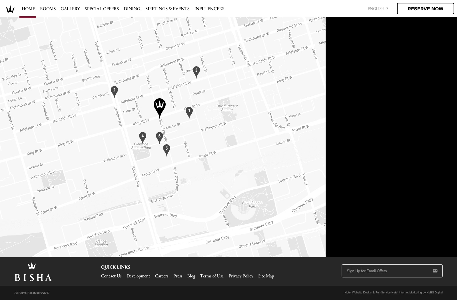
The map
Redrawn in brand black & white, crown pin
07 · The brand system
Serif confidence,
velvet palette.
A confident serif carries the headlines; GT America and Akkurat do the quiet work underneath. Five deep velvet hues sit on black (wine, plum, navy, teal, forest) like the fabrics in the rooms.


#8A1635
Wine
#540C43
Plum
#002D52
Navy
#007E82
Teal
#126140
Forest
#000000
Black

The result
A digital presence that finally
matched the physical one.
The site gives discerning travelers permission to pick Bisha not because they're loyalty-points shopping, but because they want to stay somewhere with taste, the rooms, the partners, and the four restaurants selling the experience before a single rate appears.
“You can't template taste. You can only design with it.”
Have a property with taste stuck in a template?
SUUR designs and ships hotel platforms end to end, brand, UX strategy, and the build.