The Resort at Pedregal: Enter Through the Tunnel
For The Resort at Pedregal, we organized the website around the arrival through the mountain and the estate's cliffside setting. The design connected that introduction with accommodation photography, booking access and a separate route for wedding and group enquiries. The integrated campaign received an HSMAI Adrian Award, Gold, in 2017. Historical screens document the work; they do not prove that this arrival is unique across Cabo, establish exclusive beach access or measure a booking effect. The property later became Waldorf Astoria Los Cabos Pedregal, whose current site is not ours.
Key Takeaways
- Use a verifiable property detail to guide the design.
- Connect the story with useful room information and booking access.
- Give group enquiries a route suited to their requirements.
- Keep awards, design artifacts and commercial outcomes distinct.
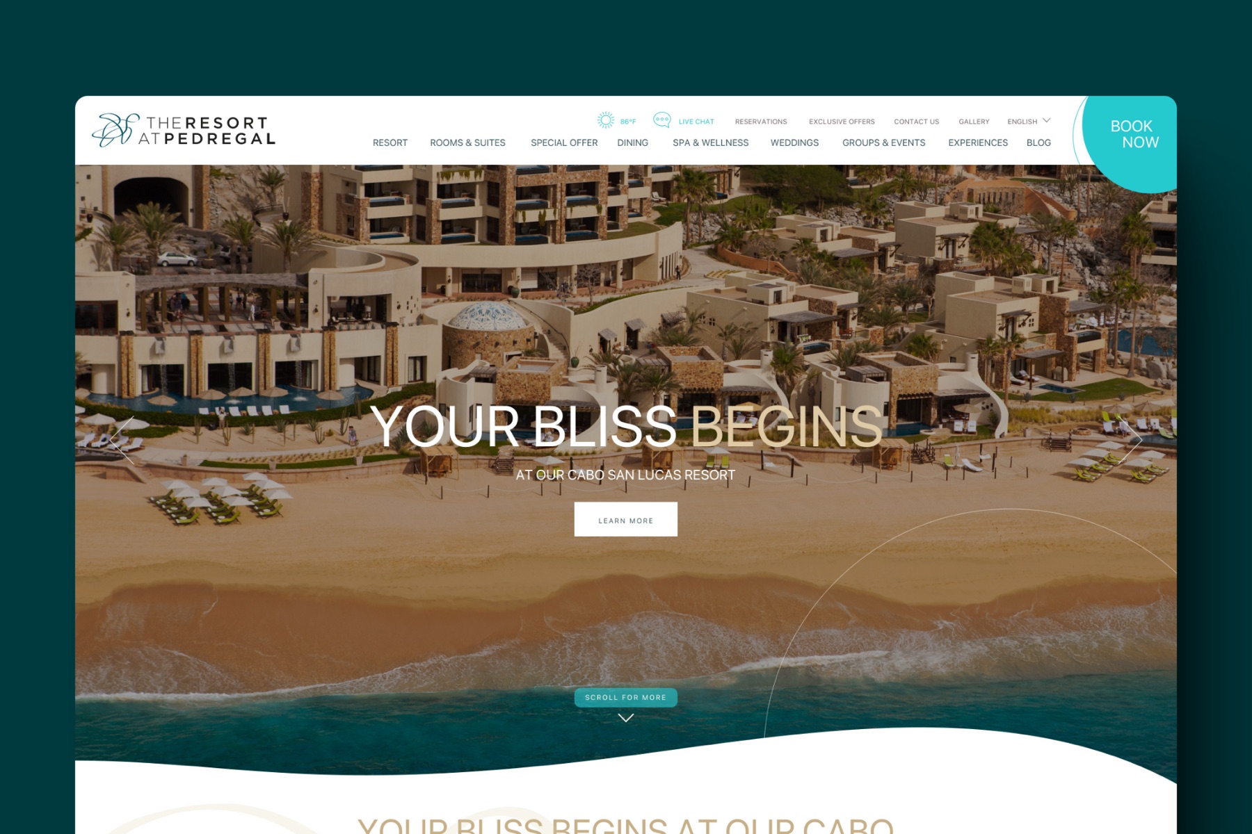
The property's distinctive arrival
The historical screenshots below are evidence of our design work. They do not establish a comparison against every hotel in Cabo or a measured booking improvement. Treat the tunnel as this project's specific design brief, not an exhaustively verified uniqueness claim.
Pedregal's arrival through the Dos Mares tunnel gives the website a clear opening: a passage through the mountain, followed by the estate and the sea. Casitas and plunge pools climb the slope. The design opportunity is to make that sequence legible before the visitor reaches a room grid. Dining, spa and wedding pages still matter, but the tunnel and cliff provide a more distinctive starting point than another list of luxury amenities.
What the previous site did instead
Our critique of the previous presentation was that broad luxury imagery and a calendar widget gave too little space to the arrival. We wanted visitors to see more specific evidence of the setting before comparing rooms. That is the team's design judgment, not a recorded study of every competitor or a measured willingness-to-pay result.
The general review question is whether the imagery explains this property or could describe the category with little change.
The decision: make the architecture of the property the architecture of the site
Our role was creative direction, creative strategy, and UX/UI design. We used the physical arrival as a narrative sequence for the site, without treating online reading time as equivalent to an actual visit.
The homepage opens on the arrival. The hero is the estate seen from above, cliff and beach in one frame, with a single line, and the booking button held in a fixed corner so it never competes with the image. Rooms, rates, and offers come after the visitor has understood where they would be.

Show accommodation features in context. Photography presents pools and terraces as parts of the accommodation rather than isolated feature labels. Match those images and descriptions to the specific room category; the historical design does not establish that every room has the same amenities.
Keep booking accessible from the property pages. The design gives room and destination information space while keeping the reservation action visible. Actual engine steps, date handling and completion require separate testing. Our hotel booking engines comparison covers integration questions rather than treating a visual comp as a working reservation.
Weddings and groups have a parallel route. Their enquiries can involve venues, capacity and several room nights, so we gave them their own navigation path. The design does not establish how often the property is booked out or the size of actual contracts.

The gallery is organized by the guest's questions. Not by the photographer's shoot list. Resort, rooms, dining, spa, weddings, experiences, in the order someone decides.
Things to do gets its own world. Los Cabos sells activity as much as rest, so the experiences section is a destination in itself: Baja by land, paddle boarding at sunrise under the arch, swimming with whale sharks, Espiritu Santo island. Each one is a full-bleed image with a short paragraph and one action, because on a phone a list of twelve activities is a wall and four big pictures are an invitation.

Mobile was part of the design brief. We considered narrow layouts before expanding them. That records our design approach; we do not have audience data establishing the device or location of most prospective guests. Review the actual site's analytics and test long content, controls and booking transitions on supported devices.
The result
The integrated campaign built around the site received an HSMAI Adrian Award, Gold, in 2017. That is recognition of the campaign, not a booking number or a statement of the judges' specific reasoning. We have not published the property's direct-booking figures.
The property today operates as Waldorf Astoria Los Cabos Pedregal, same tunnel, same cliff. Its current website is a Hilton property and not our work. The screens here are the design as it shipped.
What carries to an independent property in 2026
These are three questions to consider for another property, whether independent or part of a chain:
- Which specific detail should lead? A tunnel, a cliff, a landscape or a rooftop can provide a starting point when supported by the property facts. Brush Creek Ranch leads with the land; Hard Rock Hotels leads with the music. More than one detail may matter to guests.
- Treat the differentiator as structure. If seclusion, or the view, or the kitchen is the reason to pay the rate, it belongs in the room's architecture on the page, with photography that proves it, not in a features list.
- Which tasks need separate routes? Compare the information and actions needed by leisure guests, wedding planners and group buyers. Shared navigation can work when those routes remain clear. Understanding user intent on travel websites explains how to investigate that distinction.
For scoping similar work, the hotel website design page distinguishes template, custom and multi-property delivery. The Hotel Website Grader checks narrow source-HTML signals; it cannot assess the complete guest journey or commercial result. The full case study is at The Resort at Pedregal.
Related, on the money rather than the design: why Booking.com looks cheaper than the hotel website. And on a property whose differentiator is a program rather than a place: Hotel El Ganzo, where the recording studio in the basement set the structure of the site.
Have a product idea?
Designed, built, and shipped in about 5 days.