Brush Creek Ranch: 30,000 Acres, Four Front Doors
A multi-property resort loses bookings when its website flattens every property into one homepage, and the fix is structural, not visual. Brush Creek Ranch is 30,000 private acres in Saratoga, Wyoming, a working ranch since 1884, Forbes Five-Star, Condé Nast Traveler's number one resort in the USA, and the 2026 Orvis-Endorsed Fly-Fishing Lodge of the Year. It runs as four distinct guest operations: the Lodge and Spa for up to 155 guests year-round, the adults-only Magee Homestead for 27, the five-bedroom French Creek, and Platte Canyon Glamping, all-inclusive across all four. The previous site asked a fly-fisher, a family of twelve, a wedding party, and a corporate retreat planner to land on the same page and scroll until they found themselves. Our redesign led with the scale of the land, then split the navigation by property, so each audience got its own door in two clicks. Below is what shipped, why, and what carries to any property that is more than one thing.
The property, in one sentence
It is not a hotel. It is a 30,000-acre estate with 7,600 feet of elevation change, 20 miles of private North Platte fly-fishing water, 600 private acres of downhill skiing, and access to 100,000 acres of national forest, on which four separate lodging experiences sit, each with its own audience, capacity, and season. When the design shipped, the site carried three of them, the Lodge and Spa, Magee Homestead, and French Creek; the ranch has since added Platte Canyon Glamping, which the same structure absorbs as a fourth card.
What the previous site did instead
One homepage for everyone. Horseback riding marketing above the fold for the fly-fisher who wanted the Orvis lodge. Wedding capacity buried under activities for the planner who was buying the whole Lodge. The family looking for an adults-free week at Magee scrolled past the family programming. The visuals were fine; the information architecture was the problem, which is the most common failure on hotel websites and the one a redesign most often fails to fix, because a redesign is usually briefed as a visual project.
The decision: make the map of the ranch the map of the site
Our role was creative direction, creative strategy, and UX and UI design. The central call was to organize the site the way the ranch is organized.
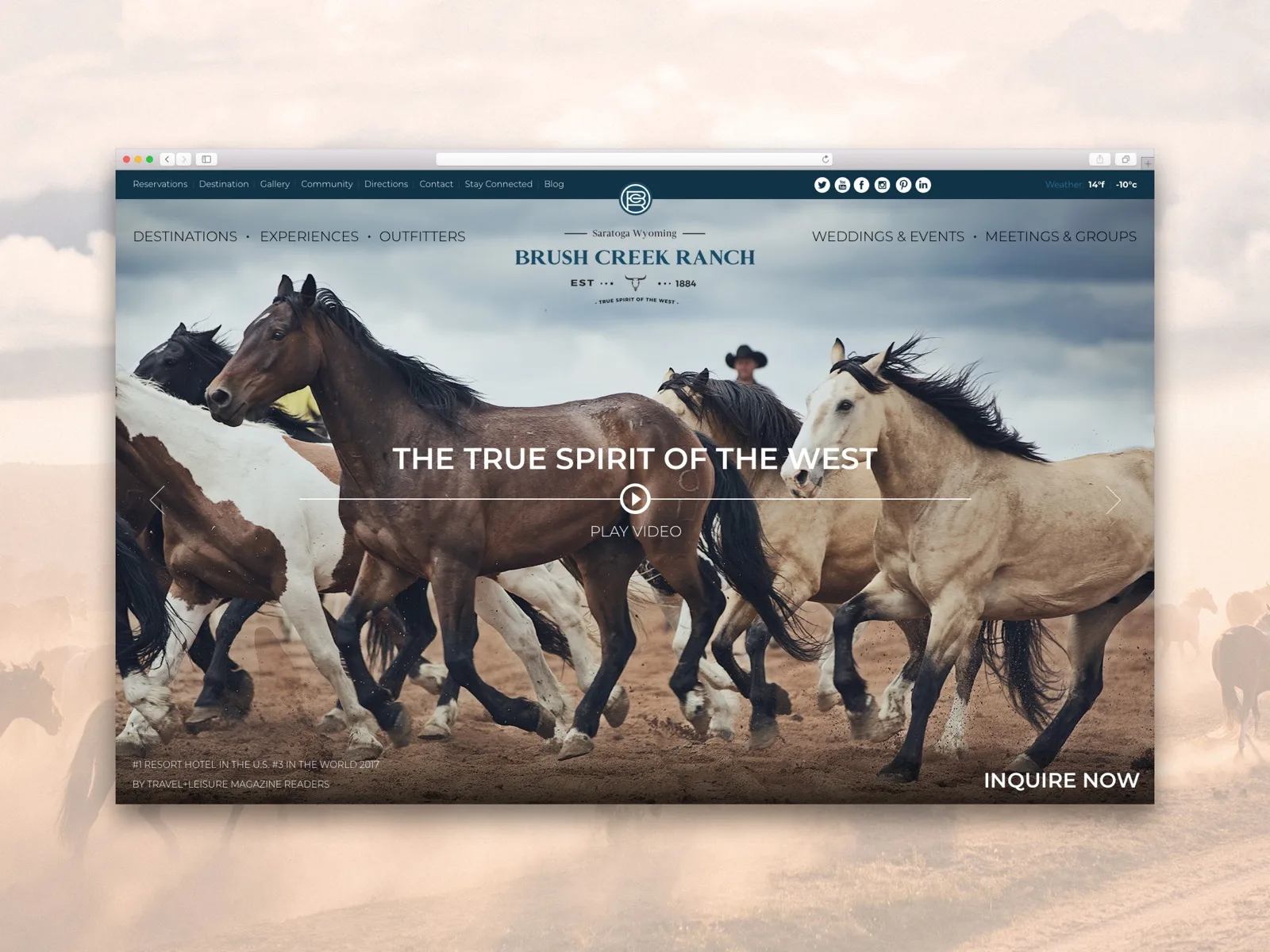
Lead with the land. The hero is full-bleed wilderness: the horses, the elevation, the river, the 1884 brand mark centered like a cattle brand. Before a room card or a rate, the visitor understands the one thing no competitor has, which is the scale. The awards line sits small under the hero, where it confirms rather than sells.
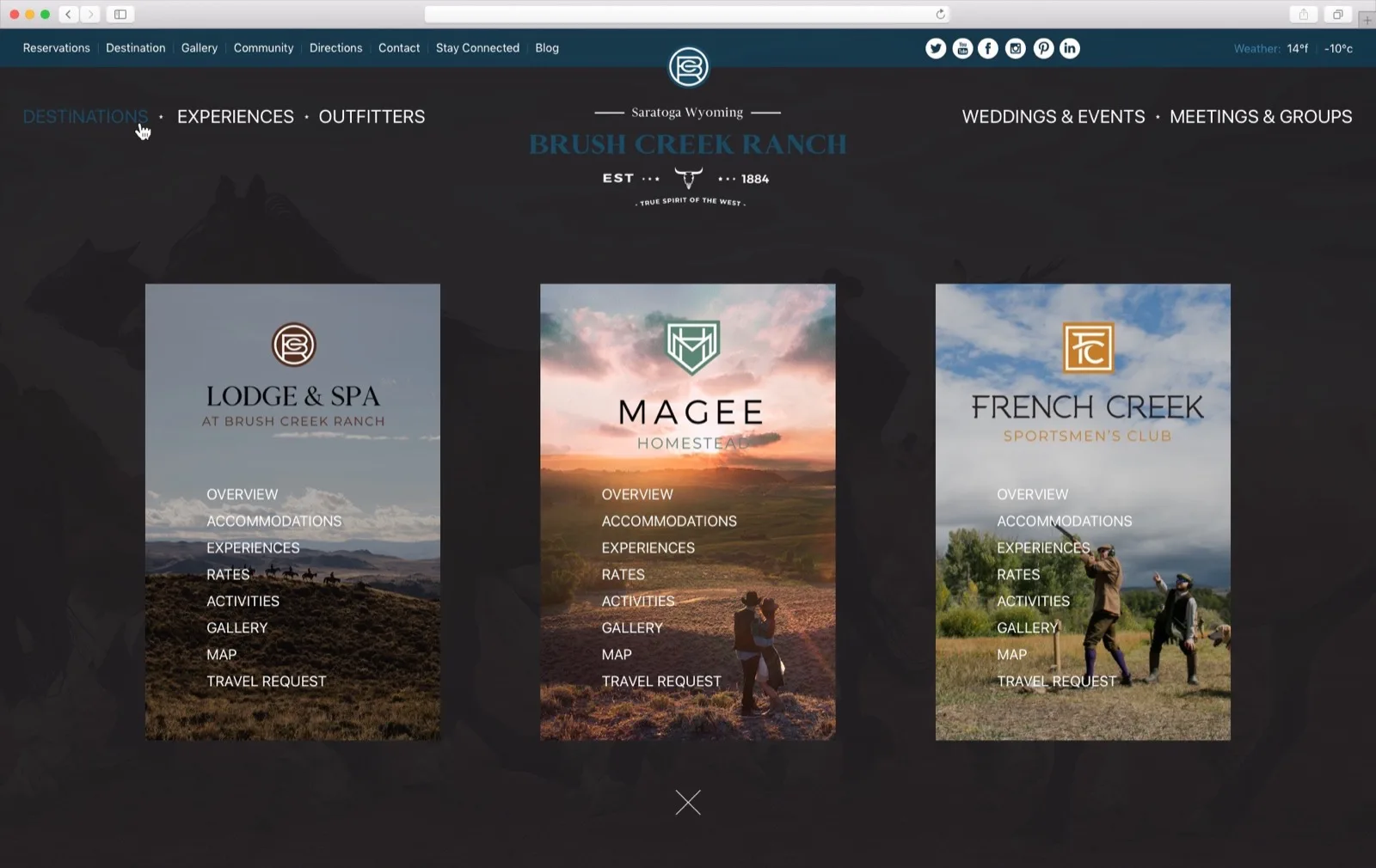
Split by property at the navigation. Destinations opens three full-height cards, one per property, each with its own mark, its own photography, and its own sub-navigation: overview, accommodations, experiences, rates, activities, gallery, map, travel request. A fly-fisher looking for the Orvis lodge is inside the Lodge and Spa in two clicks. A family of twelve booking a Magee buyout never sees the Lodge's wedding pages. Each property is a small site with its own audience, capacity, and seasonal availability, sharing one brand.
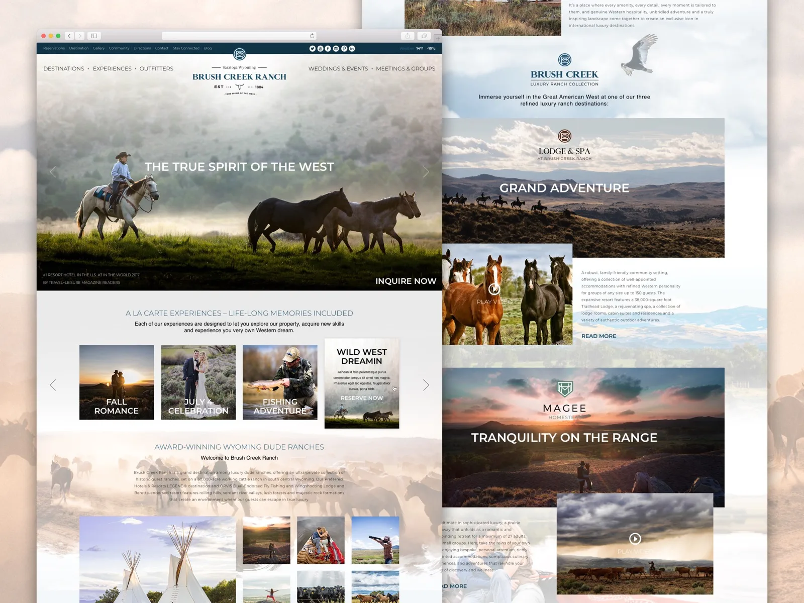
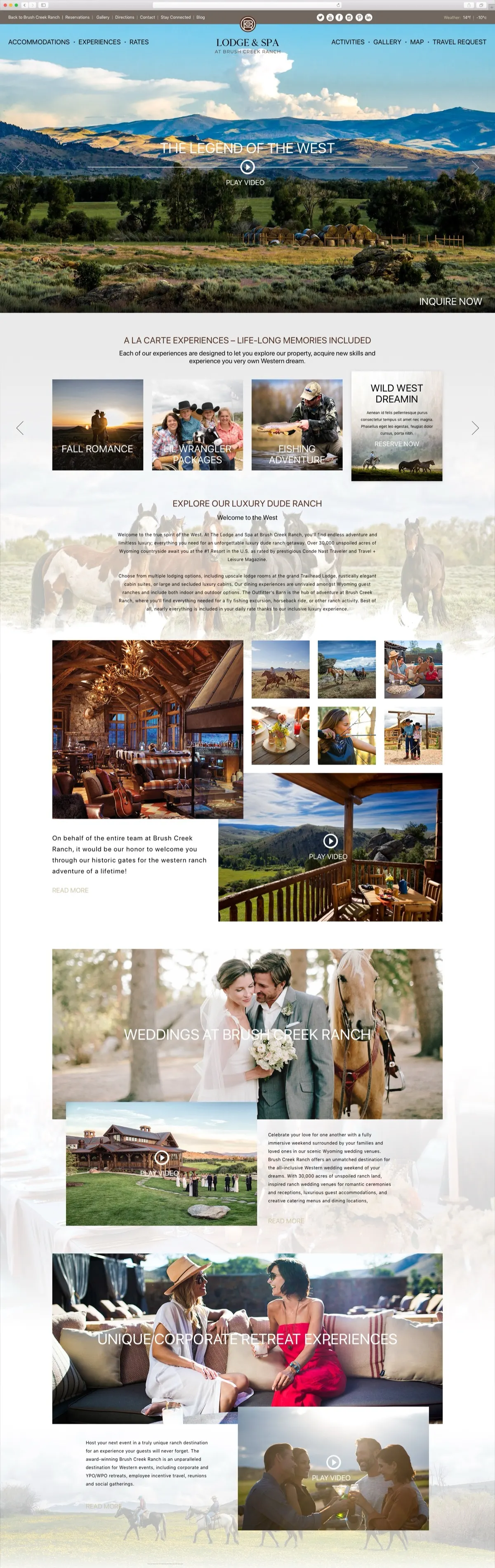
Activities and dining as layers, not silos. The Farm's farm-to-table program, the wine cellar, Orvis fly-fishing, shooting sports, horseback riding, the Trailhead spa, and yoga live as a cross-cutting layer under every property, so a guest can plan an adventure-first, a wellness-first, or a culinary-first trip without fighting the structure. The experiences row on the homepage is a la carte on purpose: Fall Romance, Fishing Adventure, the Lil Wrangler packages, each one image, one line, one action.
Weddings, groups, and retreats on their own side of the logo. The right half of the primary navigation is Weddings and Events and Meetings and Groups. Those are different purchases from a leisure stay, often the whole Lodge for 155 guests, and the person buying them does not want the leisure funnel. They get their own path from the top of every page.

Heritage as texture, not a chapter. The ranch has been working since 1884, and the temptation is a long Our Story section that travelers skip. We used the heritage instead as visual texture: the brand marks, the log architecture in the dining photography, the historical framing of the marks on each property card. The story is everywhere and the section is nowhere.
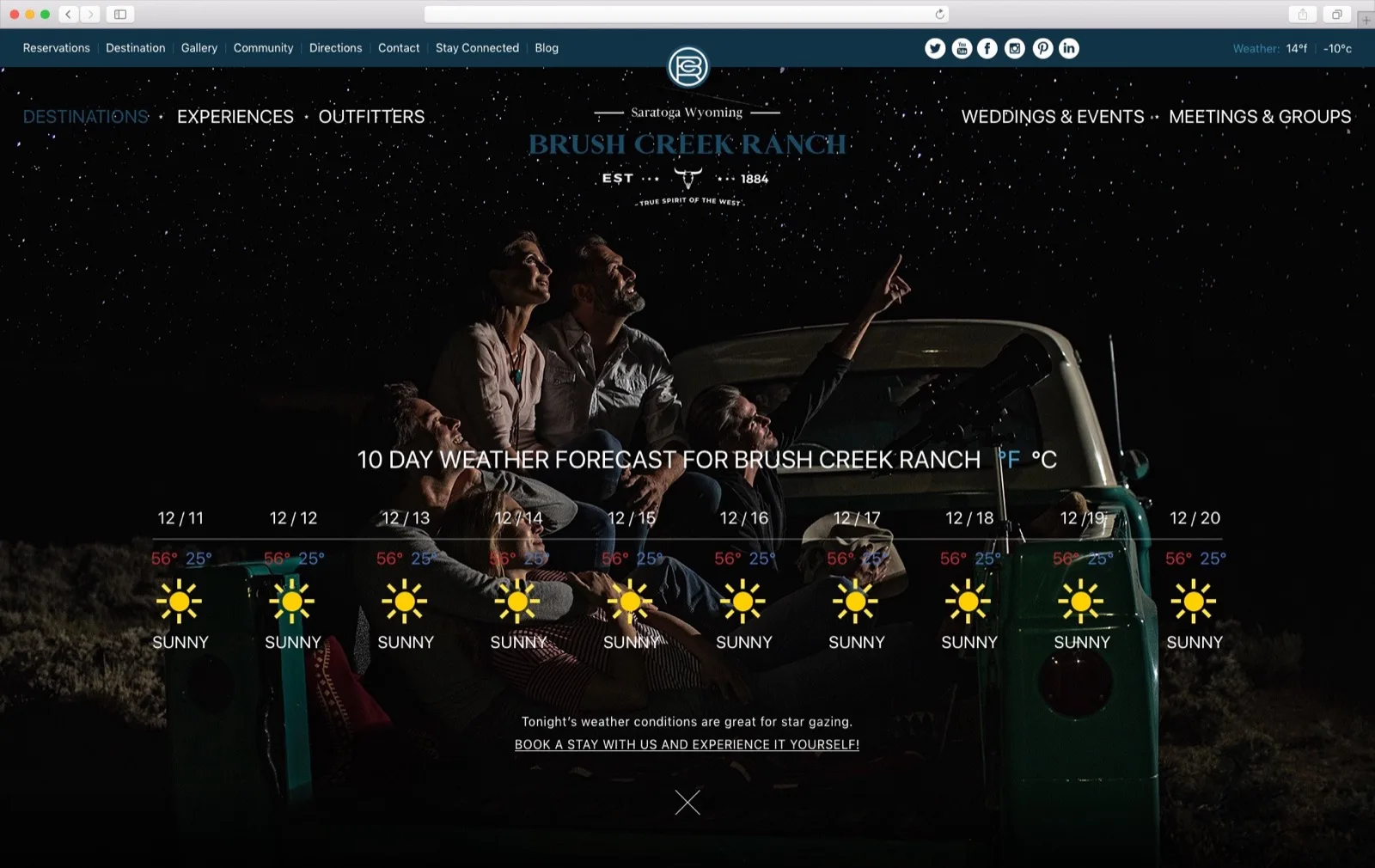
Small things that sell a remote place. A ten-day weather forecast lives in the navigation, with a line about tonight's stargazing and a link to book, because the first question about a ranch at 7,000 feet is what the weather is doing. The reservation flow is a travel request, not an instant booking engine, because an all-inclusive stay across four properties is planned with a person, and the site's job is to get the right request to the right property. Which engine sits behind that handoff is a separate purchase; our hotel booking engines comparison covers the nine most hotels shortlist.
The result
A site that honors the scale of the property without making the visitor carry it. The fly-fisher finds the Orvis lodge in two clicks. The family finds Magee without scrolling past the horseback marketing. The wedding planner gets a dedicated path. The brand reads as deliberate as the ranch. We are careful, as always, to say what this is and is not: it is the design as it shipped, and the property's direct-booking figures were theirs to keep. The ranch's current website is a later build and not our work; the screens here are ours.
What carries to a property that is more than one thing
- If the property has more than one audience, the site needs more than one door. A single homepage that serves fly-fishers, families, and wedding planners serves none of them. Split at the navigation, not at the footer.
- Lead with the fact nobody can copy. For Brush Creek that is 30,000 acres. For The Resort at Pedregal it is the tunnel. If your hero could belong to a competitor with a logo swap, it is describing the category. This is the same argument as understanding user intent on travel websites, applied to one property.
- Shared layers, separate funnels. Dining, activities, and the spa belong to every property; weddings, groups, and retreats belong to none of the leisure funnels. Model the site on that distinction and the structure stops fighting the guest.
The way we sell this work now is on a fixed price, published: the tiers are on the hotel website design page, from a build on our Aurelia template to a custom design from the property up to a platform for a group with several properties, which is the Brush Creek shape. If you want the arrival read from the inside first, that is Property Discovery. The full case study is at Brush Creek Ranch.
Have a product idea?
Designed, built, and shipped in about 5 days.