Power BI Report vs Dashboard: Which to Build
In Power BI, a report is one or more pages of visuals built on a single semantic model, which people can filter, slice and drill into; a dashboard is a single page of tiles pinned from one or more reports, which people cannot filter but can query with Q&A and attach email alerts to. Those are Microsoft's own distinctions, from the capability table in its Power BI documentation, which we read on 4 October 2026. Two consequences follow that most comparisons skip. First, you never choose one instead of the other: every dashboard tile comes from a report, so the report is always built first. Second, dashboards exist only in the Power BI service; Microsoft states they are "not available in Power BI Desktop." So the real question is whether your audience needs a single glance across several reports, with alerts, on top of the reports they already have. If the people looking are your customers, inside your own product, the answer is neither.
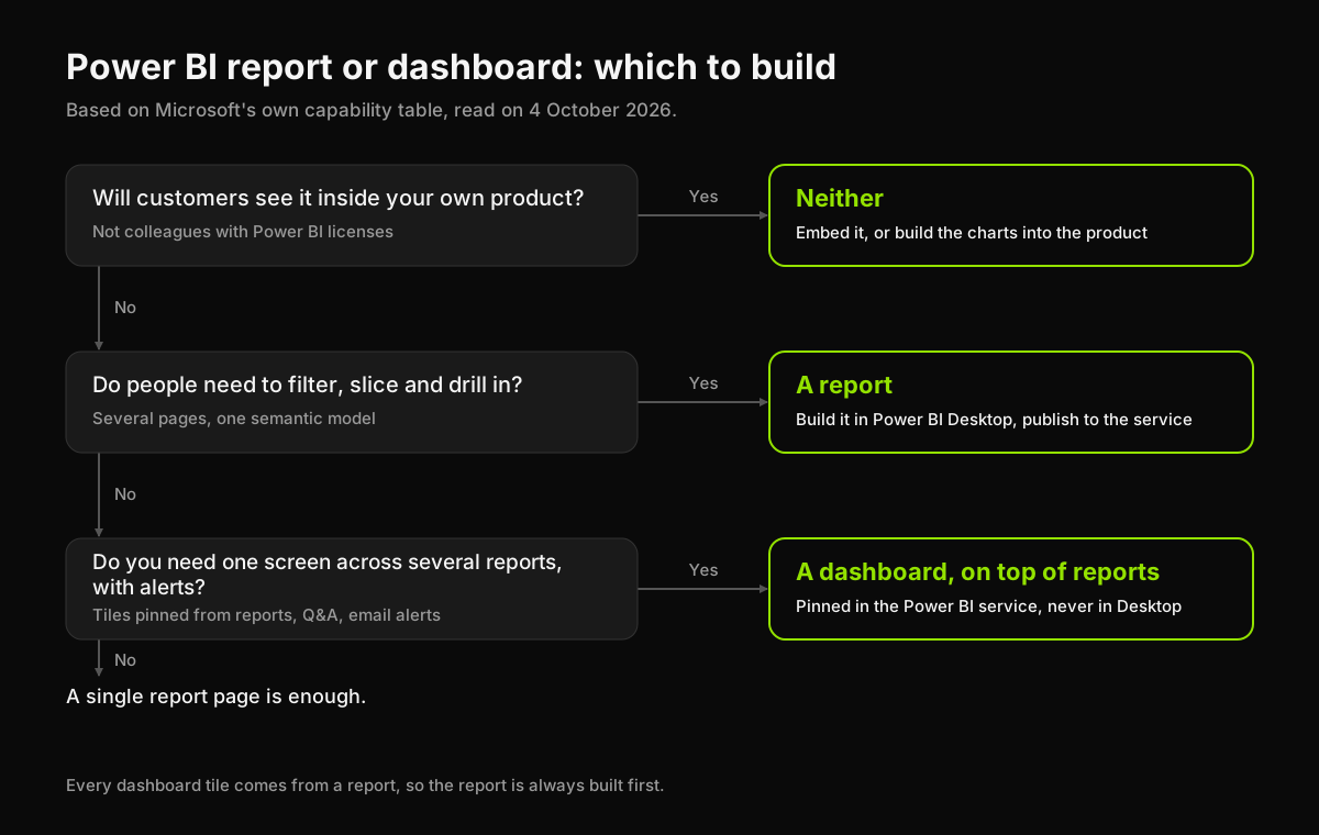
The difference, in Microsoft's words
Microsoft's documentation for business users carries one table that settles most of the argument. Here it is as captured on 4 October 2026:
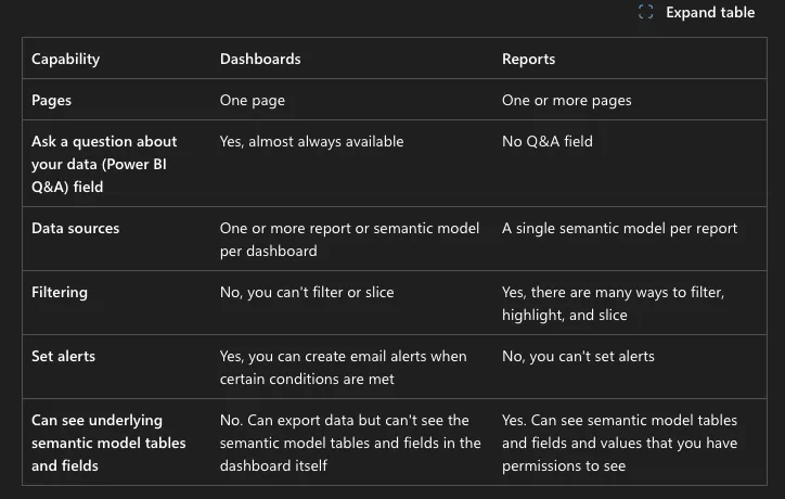
The same comparison on the reports page adds two rows:
| Capability | Dashboard | Report |
|---|---|---|
| Pages | One | One or more |
| Data sources | One or more reports or semantic models | A single semantic model |
| Filter, slice, highlight | No | Yes, many ways |
| Q&A natural-language box | Almost always available | None |
| Email alerts | Yes, on tiles | No |
| See tables and fields | No, export only | Yes, within your permissions |
| Customize the view | No | Yes: cross-filter, change visual type, bookmarks, comments, Analyze in Excel |
| Pinning | Only existing tiles, to other dashboards | Visuals or whole pages, to any dashboard |
| Where it is made | Power BI service only | Power BI Desktop or the service |
Read down the columns and the roles are clear. A report is a workbench: many pages, one model, built to be explored. A dashboard is a front door: one page, many sources, built to be glanced at and to tell you when something moves.
When to build a report
Build a report whenever someone has to answer a question the designer did not anticipate. That is most of the time. Signs you need a report:
- People ask follow-up questions. "Revenue is down" is a tile. "Down where, for which product, since when" is a report with slicers.
- The data comes from one model. A report sits on a single semantic model, which is also what keeps its numbers consistent from page to page.
- Different people need different cuts. A report lets each viewer filter to their region or team without anyone building a copy. Microsoft notes viewers "can't corrupt the reports"; their changes only affect their own view.
Reports are authored in Power BI Desktop, which Microsoft lists as a free download, then published to the service to share.
When to add a dashboard
Add a dashboard when the same people open three reports every morning to check four numbers. Signs you need one:
- The story spans several reports or models. A dashboard is the only Power BI surface that puts tiles from different semantic models on one page, including a mix of on-premises and cloud data.
- Someone needs to be told, not to look. Data alerts live on dashboard tiles, not in reports. If the requirement is "email me when stock falls below 500," that is a dashboard.
- Executives want one page. Microsoft's own description: because a dashboard "is limited to one page, a well-designed dashboard contains only the most important elements of that story." Each tile clicks through to the report page behind it, so the detail is one tap away.
A dashboard with nothing behind it is not a thing Power BI lets you make. If a stakeholder asks for "a dashboard instead of a report," what they usually mean is a report with fewer, better pages.
What it costs to share either one
Building is free; sharing is where the license shows up. On Microsoft's pricing page on 4 October 2026, Power BI Pro was $14.00 per user a month and Premium Per User $24.00, both paid yearly. To view a dashboard a colleague shares, Microsoft's documentation says you need a Pro or Premium Per User license, unless the content sits in a Premium or Fabric F64-or-larger capacity. For ten people that is $1,680 a year on Pro before anyone has opened a chart.
That pricing is also why Power BI is the wrong tool for one job: showing data to your own customers. Every viewer needs a seat or the company needs capacity, and the result still looks like Power BI rather than your product. Our comparison of data visualization tools sorts the options by exactly that line: beside the product, for your team, or inside it, for your users.
When the answer is neither
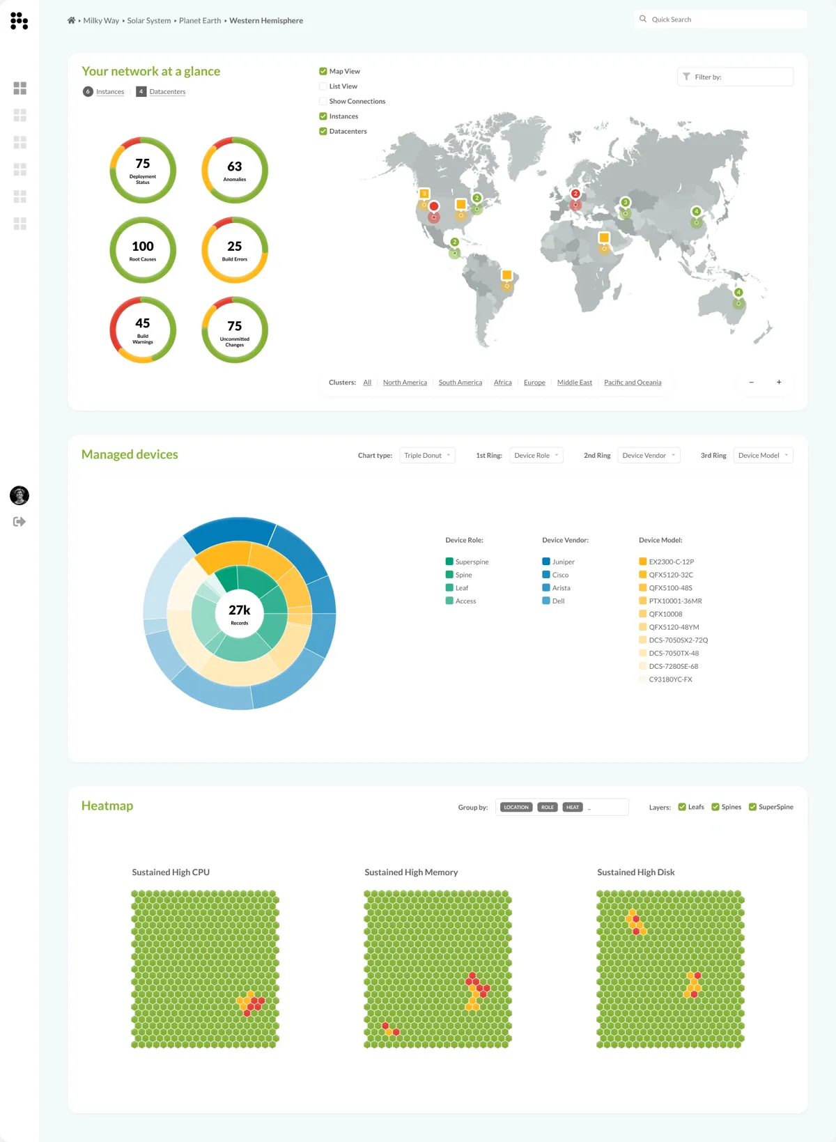
When the dashboard is the product, a BI tool is the wrong starting point. Overseer is a global network operations console we designed: about 27,000 devices rolled up across six continents in one pane, with more than 100,000 points kept smooth by hand-tuned rendering. It has a report's drill-down and a dashboard's single glance on the same screen, and it had to look and behave like the rest of the product, which no pinned tile does.
That kind of build is what our Complex Data Visualization service is for. If you need one screen rather than a system, the SaaS Dashboard is a single dashboard designed and built as working front-end, flat fee.
The short answer
Build the report first, always: it is where the data is modeled and where people explore. Add a dashboard on top only when someone needs one page across several reports, or an alert when a number moves. And if the audience is your customers rather than your colleagues, skip both and put the charts in the product.
Sources, read on 4 October 2026: Microsoft Learn, "Dashboards for business users of the Power BI service," "Reports in the Power BI service" and "Intro to dashboards for Power BI designers"; Microsoft's Power BI pricing page.
Have a product idea?
Designed, built, and shipped in about 5 days.