Data Visualization Tools
Data Visualization Tools Compared for Product Teams (2026)
Apache ECharts, D3, Recharts, Highcharts, Metabase, Power BI, Tableau, Looker Studio, Grafana, Observable, and Plotly, sorted by whether the charts live inside your product or beside it, with every price read live on 11 September 2026 and a 27,000-device operations console as the custom-build receipt.
| Vendor | Pricing | Turnaround | Best for |
|---|---|---|---|
| Apache ECharts | Free, Apache 2.0 licence | A day to a first chart; canvas and SVG rendering for large series | Product dashboards with many chart types and large datasets, without a licence conversation |
| D3.js | Free, ISC licence | Days per bespoke visualization | Visualizations that do not exist yet: custom layouts, maps, hierarchies, anything a chart type will not do |
| Recharts | Free, MIT licence | Hours for standard charts in a React app | React products that need clean standard charts and want components, not a charting engine |
| Highcharts | Core from $366 per developer seat on the annual licence; Stock +$366, Maps +$128, Gantt +$73, Dashboards $264, Grid Pro $316; perpetual licences available | A day to a first chart; the widest documentation of any commercial library | Commercial products that want a supported library with stock, maps, and Gantt modules and a licence someone else has read |
| Metabase | Open source free, self-hosted; Cloud Starter $100/mo, Pro $575/mo, Enterprise from $20,000 a year; additional users $6 or $12 a month | An afternoon from database to first dashboard | Internal analytics a whole team will actually open, with embedding into the product on Pro |
| Microsoft Power BI | Free account; Pro $14 per user a month paid yearly; Premium Per User $24; Desktop free | Days, with someone who knows the Microsoft stack | Companies already on Microsoft 365 and Fabric who want BI seats at the lowest per-user price |
| Tableau Cloud | Standard from $15 and Enterprise from $35 per user a month billed annually; Cloud+ and the Tableau+ bundle on request; annual contract required | Weeks, with an analyst | Analyst-led organizations that want the deepest visual analytics product and will pay per seat for it |
| Looker Studio | Free; Looker (Google Cloud core) on an annual contract with no published price | An hour from a Google Sheet or GA4 | Marketing and product reporting on Google data at no cost |
| Grafana | Open source free; Cloud Free tier; Pro $19 a month platform fee plus usage; Enterprise with a $25,000 a year minimum | Hours for a metrics dashboard | Anything that is a time series: infrastructure, product telemetry, operations |
| Observable | Free; $22 per editor a month on annual billing ($25 monthly); a $40 tier ($45 monthly); private viewers $10 each | Hours in a notebook | Data teams exploring and prototyping visualizations in D3 and Plot before they are built into a product |
| Plotly | Free; Pro $29 per creator seat a month ($290 a year), viewers free; Dash Enterprise on request | Hours in Python | Python teams building analytical apps in Dash and sharing them without a front-end team |
| SUURThat’s us | Complex Data Visualization from $30,000, scoped per dataset, four to eight weeks; SaaS Dashboard $15,000 flat, one screen designed and coded | Four to eight weeks for a bespoke visualization; two weeks for one dashboard screen | Products where the visualization is the product: a fleet console, a scheduling view, a map of everything, designed and coded by one senior |
- Pricing
- Free, Apache 2.0 licence
- Turnaround
- A day to a first chart; canvas and SVG rendering for large series
- Best for
- Product dashboards with many chart types and large datasets, without a licence conversation
- Pricing
- Free, ISC licence
- Turnaround
- Days per bespoke visualization
- Best for
- Visualizations that do not exist yet: custom layouts, maps, hierarchies, anything a chart type will not do
- Pricing
- Free, MIT licence
- Turnaround
- Hours for standard charts in a React app
- Best for
- React products that need clean standard charts and want components, not a charting engine
- Pricing
- Core from $366 per developer seat on the annual licence; Stock +$366, Maps +$128, Gantt +$73, Dashboards $264, Grid Pro $316; perpetual licences available
- Turnaround
- A day to a first chart; the widest documentation of any commercial library
- Best for
- Commercial products that want a supported library with stock, maps, and Gantt modules and a licence someone else has read
- Pricing
- Open source free, self-hosted; Cloud Starter $100/mo, Pro $575/mo, Enterprise from $20,000 a year; additional users $6 or $12 a month
- Turnaround
- An afternoon from database to first dashboard
- Best for
- Internal analytics a whole team will actually open, with embedding into the product on Pro
- Pricing
- Free account; Pro $14 per user a month paid yearly; Premium Per User $24; Desktop free
- Turnaround
- Days, with someone who knows the Microsoft stack
- Best for
- Companies already on Microsoft 365 and Fabric who want BI seats at the lowest per-user price
- Pricing
- Standard from $15 and Enterprise from $35 per user a month billed annually; Cloud+ and the Tableau+ bundle on request; annual contract required
- Turnaround
- Weeks, with an analyst
- Best for
- Analyst-led organizations that want the deepest visual analytics product and will pay per seat for it
- Pricing
- Free; Looker (Google Cloud core) on an annual contract with no published price
- Turnaround
- An hour from a Google Sheet or GA4
- Best for
- Marketing and product reporting on Google data at no cost
- Pricing
- Open source free; Cloud Free tier; Pro $19 a month platform fee plus usage; Enterprise with a $25,000 a year minimum
- Turnaround
- Hours for a metrics dashboard
- Best for
- Anything that is a time series: infrastructure, product telemetry, operations
- Pricing
- Free; $22 per editor a month on annual billing ($25 monthly); a $40 tier ($45 monthly); private viewers $10 each
- Turnaround
- Hours in a notebook
- Best for
- Data teams exploring and prototyping visualizations in D3 and Plot before they are built into a product
- Pricing
- Free; Pro $29 per creator seat a month ($290 a year), viewers free; Dash Enterprise on request
- Turnaround
- Hours in Python
- Best for
- Python teams building analytical apps in Dash and sharing them without a front-end team
- Pricing
- Complex Data Visualization from $30,000, scoped per dataset, four to eight weeks; SaaS Dashboard $15,000 flat, one screen designed and coded
- Turnaround
- Four to eight weeks for a bespoke visualization; two weeks for one dashboard screen
- Best for
- Products where the visualization is the product: a fleet console, a scheduling view, a map of everything, designed and coded by one senior
"Data visualization tools" covers two different purchases, and most comparison pages mix them up. One is a library your product renders in front of your users. The other is a BI tool your team opens to understand the business. They cost differently, they are chosen by different people, and the mistake product teams make is buying the second to do the first.
This page sorts the tools by where the chart lives, with every price read from the vendor's own page on 11 September 2026. It ends with the third case, the one where the visualization is the product, which is the work we do, with a 27,000-device operations console as the receipt.
Inside the product, beside it, or the product itself
| Where the chart lives | What you need | Tools | What it costs |
|---|---|---|---|
| Inside the product, for your users | A library your front-end renders | ECharts, Recharts, D3, Highcharts | Free, or $366 per developer seat |
| Beside the product, for your team | A BI tool on your database | Metabase, Power BI, Tableau, Looker Studio, Grafana | Free to $35 per user a month |
| The product itself | A custom build | D3 and a front-end team, or a studio | From $30,000 |
Libraries: charts inside the product
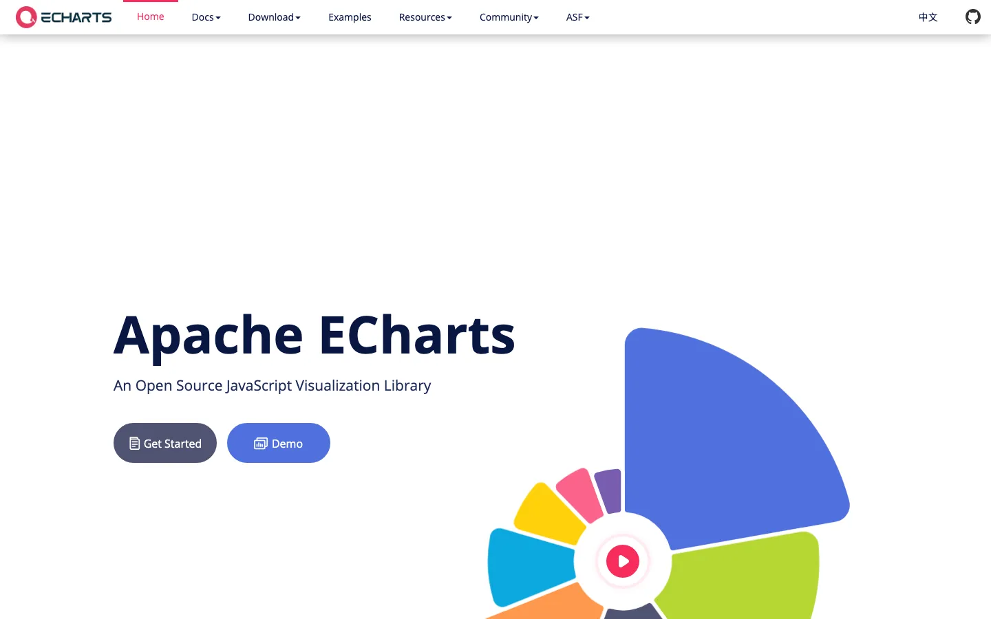
Apache ECharts is the default for a product dashboard: dozens of chart types, canvas rendering that stays smooth on large series, theming, and a licence nobody has to read. It renders to a div and does not care what framework is around it.
Recharts is the React-native answer for standard charts: components you compose in JSX, styled like the rest of your app, done in an afternoon. It is the wrong tool the moment you need a chart type it does not have.
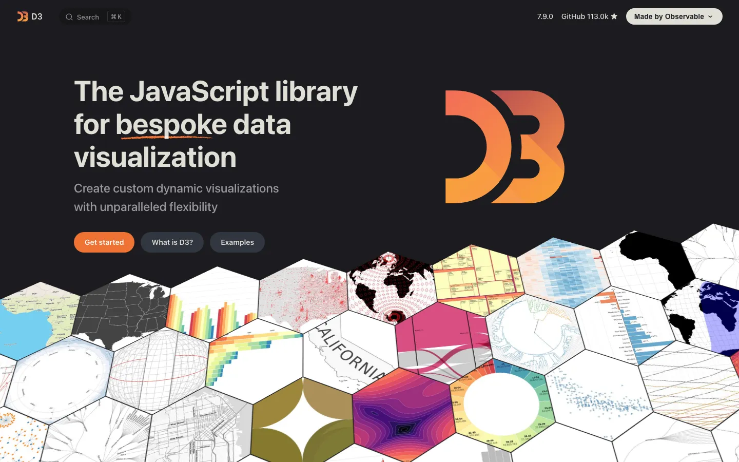
D3 is not a charting library. It is the toolkit for drawing anything from data, which makes it the right answer for a visualization that does not exist yet, a custom map, a hierarchy, a network, a layout of your own, and the wrong answer for a bar chart. Most of the bespoke work on this page is D3 or the same ideas by hand.
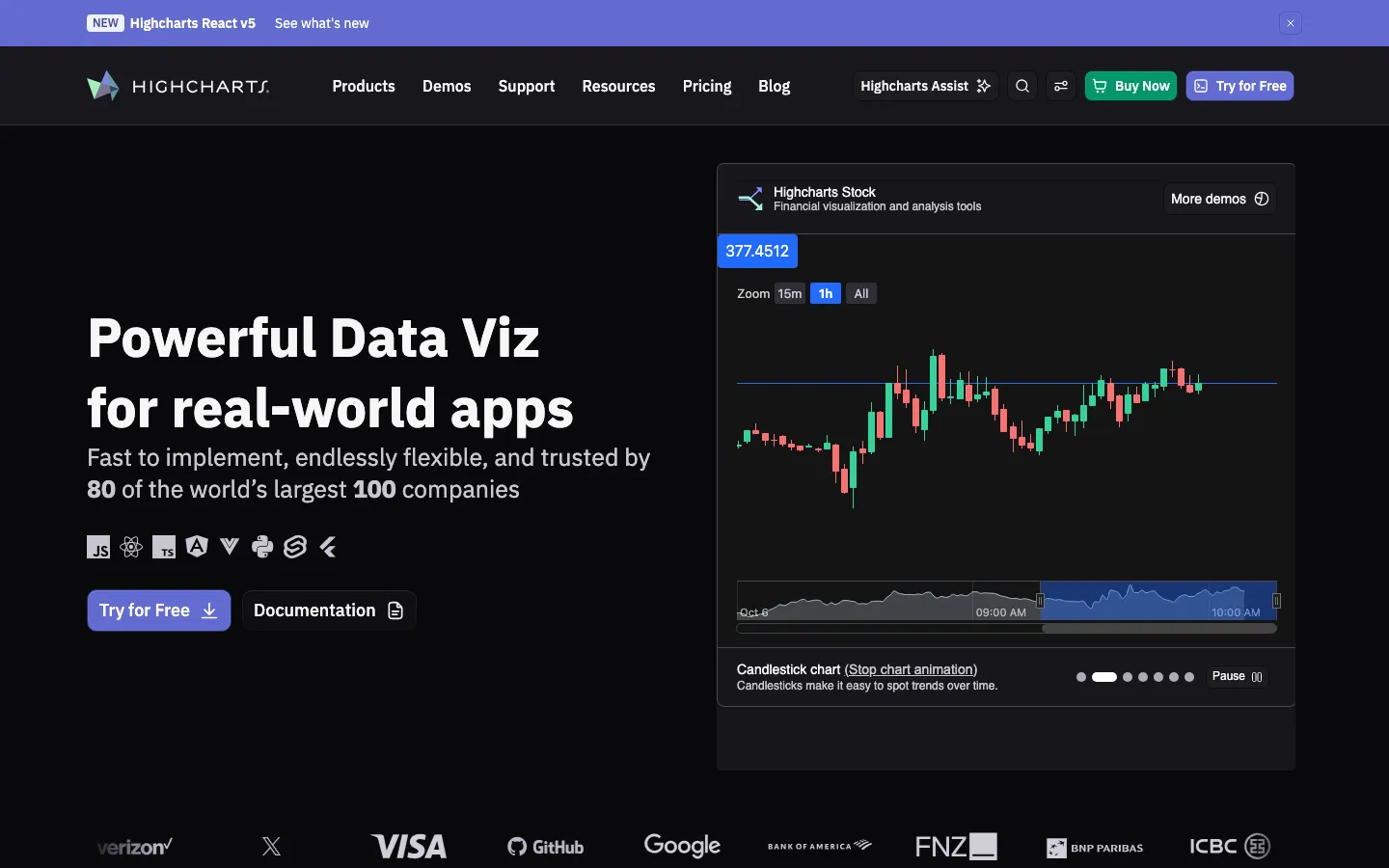
Highcharts is the commercial library: the same coverage as ECharts with a support contract, stock, maps, and Gantt modules, and documentation that has answered your question already. On 11 September 2026 the shop listed Core at $366 per developer seat on the annual licence, Stock at a further $366, Maps at $128, Gantt at $73, Dashboards at $264, and Grid Pro at $316, with perpetual licences as the alternative. It is what you buy when someone has to sign off on the licence.
BI tools: charts beside the product
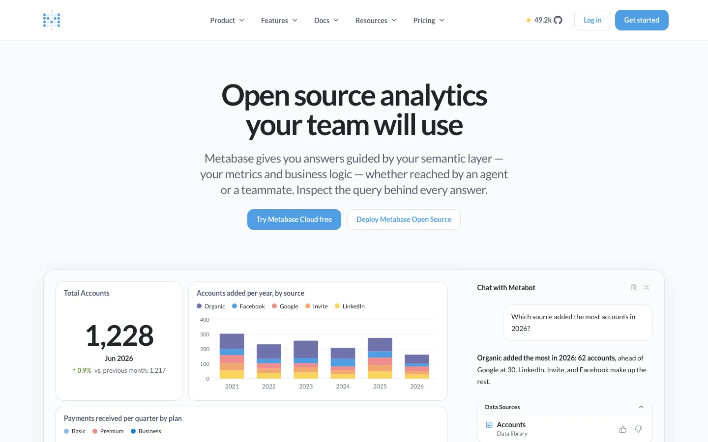
Metabase is the BI tool a whole team will open. Open source and free to self-host, or hosted at $100 a month on Starter and $575 on Pro on 11 September 2026, with Enterprise from $20,000 a year and additional users at $6 or $12 a month. Pro adds embedding, which is how a lot of products get their first in-app analytics without a front-end team; it is a fine bridge and a poor destination.

Power BI is the cheapest serious BI seat: Pro at $14 per user a month paid yearly and Premium Per User at $24 on 11 September 2026, a free desktop authoring tool, and the Microsoft 365 and Fabric integration that decides the purchase for most companies already on that stack.
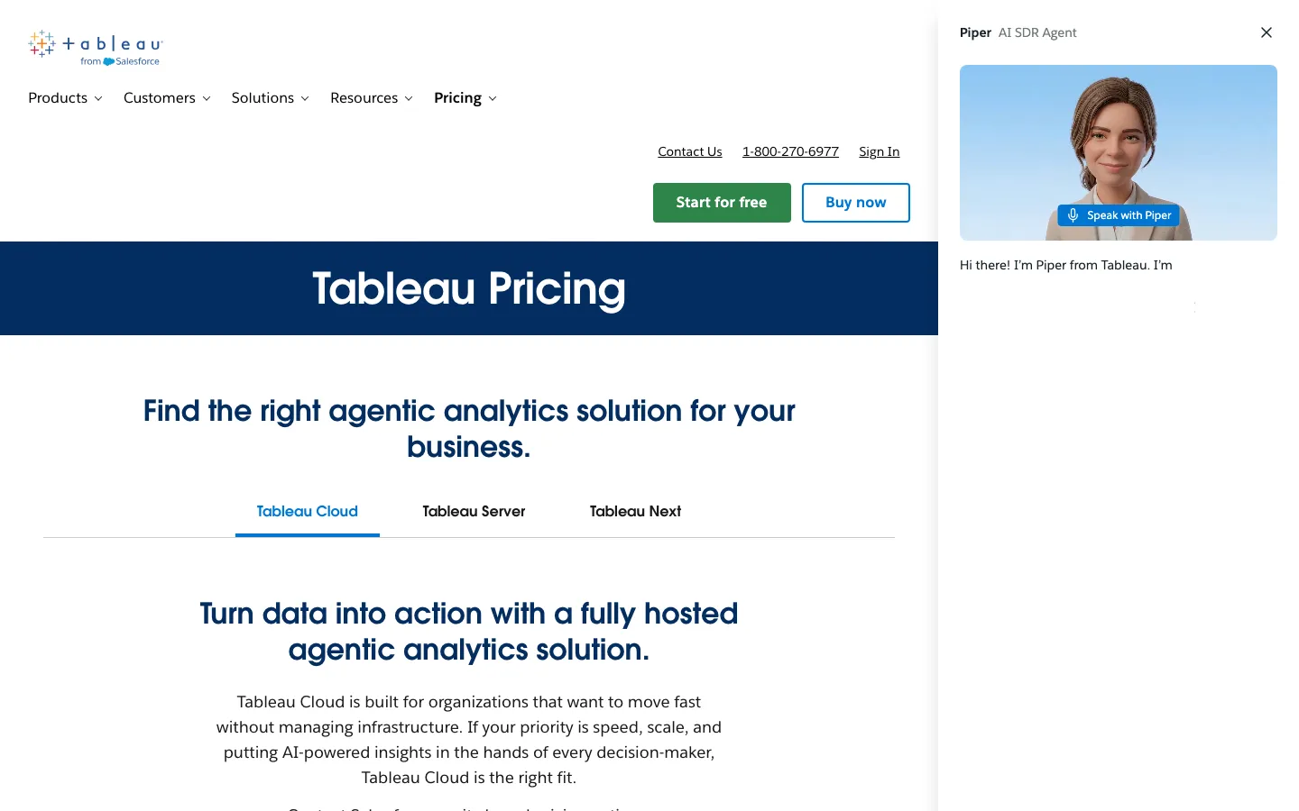
Tableau is the deepest visual analytics product and the one analysts ask for by name. Tableau Cloud listed Standard from $15 and Enterprise from $35 per user a month billed annually on 11 September 2026, with Cloud+ and the Tableau+ bundle on request and an annual contract required. The value is in the authoring, which is why it is an analyst's tool and not a product team's.
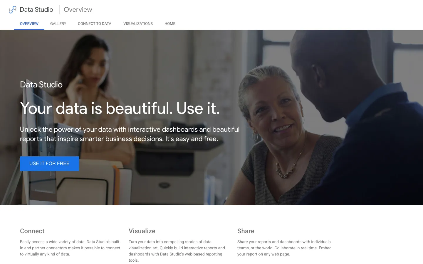
Looker Studio is free and the right answer for reporting on Google data: GA4, Search Console, Sheets, BigQuery, in an hour. Looker itself, the modeling layer for large organizations, is an annual contract with no published price.
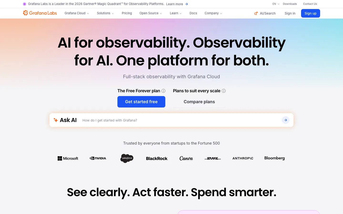
Grafana is the tool for anything that is a time series: infrastructure, product telemetry, operations. Open source and free, a free cloud tier, Pro at a $19 a month platform fee plus usage, and Enterprise with a $25,000 a year minimum on 11 September 2026. If your product's data is metrics over time, it is also a reasonable thing to look at before building.
Notebooks: exploring before building
Observable is where visualization work gets prototyped: notebooks in D3 and Plot, free, then $22 per editor a month on annual billing or $25 monthly, a $40 tier ($45 monthly), and private viewers at $10 each on 11 September 2026. Plotly is the same idea for Python teams: free, Pro at $29 per creator seat a month or $290 a year with viewers free, and Dash Enterprise on request for analytical apps that ship without a front-end team.
When the visualization is the product
The third case is the one the tools above do not cover. A fleet console that operators watch all day. A route with its elevation profile. A pipeline view that is the workspace. Users pay for the visualization, it has to drill from everything to one record, it has to stay smooth at a hundred thousand points, and it has to look like the product, not like an embedded dashboard. That is custom work, D3 or the same ideas by hand, and it is what we do.
The receipt is Overseer, a single-pane operations console for a global data center network: about 27,000 devices in one rollup across six continents, drilling from a whole-world view down to a single device, with over a hundred thousand points kept smooth by hand-tuned rendering, and a live interactive recreation on the case study page. Two smaller ones: PaceCalc, which renders race course elevation profiles from GPX files, fifteen courses so far, and TripLeads.AI, a lead pipeline analytics view for travel advisors tracking twelve trip types.
SUUR: Complex Data Visualization, from $30,000
This is us, so weigh it accordingly. Complex Data Visualization is scoped per dataset and surface, quoted before it starts, and most ship in four to eight weeks, designed and coded by one senior in your stack, so the result is a component in your codebase rather than an iframe from a BI tool. A single dashboard screen, designed and delivered as working front-end code, is the SaaS Dashboard product at $15,000 flat in about two weeks. If the question is which BI tool to buy for the team, the answer is above and it is not us.
Best for: products where the visualization is what users pay for, and teams who want it built once, properly, by the person who designed it.
Which one you need
- Charts in your product, standard shapes: ECharts or Recharts, free, this week.
- Charts in your product, with a support contract: Highcharts, from $366 a seat.
- Your team's own analytics: Metabase if everyone should open it, Power BI if you are on Microsoft, Tableau if analysts lead, Looker Studio if the data is Google's, Grafana if it is a time series.
- Exploring before building: Observable or Plotly.
- The visualization is the product: a custom build, and the case study shows what that looks like at 27,000 devices.
Frequently asked questions
Decide where the chart lives first. If it is inside your product, in front of your users, use a library your front-end renders: Apache ECharts for breadth and large datasets, Recharts for standard charts in a React app, D3 for anything a chart type will not do, or Highcharts if you want a supported commercial library. If it is beside your product, for your own team, use a BI tool: Metabase if you want everyone to open it, Power BI if you are on Microsoft, Tableau if analysts run the show, Looker Studio if the data is Google's, Grafana if it is a time series. If the visualization is the product itself, a console, a map, an operations view, it is a custom build.
Apache ECharts, D3, and Recharts are free and open source with no seat limits, and they are what most production dashboards are rendered with. Metabase and Grafana are free to self-host. Looker Studio is free. Power BI Desktop, Tableau Desktop Free Edition, Observable, and Plotly have free tiers with limits. The cost of free tools is the front-end or data engineering time to use them, which is why the BI seats exist.
Verified on 11 September 2026. Libraries: ECharts, D3, and Recharts free; Highcharts Core from $366 per developer seat on the annual licence, with Stock, Maps, Gantt, Dashboards, and Grid modules priced separately. BI tools: Metabase $100 or $575 a month hosted, or free self-hosted, with Enterprise from $20,000 a year; Power BI Pro $14 per user a month, Premium Per User $24; Tableau Cloud Standard from $15 and Enterprise from $35 per user a month billed annually; Looker Studio free; Grafana free or $19 a month plus usage, Enterprise from $25,000 a year. Notebooks: Observable $22 per editor a month, Plotly $29 per creator seat. Custom: our Complex Data Visualization service is from $30,000, and a single designed and coded dashboard screen is $15,000 flat.
ECharts when you need many chart types, large series, and canvas rendering without a licence, which covers most product dashboards. Highcharts when you want the same coverage with a support contract, stock and Gantt modules, and documentation someone else maintains, at $366 per developer seat and up. D3 when the visualization does not exist as a chart type: a custom map, a hierarchy, a network, a layout of your own. D3 is not a charting library; it is the toolkit the others are built from, and the reason it is the right answer for bespoke work and the wrong answer for a bar chart.
When the visualization is the product. A BI tool answers questions about your business; a custom visualization is what your users pay for: a global fleet console, a route with an elevation profile, a pipeline view that is the workspace. The tells are that users will look at it every day, that it needs to drill from a whole-world view to a single record, that it has to stay smooth at a hundred thousand points, and that it has to match the product's design system. Embedding a BI dashboard into a product at that point is a compromise users notice.
Our Complex Data Visualization service is from $30,000, scoped per dataset and surface and quoted before it starts, with most shipping in four to eight weeks, designed and coded by one senior in your stack. The receipt is Overseer, a single-pane operations console for a global data center network: about 27,000 devices in one rollup across six continents, drilling from the world to one device, with over a hundred thousand points kept smooth by hand-tuned rendering. A single dashboard screen, designed and delivered as working front-end code, is the SaaS Dashboard product at $15,000 flat in about two weeks.
Power BI if the company runs on Microsoft 365: at $14 per user a month for Pro on 11 September 2026, with a free desktop authoring tool and Fabric integration, it is the cheapest serious BI seat. Tableau Cloud if analysts lead and visual analysis depth matters more than the seat price: Standard was from $15 and Enterprise from $35 per user a month billed annually the same day, on an annual contract, with the higher editions on request. Both are the wrong tool for charts inside your product, where a library your own front-end renders is cheaper, faster, and matches the design.
Want to talk to SUUR directly?
We work with founders shipping product, not just decks.