apstra · Principal UI/UX, concept lead
Overseer
A command center for a whole fleet of data centers.
Drill from the universe to a single box. The same trustworthy view at every zoom level.
Apstra ran one fabric beautifully. The largest customers run dozens. Overseer is the missing altitude.
~27k
Devices, one rollup
6
Continents, one pane
6
Health signals at a glance
1
Pane of glass for the estate
The problem
Excellent at the scale of one site. Silent at the scale of the estate.
Apstra's unit of management was the blueprint: one designed-and-operated fabric, with deep intent-based control of anomalies, root causes, build state. But it had no native answer to the question a global operator asks first thing in the morning: across all of my sites, where should I be looking right now?The only way to find out was to check each blueprint in turn. That doesn't scale.
The insight
It came from operators, not a whiteboard.
The signal came from large, multi-location enterprises (think global banks running data centers on every continent) who needed to oversee the fleet, not babysit it one fabric at a time. Their pain became the spine of the concept: fleet-level situational awareness first, drill to detail second.
The core bet
Change the altitude, not the vocabulary.
Overseer reuses the exact concepts operators already trust from Apstra (anomalies, root causes, build errors and warnings, uncommitted changes, deployment status), but aggregates them across every site. It feels like Apstra grew up, not like a different tool.
The artifact · live
Drive it yourself.
A faithful, interactive recreation of the home dashboard, rebuilt from the original design. Pan the map, press ⌘K to jump anywhere, toggle a region, scrub the heatmaps. It's really running.
Key design moves
Four ways to make a fleet legible.
01
Health at a glance
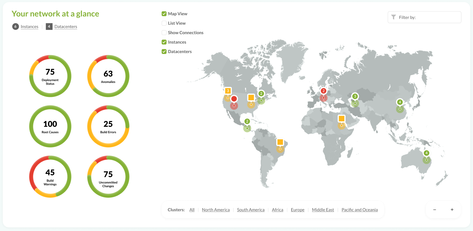
Six radial gauges roll the whole fleet's core operational metrics into one read: Deployment Status, Anomalies, Root Causes, Build Errors, Build Warnings, Uncommitted Changes. Green, amber, red. The state of the entire estate in a single glance.
02
A map you operate, not just look at
Every site is pinned and colored by health. Pan, zoom, and drill from the world into a region into a datacenter. Datacenters and instances are distinct markers you can toggle, and you can filter by status to answer the only question that matters at 9am: “show me what's on fire.”
03
Managed devices, summarized honestly
A multi-ring breakdown of tens of thousands of devices by role, vendor, and model, so fleet composition is one picture instead of a spreadsheet. Select a ring and the center reads the top segment.
04
Heatmaps for sustained stress
Honeycombs for sustained high CPU, memory, and disk surface where pressure is building across the fleet before it becomes an outage. Sustained, not momentary. This is about trends, not spikes.
The throughline
An early articulation of where the product would go.
The concept resonated with the operators it was built for. It named a real, fleet-scale problem and showed a credible answer. And the instincts in Overseer (fleet-level situational awareness, plain-language health, drill from summary to root cause) run straight through to today's operator-experience-at-scale work and the command-palette / AI direction.
“From the Milky Way to a single device, the same trustworthy view at every zoom level.”
Have complex software that needs to feel simple?
Deep, technical product design for B2B and enterprise tools experts rely on all day.