What Is a Design System? A Working Definition, With Two Real Ones
A design system is the complete set of design decisions a product is built from, tokens, components, patterns, and the rules for using them, kept in code and actually used, so that every new screen is assembled rather than invented. A style guide is a document about how things should look. A UI kit is a Figma file of how they look. A component library is the code. A design system is all of those, agreeing with each other, plus the documentation that lets the next person, or the next agent, ship a page without asking. The test: if a new hire or a coding agent can build a correct screen on day one from the system alone, you have one; if they need the designer in the room, you have a style guide. Below: what goes in one, who needs one, what ours cost, and two real systems, a 115-icon language for an enterprise networking product and the one this site is built on.
What is a design system, in simple terms
It is the answer to "how do we build screens here" written down once, in a form that machines and people both use. The colors are named, not picked. The type scale has steps, not sizes. The button has every state drawn and coded. The form has a rule for where the error goes. And a document says why, and what not to do.
The word "system" is doing the work. A collection of nice components is a kit. A system is when the components share the same decisions underneath, so that changing a decision, the accent color, the corner radius, the spacing unit, changes every component at once.
Design system versus style guide versus component library
These get used interchangeably and they are not the same thing.
| Term | What it is | Where it lives | What it cannot do |
|---|---|---|---|
| Style guide | Rules about look: colors, fonts, logo use, tone | A PDF or a web page | Build anything; it describes |
| UI kit | Drawn components and screens | A Figma or Sketch file | Ship; it is a picture of the product |
| Component library | Coded components | A package in the codebase | Explain itself; it has no rules |
| Design system | All three, agreeing, plus documentation | Code, design file, and docs, kept in sync | Nothing, if it is maintained; everything, if it is not |
Most companies that say they have a design system have a UI kit and a style guide. The tell is drift: the Figma button and the production button stop matching within a quarter, because nothing forces them to agree.
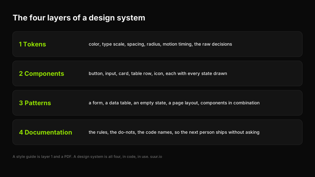
What is in a design system: the four layers
Tokens. The raw decisions, named. This site has eight color tokens, five font families, five breakpoints, and a five-step radius scale (4, 8, 12, 16, and full), declared once in a theme block and referenced everywhere. Lime is the only accent and it is a token, so there is one place to change it.
Components. Buttons, inputs, cards, table rows, icons, each with every state drawn and coded: default, hover, focus, disabled, loading, error. The button on this site has four variants in a strict hierarchy, primary, outline, dark, and outline on dark, and nothing else is allowed to look like a button.
Patterns. Components in combination, with rules: how a form lays out, what an empty state says, how a page is structured. Every commercial page on this site is one pattern, a single offer template that renders eighteen different products from data. When the template improved, all eighteen pages improved in one deploy.
Documentation. The rules and the do-nots, written for someone who was not in the meeting. Ours is a file called DESIGN.md at the root of the repository, and the rule for both people and coding agents is the same: read it before any visual decision. It says which font carries the editorial accent, that dark heroes may use a colored shader and nothing else may, that there are no three-column icon grids and no uniform bubbly radius on everything. That last sentence is what documentation is for.
Two real design systems
An icon language for an enterprise product: 115 icons, one grid
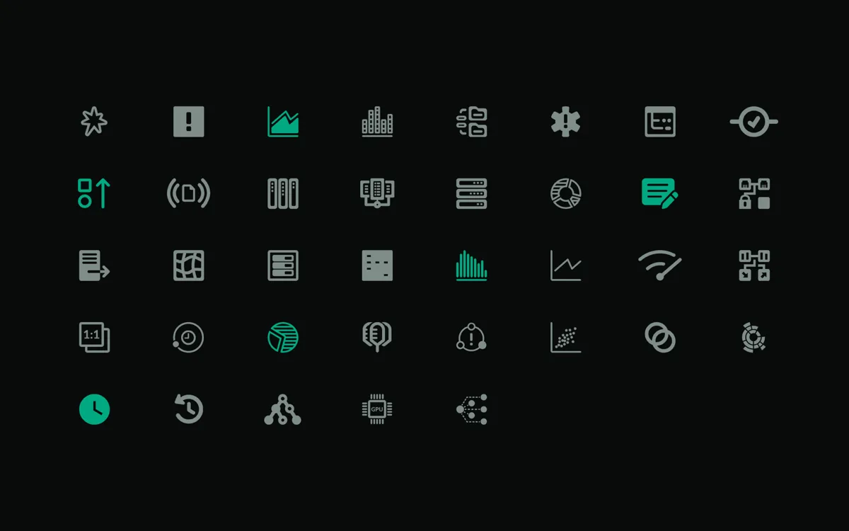
Apstra is intent-based networking software from Juniper, now HPE: dense, expert, and full of concepts that have no ready-made pictogram. The icon system we design and steward for it is a design system in miniature: 115 icons across five product domains, navigation, operations, intent-based analytics, charts, and AI, drawn on one grid with one stroke weight, so that a glyph invented this month sits next to one from three years ago without a seam.
The systemic part is not the drawing, it is the dictionary. Every concept gets one icon, that icon gets one meaning, and new features draw from the dictionary before they add to it. When a team ships a screen with a new metaphor, the question is whether the metaphor already exists, and it usually does. That is the difference between an icon set and an icon system, and it is the same difference as between a UI kit and a design system. The 3D icons for the same product are the marketing layer on top of the same language.
The system this site runs on
The second example is the one you are reading. The tokens above, the four button variants, the offer template, and DESIGN.md are a working design system for a marketing site that ships a post a day and rebuilt fifteen commercial pages on a new template in a single day in early September 2026. None of that speed comes from typing fast. It comes from the fact that a page here is assembled from decisions already made, and that the agents doing a share of the assembly read the same rules file a designer would.
That is the part of the definition that changed in the last two years. A design system used to be how a team of designers and engineers stayed consistent. It is now also how a company lets coding agents ship product without producing a hundred slightly different buttons. Systems that only exist in Figma cannot do that. Systems in code, with the rules in a file, can.
Who needs a design system, and who does not
You need one when more than two people ship screens, when the product has more than about twenty screens, when the same component keeps getting rebuilt, or when agents are writing any of your front-end. At that point the system is cheaper than the drift.
You do not need one when you are one designer-engineer shipping a first version. You need a style guide and a component folder, and the discipline to keep both small. A Product Sprint ships with exactly that: tokens, a handful of components, and a page or two, which becomes the seed of a system if the product survives. Building a full system before the product has users is the most expensive way to find out what the product is.
What a design system costs
The public ones are free to read and worth reading: Google's Material Design, Shopify's Polaris, Atlassian's, IBM's Carbon, GitHub's Primer. They are also the output of teams of dozens over years, which is not the budget most companies have.
For a company with a product and no system, our published price is the Design System add-on, from $12,000 flat, two to three weeks: tokens, the core components with every state, the first patterns, and the documentation, delivered in code and in Figma, agreeing with each other. It attaches to a Design Sprint or runs inside a Design Partner retainer, where the system keeps growing as the product does. For context on where that sits in the wider market, the website design cost post has the tiers, and the earlier guide to design systems for startups covers how to keep one alive after it ships.
How to tell if you have one
Pick a screen the product does not have yet. Hand the brief to someone who has never worked on the product, or to a coding agent with access to the repository, and ask for it by tomorrow. If what comes back looks like it belongs, you have a design system. If it comes back with questions about which blue, which button, and where the error message goes, you have a style guide and a backlog.
Have a product idea?
Designed, built, and shipped in about 5 days.