Landing Page vs Website: When You Need One or Both
Use a focused landing page when visitors arrive for one specific offer. Build a broader website when they need to explore your business, compare options or return for different tasks. You may need both, and they can share the same domain and design system.
Page count doesn't settle the decision. A website can have one page, and a homepage can serve a campaign well when its message and next step match the visitors arriving there. Start with what those visitors need to decide.
Key Takeaways
- A campaign landing page organizes information around a specific offer and action. A website can support several audiences and tasks.
- One page can fill both roles when the business and visitor needs are simple.
- Keep navigation and supporting information that help people make an informed decision.
- Compare scope and qualified outcomes, not page counts or conversion rates with different denominators.
What is the difference between a landing page and a website?
A landing page is a page; a website is the wider collection of pages and functions it may belong to. In campaign planning, “landing page” usually means a destination built around a particular offer, audience and desired action. Unbounce's definition uses this campaign-focused meaning.
In a traffic report, the term can also describe whichever page a visitor enters first. Someone arriving from search might land on your homepage, an article or a product page. That entry point isn't necessarily a dedicated campaign page.
A dedicated page doesn't require a separate domain. It might live at a path such as example.com/inventory-review, using the same publishing tools as the rest of the site.
Choose the smallest scope that covers the visitor's job
Choose one page if it can answer the relevant questions clearly. Add separate destinations when visitors have meaningfully different tasks or need more detail than that page can comfortably provide.
| Your situation | Sensible starting scope | What would justify expanding it? |
|---|---|---|
| One service, one audience, one enquiry route | A one-page website that also serves as the landing page | New services or distinct customer questions |
| A specific promotion with an existing business website | A campaign page within that website | Additional offers with different terms or audiences |
| Several services that buyers need to compare | A website with clear service destinations | Enough useful material to support separate resources or case studies |
| An established product serving prospects and customers | A website with routes for evaluation, sign-in and help | A campaign whose promise needs a more focused explanation |
| An early idea with a narrowly defined test | A page explaining the proposed offer and honest next step | Evidence that visitors need another path, or a product ready for broader use |
Don't describe an unavailable product as available just to collect sign-ups. State whether the action joins a waitlist, requests a conversation or purchases something deliverable. That choice affects the copy and the meaning of the results.
A worked example: one campaign within a larger business
Imagine an independent operations consultant who helps retailers with inventory, purchasing and staff planning. The consultant wants to advertise an inventory review to store owners. This is a hypothetical scope, not a client result.
The campaign page could explain who the review suits, what information the consultant needs, what the customer receives and how to request a call. Relevant experience and a sample deliverable would help visitors evaluate the offer. The form needs a confirmation and a clear explanation of what happens next.
The wider website has a different job: explaining the consultant's other services, background, working process and contact options. Someone referred for staff planning shouldn't have to interpret an inventory promotion to find their route.
For this business, both are useful. The campaign can link to the consultant's background, while the main site can make the inventory review discoverable. If inventory reviews were the consultant's only service, that same page might be enough as the entire initial website.
Before commissioning the work, write down the boundary: one campaign audience, one offer, one enquiry flow, supplied proof, form delivery, confirmation, mobile checks and measurement. Specify who writes the copy and follows up on enquiries. A page mockup alone doesn't cover that scope.
Does a landing page need to remove navigation?
Navigation should reflect the visitor's decision. A focused page can reduce unrelated options while retaining access to information people need, such as product details, company background, pricing terms or privacy information.
Nielsen Norman Group's homepage guidance describes the homepage's role in explaining the organization and supporting navigation. It also discusses a plan-selection example where removing the home link left users feeling trapped. That doesn't settle every campaign design, but it is a useful reason to question a blanket “remove all links” rule.
Our Biteful website project provides an inspectable example of a homepage serving several paths.
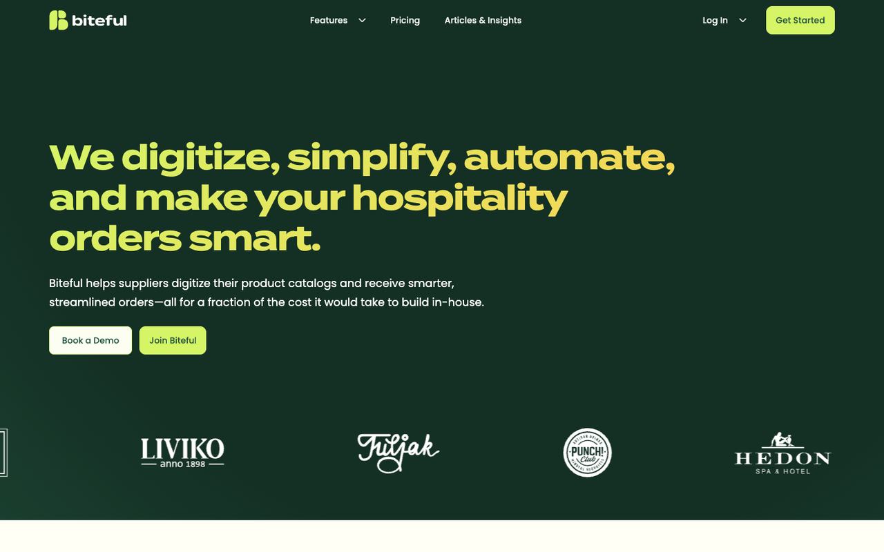
Existing Biteful project capture. The capture date is not independently established; this image documents the visible design, not the current live site or conversion performance.
The navigation includes Features, Pricing, Articles & Insights, Log In and Get Started. The hero offers Book a Demo and Join Biteful. Those visible choices illustrate the broader homepage role: exploring the product, choosing a demo or finding account access.
A hypothetical Biteful campaign promoting demos could give that action more emphasis and explain what the demo covers. The screenshot cannot tell us whether removing the other links would help, or whether either design would produce more qualified enquiries. Those would be separate questions to investigate.
For either format, test the full mobile journey, including form completion and confirmation. Google's mobile landing-page guidance emphasizes relevant content, loading performance and usable forms. A smaller navigation menu doesn't compensate for an unclear offer or a broken submission.
Which is better for SEO?
Neither format has an automatic SEO advantage. The useful question is whether each page answers a distinct search need and can be discovered and understood.
Google's SEO Starter Guide recommends logical organization, descriptive titles, useful content and links that help discovery. It doesn't promise indexing or rankings for choosing a particular page count.
The hypothetical consultant might eventually need a substantial inventory-review page and a separate staff-planning page because they answer different questions. Publishing several near-identical versions of the same offer would add little value for the reader. Give a topic its own page when there is enough distinct, useful information to justify it.
For a temporary campaign, decide what happens when the offer ends. Visitors following an old email or saved link still need an accurate explanation and an appropriate next step.
Is a landing page cheaper than a website?
A focused page can involve less work than a broader site when it uses existing content, components and integrations. But “one page” is not a complete cost specification. An interactive quote flow may require more work than several straightforward information pages.
Compare proposals against the same responsibilities:
- Content: messaging, copy, photography and evidence supplied or created.
- Design: existing components adapted or a new visual system developed.
- Functionality: forms, scheduling, payments and connections to other tools.
- Launch: accessibility checks, mobile testing, analytics and domain setup.
- Operation: content updates, software fees, enquiry handling and support.
Separate the initial build from ongoing costs. The website design cost guide explains how these responsibilities change the buying decision. Request a scope that names them before comparing totals.
Measure the action and the quality behind it
Define success before launch, including the denominator, reporting period and qualification rules. A form submission, a booked meeting and a paying customer are different outcomes.
For an illustrative four-week campaign, suppose there are 1,000 eligible landing-page sessions. Of those, 40 sessions produce at least one valid enquiry. The session conversion rate is 40 ÷ 1,000 × 100 = 4%. Count each converting session once. Document exclusions for staff, bot and test traffic from the session total, and exclude invalid submissions from the enquiry count.
Suppose 10 of those converting sessions produce enquiries meeting the consultant's predefined criteria: an operating retail business and a contact responsible for purchasing. The qualified-enquiry session rate is 10 ÷ 1,000 × 100 = 1%. These are invented inputs to demonstrate the calculation, not benchmarks or expected results. The conversion rate calculator can help check the arithmetic after you define the counts.
Don't compare that campaign with a whole website rate that includes existing customers visiting help pages. Compare equivalent traffic and goals. If you want to attribute a difference to page design, a raw before-and-after rate is insufficient: audience, offer and timing may have changed too.
Turn the decision into a brief
Complete this short brief before choosing layouts or requesting a quote:
Visitors: Who arrives, from where, and what do they already know?
Decision: What should they understand or do on this visit?
Evidence: What information supports that decision, and who supplies it?
Other routes: What legitimate needs require navigation or separate pages?
Delivery: Who owns the form, confirmation, follow-up and ongoing updates?
Measurement: Which outcome will you count, over which visits and period?
If those answers fit one coherent page, start there. If they describe several distinct visitor tasks, give those tasks clear destinations. Add a dedicated campaign page when its audience and promise need a more focused path than the existing site provides.
Have a product idea?
Designed, built, and shipped in about 5 days.