Hotel Room Page Design: Help Guests Choose Before They Book
A good hotel room page helps guests understand the space, compare it with other rooms and check availability for the option they chose. Design those decisions together. A beautiful gallery cannot explain whether the sofa becomes a bed, and a booking button is only useful if its destination makes sense.
My starting point for hotel room page design is the difference between the rooms. If “Classic,” “Superior” and “Deluxe” share the same description and photographs, the guest has little to work with. More adjectives won't resolve that. The design needs facts the property team can stand behind.
This guide works through an illustrative room inventory, a page layout and a booking test. For the wider project, use our hotel web design brief. To apply this process to your property, download the room-page worksheet and launch checklist.
Key takeaways
- Show differences that affect the stay: beds, occupancy, space, layout and view.
- Separate guaranteed room features from requests, variations and rate-plan inclusions.
- Keep the same facts in the same order when guests compare rooms on a phone.
- Test the selected room, dates and guests through the booking handoff, including unavailable stays.
Start with the differences a guest is paying for
Build a room inventory before designing the page. Put every category into the same set of fields, then identify which differences help someone choose. This gives the writer, designer, photographer and booking-engine specialist a shared reference.
Imagine a small city hotel with the following three categories. These are fictional teaching examples, not a client's inventory or measured results. Their dimensions, occupancy rules and features are assumptions for this exercise.
| Room category | Space and sleeping arrangement | Reason to choose; limitation to disclose |
|---|---|---|
| Compact King | 18 m²; one king bed; up to two adults | Street-facing room for guests who want a king bed; no sitting area |
| Courtyard Twin | 24 m²; two single beds; up to two adults | Separate beds and a courtyard outlook; beds cannot be joined |
| Family Suite | 38 m²; king bedroom and separate living room with sofa bed; two adults and up to two children aged 3–12 | Separate sleeping spaces when the sofa bed is open; sofa-bed setup must be requested |
All three example categories have an en-suite shower, Wi-Fi and air conditioning. Put those shared features in a common amenities section. Repeating them at the top of every comparison card makes the meaningful differences harder to spot.
The Family Suite needs more explanation than “sleeps four.” In this example it does not accommodate four adults. Its sofa bed is in another room and requires setup. Those details belong near the occupancy statement, not behind a general policies link.
For a real hotel, ask reservations and operations to approve each field. Record the source and the date checked. If two rooms within a category have different layouts, show the variation explicitly or investigate whether the category itself needs clearer definition. Do not invent a single precise room size when the inventory only supports a range.
Give each room page a clear order
Lead with the room's identity, its defining facts and a way to check availability. Then help guests inspect the space, understand practical details and compare alternatives. The order should work even when they arrive directly from search and have never seen your homepage.
The illustrated Courtyard Twin page below shows the hierarchy I would start with. It is a content wireframe, not a finished hotel identity. A real design would use the property's typography, photography and visual character.
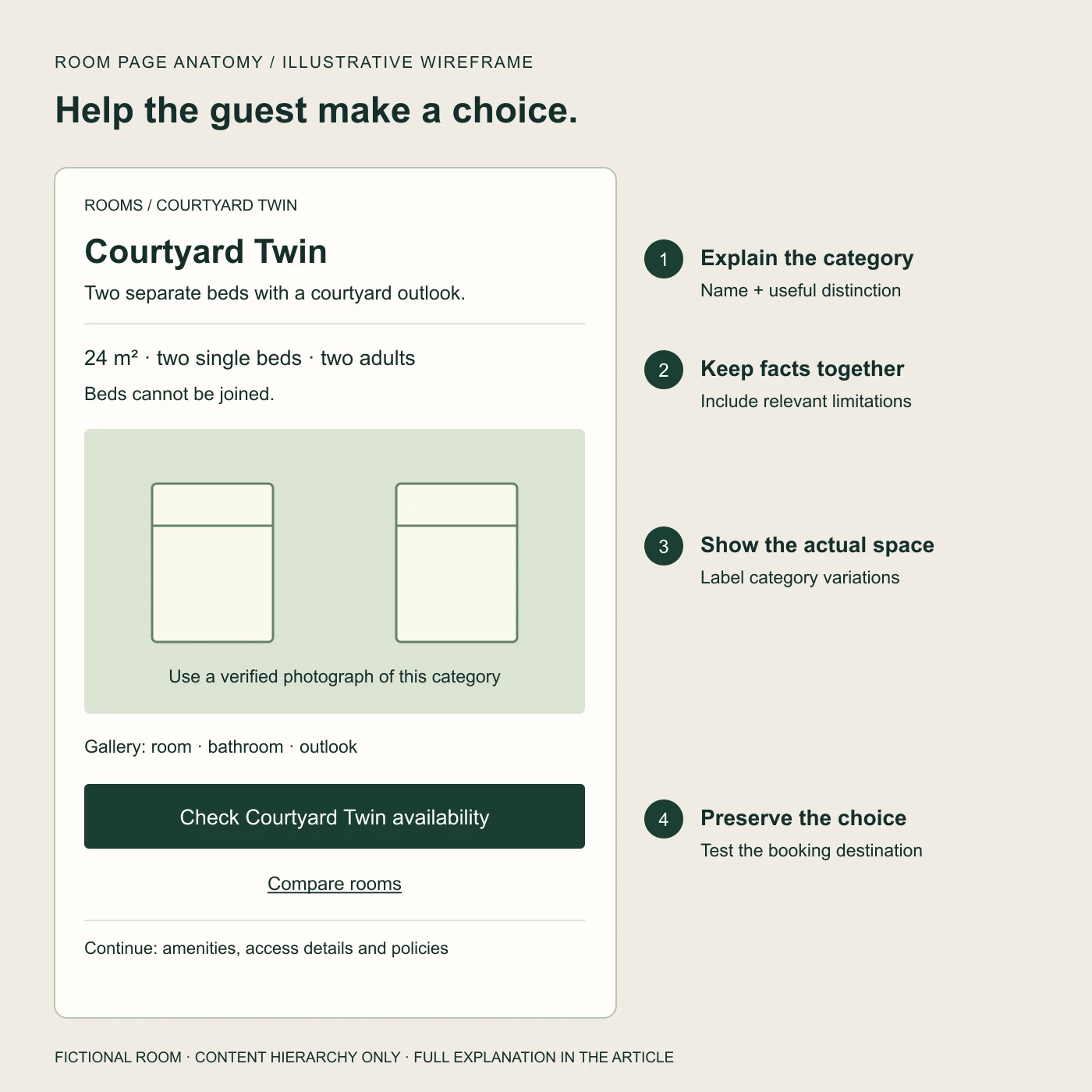
Original illustrative layout. The numbered points below explain the same structure in text; the image contains no additional room facts.
- Name and useful distinction. “Courtyard Twin” is followed by “Two separate beds with a courtyard outlook.” A branded room name can stay, but it should have a plain-language explanation.
- Facts at the decision point. Display 24 m², two single beds and a maximum of two adults together. Add “Beds cannot be joined” where someone choosing between a double and a twin will see it.
- Evidence of the actual category. Show both beds, the space around them and the outlook. A bathroom photograph and an accurate floor plan can answer questions that a tightly cropped bedroom shot leaves open.
- A specific next step. “Check Courtyard Twin availability” explains what the button will do. “Compare rooms” provides a route back to the other options without requiring the guest to reconstruct their search.
The complete page also needs relevant amenities, access information and policies. Describe specific access features the property has verified; a general “accessible” badge does not explain a doorway, bathroom or route to the room. Provide a clear contact route for needs the published details cannot answer.
Let the content determine whether a category deserves its own page. Distinct inventory, photographs and booking behavior usually give that page a useful purpose. If several categories have almost nothing to distinguish them, solve the information problem before generating nearly identical pages for search.
Photograph the room a guest can actually book
Assign photographs to a verified room category and label meaningful variations. The gallery should help someone understand the available space, not imply that every room has the best view in the building.
For the illustrative Courtyard Twin, the shot list would include both beds in one frame, circulation space, the bathroom and the courtyard outlook. A detail of locally made ceramics might add character, but it would not replace the view that proves there are two separate beds.
For the Family Suite, photograph the sofa bed both closed and prepared, and show how the living room connects to the bedroom. If the open bed reduces usable floor space, the photograph should make that clear. An accurate floor plan can help explain doors and separation; label it as representative if the category has variations.
Keep an image register with the category, actual room photographed, photographer or rights holder, usage permission and any qualification needed in the caption. A “representative image” label is not a substitute for checking that the pictured features are available in the category.
Use descriptive alternative text for informative images. Keep important booking facts in ordinary page text too, so guests do not have to interpret a photograph or open every gallery slide to find them.
Make room comparison work on a phone
Use a small, consistent set of decision fields across room cards. On a narrow screen, I would start with stacked cards showing beds, occupancy, size, layout and outlook in the same order, followed by the main limitation and each room's availability action.
For our example, the comparison should make two decisions straightforward: two adults who need separate beds can identify the Courtyard Twin, while a family can inspect the Suite's child-age and sofa-bed conditions. Guests should not have to open three galleries to discover either fact.
Do not shrink a desktop comparison table until its text becomes unreadable. If a table is the clearest solution, preserve readable text and make any horizontal scrolling apparent and keyboard-operable. Keep room names associated with their facts. W3C's accessible tables guidance explains how header and data-cell relationships preserve context for assistive technology; a visually aligned grid alone does not establish those relationships.
Booking controls need equal care. Give date and guest fields clear labels, retain their entered values when an error occurs and explain what needs correcting. W3C's form-label guidance describes associating labels with their controls. A calendar icon on its own does not tell the guest whether a field means arrival or departure.
Before approving the design, ask someone unfamiliar with the inventory to choose a room for two adults who want separate beds. Then ask them to find an option for two adults and two children, aged six and nine. Observe where they hesitate, what they misread and whether the page actually answers their questions. This is a proposed usability exercise, not a claim that we have tested this fictional property.
Carry the choice into the booking engine
The room page and booking engine should agree on the selected category and any dates or guest details already entered. Check what your provider and installed configuration support before promising that behavior in the design.
For example, Mews documents booking-engine deeplinks for room selection, arrival and departure dates, adult and child counts, language and currency. Its route parameters have dependencies, including differences between single-property and multi-property modes. Those documented capabilities are a starting point for integration work, not proof that a particular hotel's links work correctly. The documentation was checked on November 10, 2026.
Write the expected handoff in plain language before implementing it:
A guest chooses Courtyard Twin, two adults, arriving November 20 and departing November 22, 2026. The booking engine opens for that room and stay. If the room is unavailable, it explains that result and offers a clear way to change dates or inspect alternatives.
These are test inputs for the fictional example, not an availability claim. On a real integration, use suitable test dates and the provider's approved test environment or process.
| Test | Expected result | Evidence to keep |
|---|---|---|
| Room-led entry | Selected category, dates and guest count agree with the originating page | Before-and-after screenshots with the inputs recorded |
| No availability | No silent switch to another room; alternatives or date changes are clearly explained | Unavailable result and the next step |
| Change guest count | Eligibility is recalculated; an unsuitable room is explained | Result for the revised party |
| Return to compare | Previously entered choices are retained, or the need to re-enter them is clear | Back-navigation behavior on a phone |
Map the public category name to the booking system's actual identifier. A later inventory rename or remapping needs a fresh link check. Give someone responsibility for that maintenance; otherwise a working launch can quietly become a confusing booking path.
If the engine cannot preselect a room, make the button and destination honest about the extra step. Do not promise “Book this room” when the next screen resets the guest to the full inventory without explanation.
Separate the room from the rate
Room facts describe the space. Rate facts describe the offer for a particular stay. Keep that distinction visible so a guest does not mistake an optional package for a guaranteed room feature.
In our example, the Family Suite always includes a separate living room. Breakfast might belong to one rate plan, while cancellation terms could differ between two offers for the same room. Put those conditions beside the applicable offer and keep the room description stable.
If you show a “from” price, establish the dates, occupancy, inclusions and update mechanism behind it. A manually typed price needs an owner and a review process. Where you cannot keep a useful price accurate, a clear availability action is preferable to an unexplained number. Our guide to why an OTA can look cheaper than the hotel's website examines the comparisons guests may be making.
Before launch, have the property team check room names, occupancy, photographs, mandatory setup requests and any displayed price conditions against the booking system. Design review cannot establish those operational facts on its own.
Turn the page into a brief your team can build
Use the editable room-page checklist to record each category's facts, photo coverage, booking mapping and acceptance checks. Assign an owner and evidence to every unresolved item. The useful output is a page the property team can verify and a journey the developer can demonstrate.
This is where SUUR can help with hotel website design and development: structure the room content, develop a visual direction around the property's identity, design the comparison experience and implement the supported booking handoff. The scope should include mobile behavior, unavailable states and the maintenance rules for room data.
A useful starting brief is your current room list, booking-engine name, available photographs and the questions reservations keeps answering. From that, we can work out what the page needs to explain before deciding how it should look.
Have a product idea?
Designed, built, and shipped in about 5 days.