iOS · App Store · design + build
Run the
numbers.
A race-pace calculator that treats runner's math like typography.
Product strategy, UX/UI design, and full SwiftUI development, shipped from zero to the App Store by SUUR.
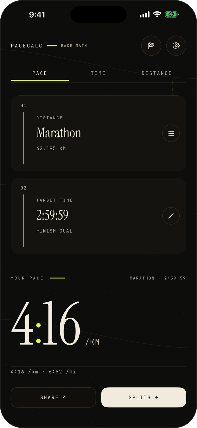
Every pace calculator looks like a spreadsheet. PaceCalc sets a marathon goal like a broadsheet front page , and answers on every keystroke.
3
Modes: pace, time, distance
24
Built-in race distances
3
Share-card layouts
5.6 MB
Free. No ads. No accounts.
The idea
The colon is the brand.
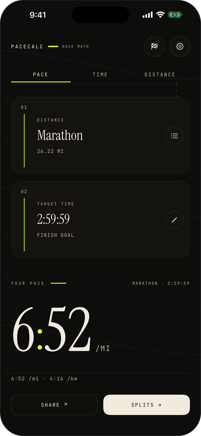
The answer lands as an enormous serif numeral, and in every pace and time on screen, the colon is tinted: hi-vis on ink, clay on paper. One rule, applied everywhere, is a brand. Pick two of pace, time, and distance; the third recomputes on every keystroke, in both unit systems at once.
Under it, split strategies: even, negative, positive, or custom: turn a finish-line wish into a per-kilometer plan.
The experience
From finish-line wish to race-day plan.
01
Save the race. Watch it approach.
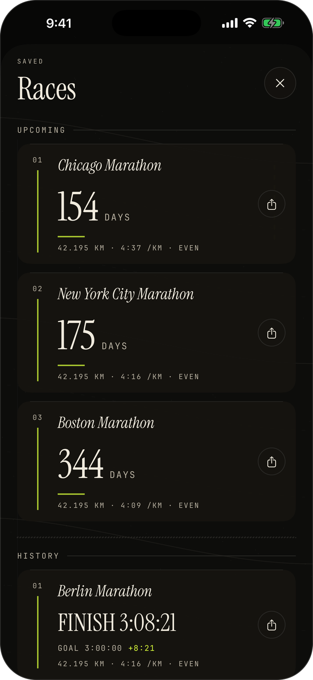
A plan becomes a saved race with a countdown in days: Chicago in 154, New York in 175. After the gun, a post-race check-in closes the loop: Berlin, goal 3:00:00, finish 3:08:21, the +8:21 in hi-vis so it stings just enough.
02
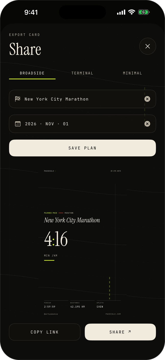
A goal card worth posting.
Broadside is the poster layout: race name in serif italic, the pace enormous, finish, distance, and strategy set like footnotes. It renders as an image built for the group chat and the story post. The app's growth loop is a screenshot.
03
Or a pace receipt.
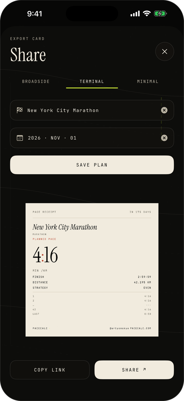
Terminal prints the plan like a till receipt on cream paper: PACE RECEIPT, the race, the pace, then every split ticked down the page to the 0:50 tail of a marathon. Runner's math, itemized.
04
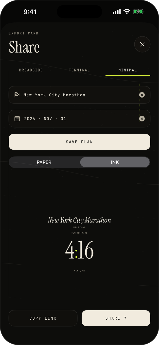
Paper or ink.
The whole app lives in two materials: paper, warm cream with a clay accent, and ink, near-black with hi-vis. Minimal strips the card to type alone, and the toggle sits right in the share sheet.
Beyond the app
Race day counts down on the Lock Screen.
A WidgetKit lock-screen widget keeps the next race and its days-to-go one glance away, and App Intents put all three calculations in Siri and Shortcuts. Every card also carries a link that opens the same plan on pacecalc.com, the app and the web platform speak one URL.
Built with intention
100% native SwiftUI. All math in one pure, verified module.
The result
Live on the App Store. 5.6 megabytes, zero asks.
Free, offline-capable, no ads, no accounts, no sign-up: the whole product is smaller than one photo. It pairs with the PaceCalc web platform, also designed and built by SUUR: strategy, UX/UI, and every line of Swift shipped end to end.
“Most utilities get used and deleted. A utility with taste gets kept, and shared.”
Have a product that needs this kind of craft?
SUUR designs and ships native mobile products end to end, strategy, UX/UI, and the code.