Case study · Branding · Identity & website
Jane.LA
Los Angeles.
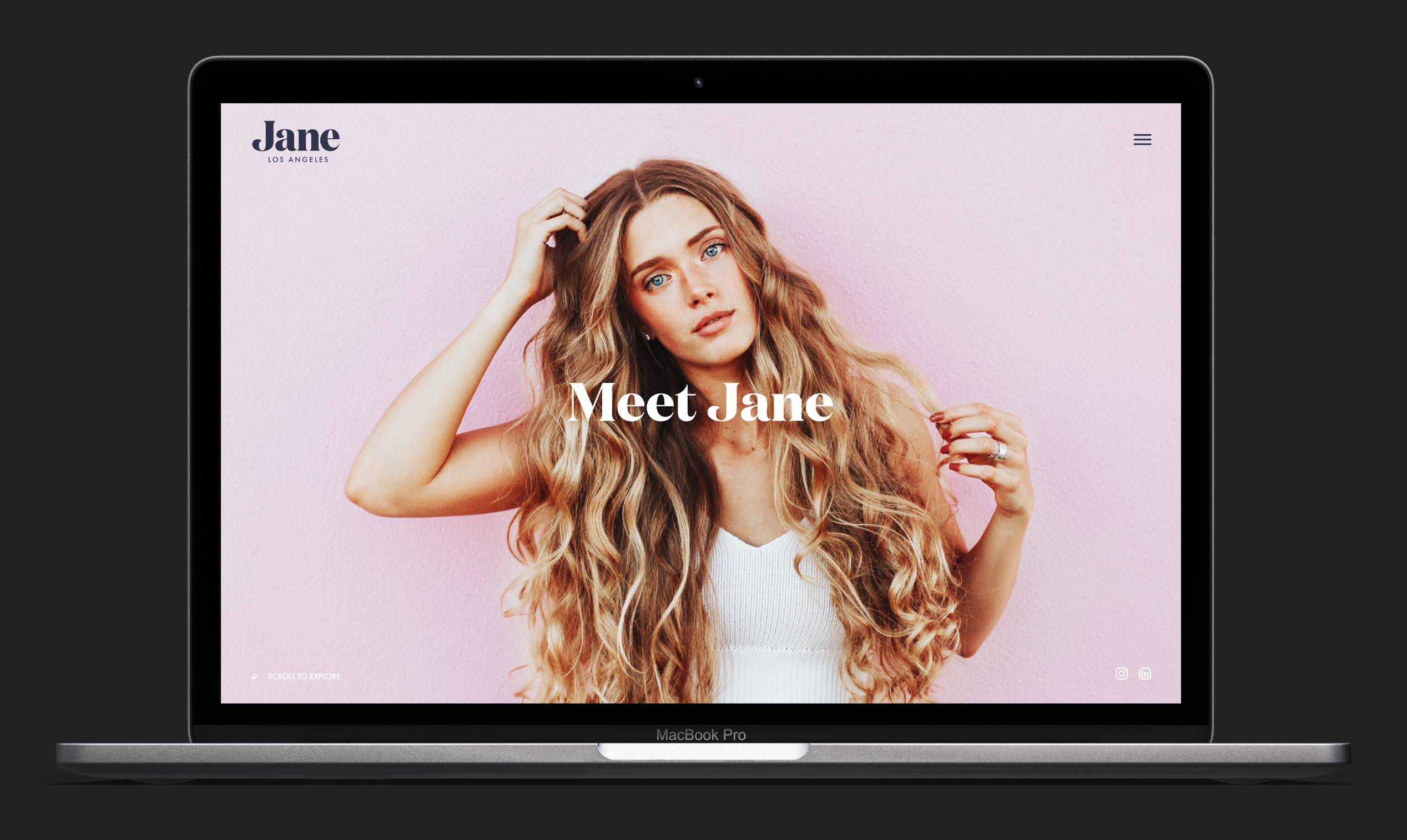
We didn't build an agency brand. We built a person, born on the sunny shores of LA, a connector and a creator, and very good at her job.
The brand in motion: Jane, in her own light
1
Archetype. The agency built as a person named Jane
4
Operating values: Be Bold, Smart, Happy, Jane
$50–100M
Revenue band of the brands Jane serves
3
Flagship clients: T3, Proactiv, Hidden Garden
2022
Brand, brand book, and website shipped
Most agencies brand themselves as a logo on a deck. We gave this one a person instead, impossible to commoditize because you can't copy a personality , then designed the identity and the site around her.
01 · The move
Don't build an agency brand.
Build a person.
Working with the founders, we landed on a single move: Jane. Born and raised in Los Angeles, a go-getter and a connector, “the positive vibration on the path to growth.” The agency isn't a logo on a deck. It's Jane showing up in the room. Energetic, efficient, genuine, unconquerable.
All of it under four operating values that became the brand's whole personality: Be Bold. Be Smart. Be Happy. Be Jane.
02 · The identity
A serif with personality,
navy and dusty pink.
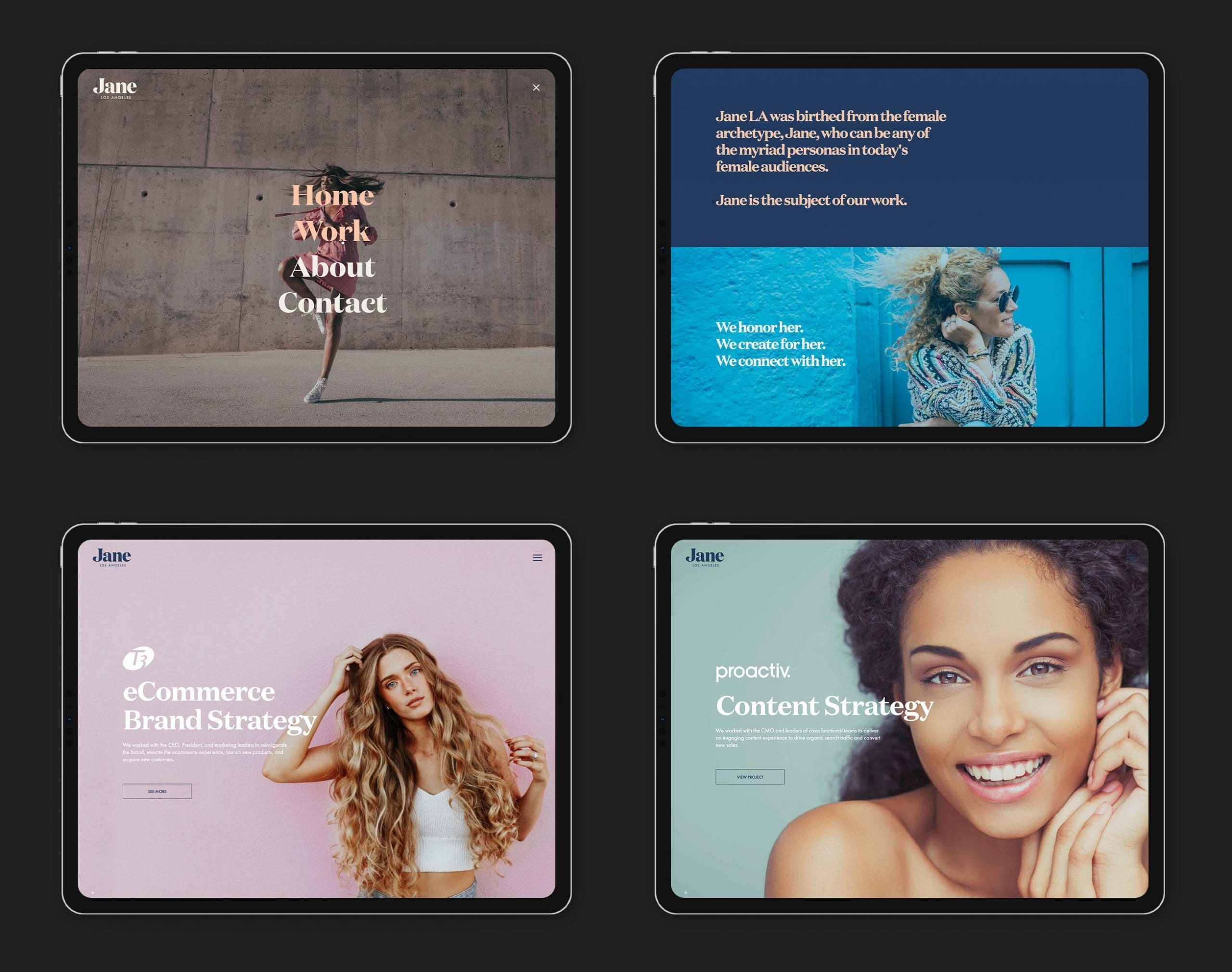
A serif wordmark with warmth, a J|LA symbol that holds at favicon scale, and a palette warm enough to be welcoming but restrained enough to read senior. Photography leaned into the LA fingerprint, palm trees, sunset light, women at work, without sliding into stock. All of it codified in a brand book: logomarks, clearspace, color hierarchy, typography, imagery.
03 · The website
A site where Jane
introduces herself first.
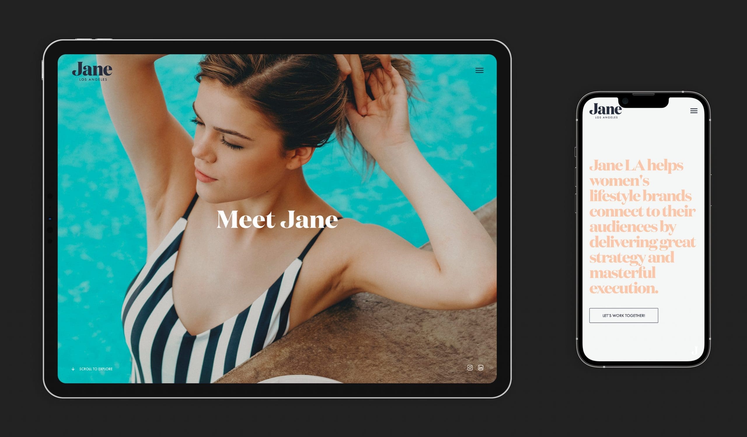
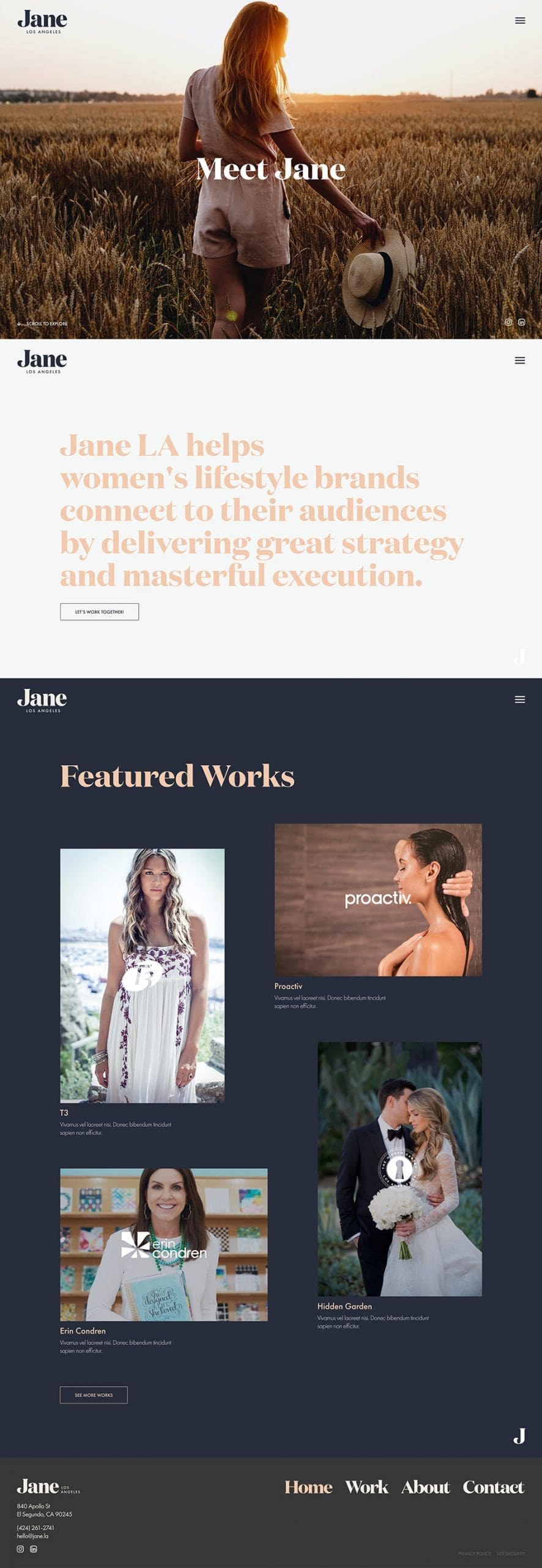
Mobile-first and responsive, the site lets Jane say hello before the client logos do, a tone of voice that's casual, confident, and never corporate. It sells what the brand actually is: an agency that thinks of itself as a person who's good at her job and likes the work. Hover to scroll it.
hover to scroll
The homepage: Jane first, logos second
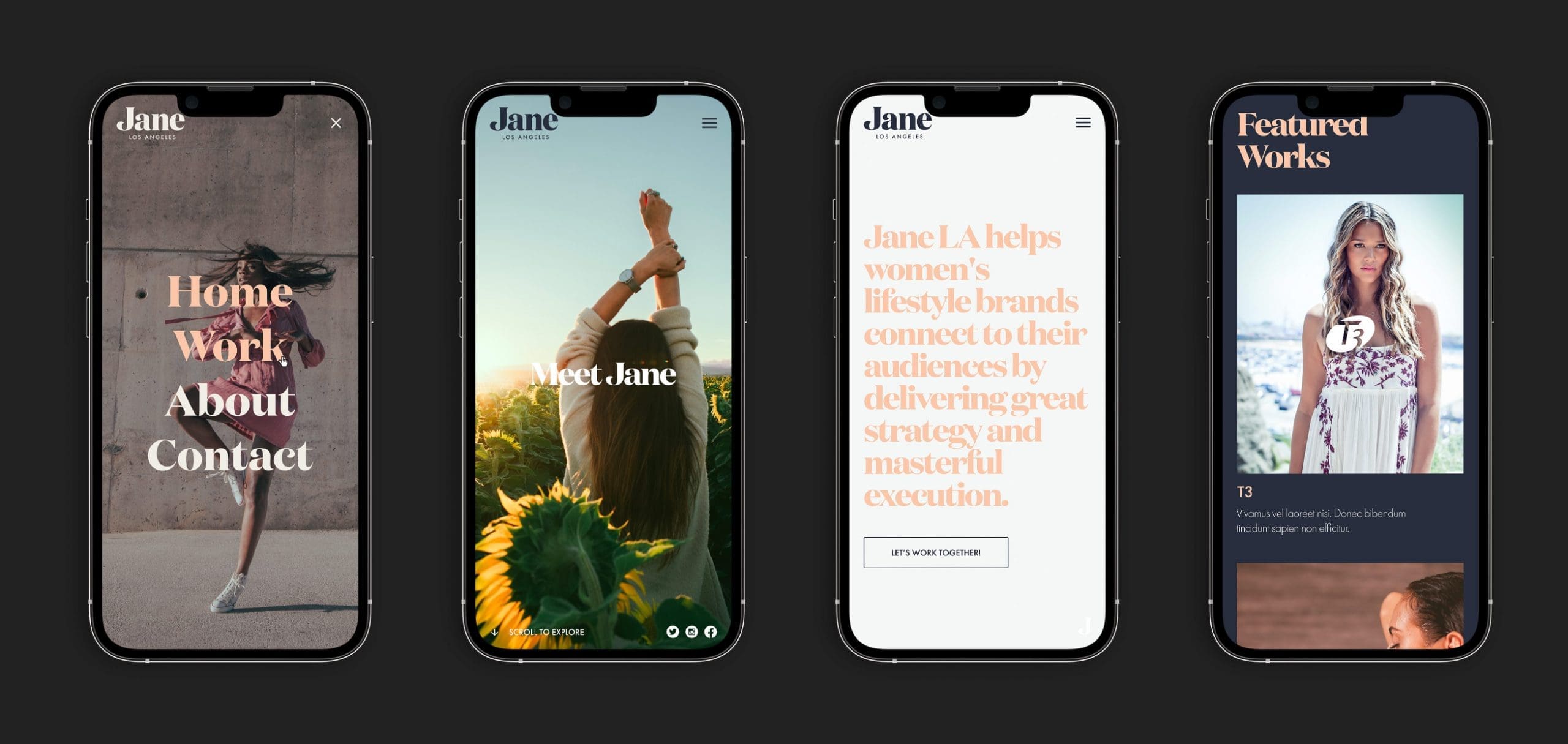
Built mobile-first, from phone to projector
04 · Who Jane works for
Women's lifestyle brands
with growth on the line.
$50M–$100M consumer brands with a CMO who's been around and needs a partner who executes as hard as they do. T3, Proactiv, and Hidden Garden all sit in the identity as Jane's work.
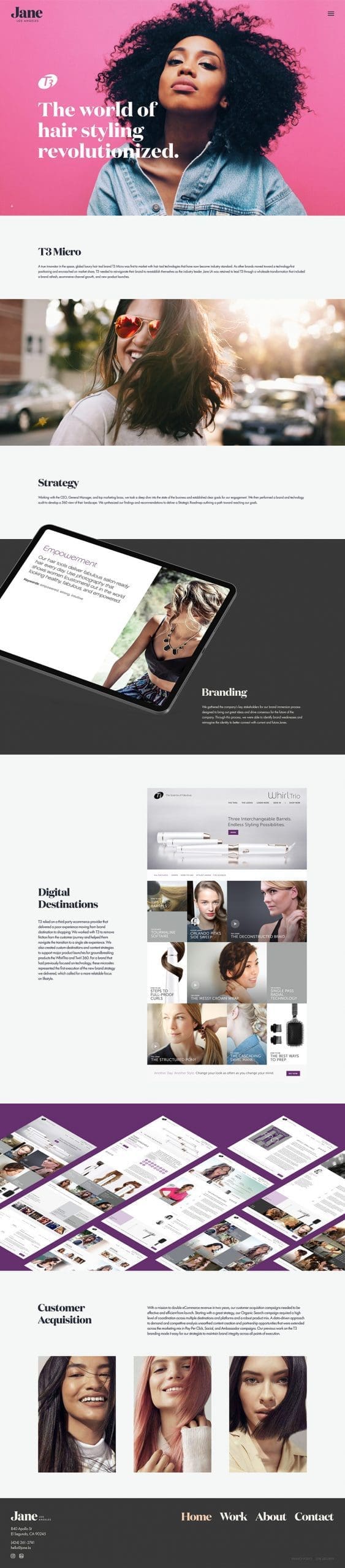
hover to scroll
T3
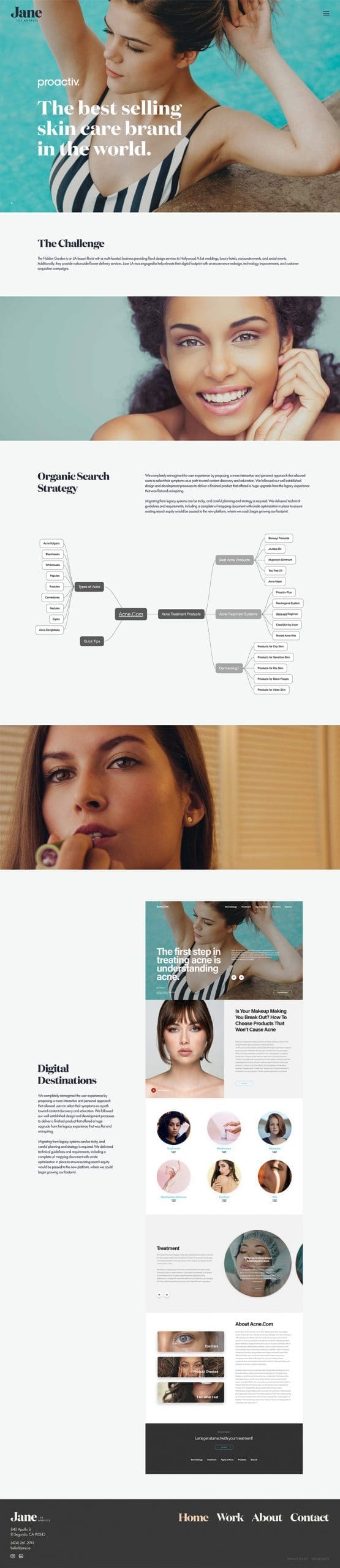
hover to scroll
Proactiv
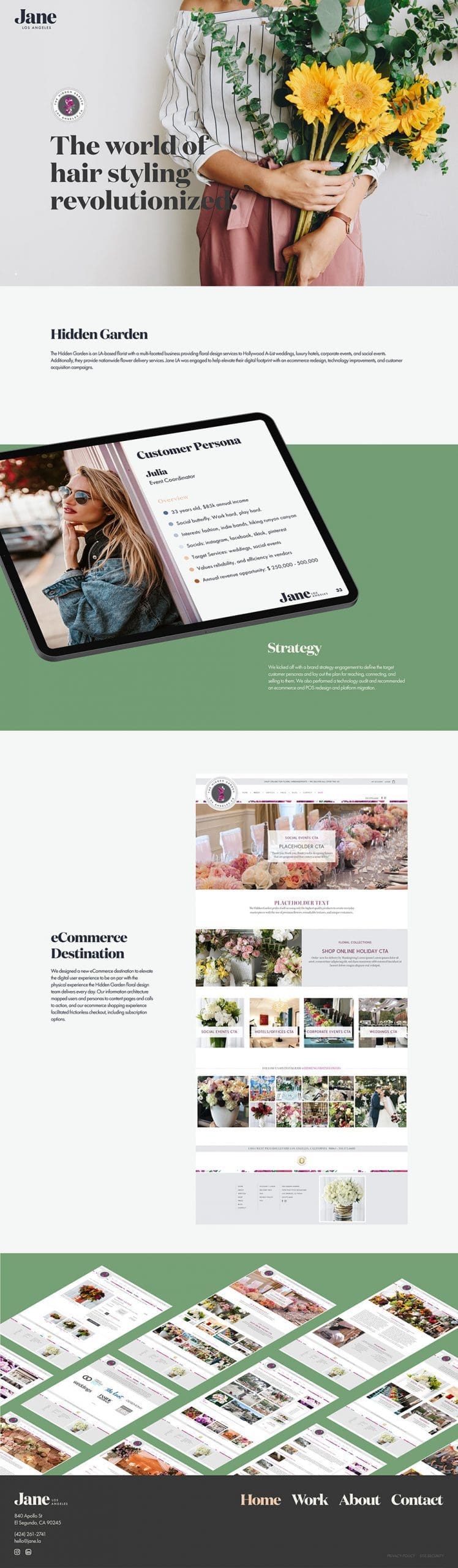
hover to scroll
Hidden Garden
The result
A brand that walks
into the room.
Jane LA got an identity system and a site that behave like the person the agency wanted to be: bold, smart, happy, and unmistakably itself in a category that fights hard to commoditize everyone in it.
“We push the envelope. We move the needle. We do it with a smile. We do it for Jane.”
Need a brand people remember?
SUUR builds brand identities and the sites that carry them, strategy, design, and the build.