Launch website · September 2026 · design + build + publish
Four pages.
Nothing untrue.
The launch site for an iOS app, built to get a stranger to the App Store with an accurate picture of what they will find.
Design, build, deployment, analytics and QA for inflight.suur.io, the website for the InFlight app. Live 21 September 2026.
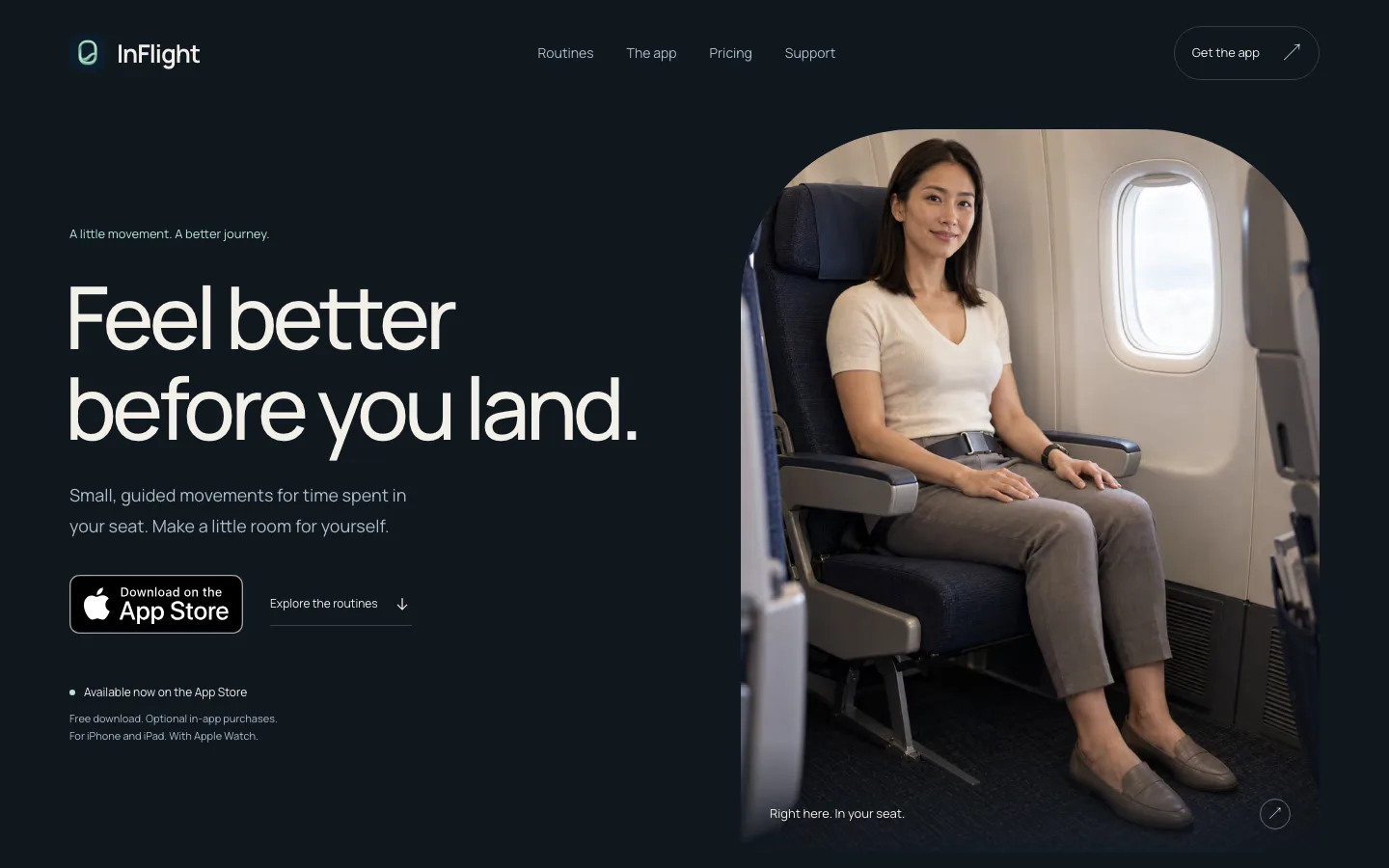
An app launch site has one job. Send the right person to the App Store, expecting exactly what they will get. Everything here served that or was cut.
98
Lighthouse performance, mobile, live
100
Accessibility, best practices, SEO
186 KiB
Total weight of the home page
16
Page and viewport checks passed
Lighthouse 13 mobile run against the live site on 12 September 2026; browser QA at 320, 390, 768 and 1440 pixels across all four pages on 21 September 2026. Lab numbers, not field data.
The idea
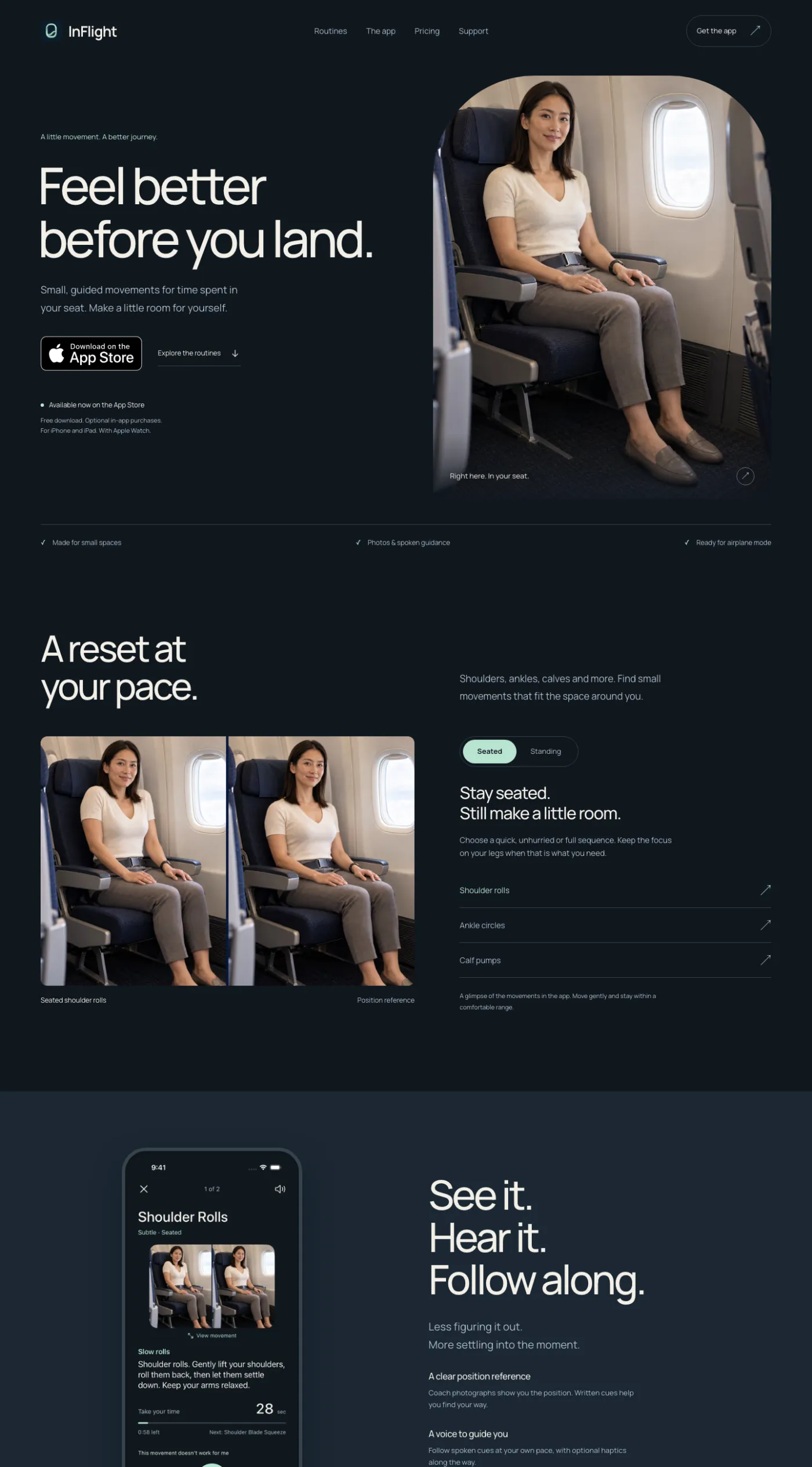
Lead with the seat, not the phone.
The distinctive moment of the product is a passenger making a little room in a real economy seat, so the hero is a tall photograph of exactly that, with a generous left-aligned headline beside it. The phone appears once, later, as one restrained screenshot. The person is never covered by a collage.
The palette is the app's own, read from its colour file: cabin navy, warm white, slate, soft mint for controls, one warm accent. Manrope, self-hosted, medium weight, reading columns under seventy characters. One entrance animation, respecting reduced motion. No parallax, no flight map, no glass.
The pages
Editorial flow, one truth rule per section.
01
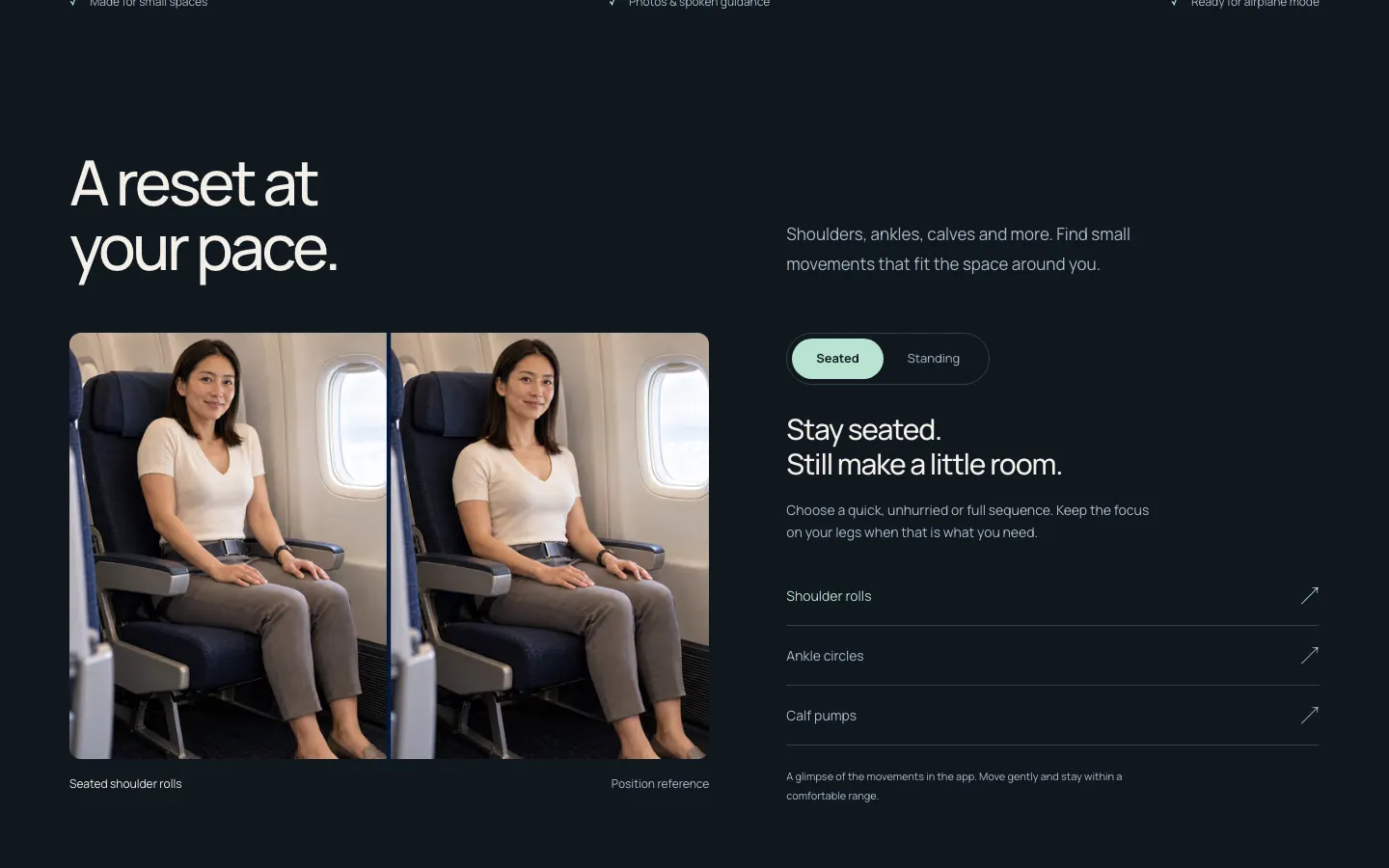
A preview, not a fake workout
The routines section has a Seated or Standing switch that changes the photograph and the copy, and lists a handful of real movements from the app. It is labelled as a glimpse, because that is what it is. Nothing on the site pretends to run a routine in the browser, and the photographs are never called videos.
02
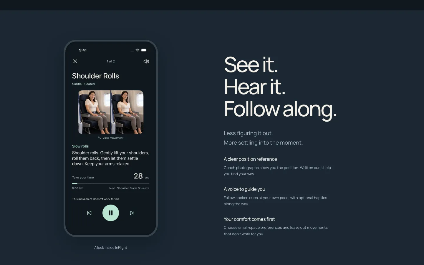
The real player, not a render
One actual screenshot of the routine player, framed plainly, next to three sentences about what it does: a position reference, a written cue, a voice. The brief asked for the product to be established with a single restrained capture rather than a collage that hides the person, and it holds.
03
Pricing as configured, nothing implied
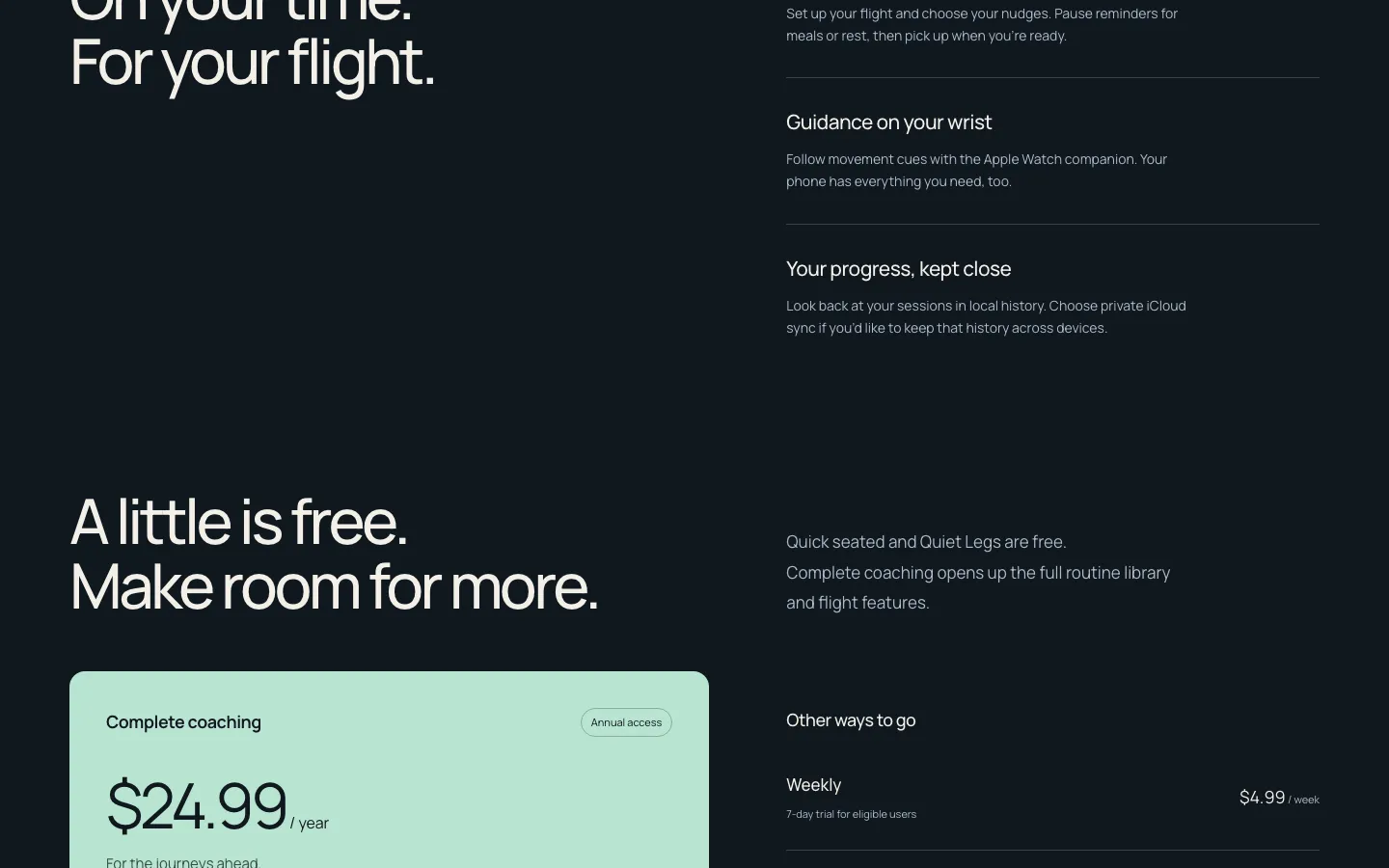
Annual is featured because it is the plan the app features. Weekly, monthly and permanent access sit beside it at the prices set on the US storefront. The free routines are named. No plan is shown with a trial it does not have, no savings claim compares different periods, and a small line says to confirm current pricing in the App Store.
04
Support that answers the nine real questions
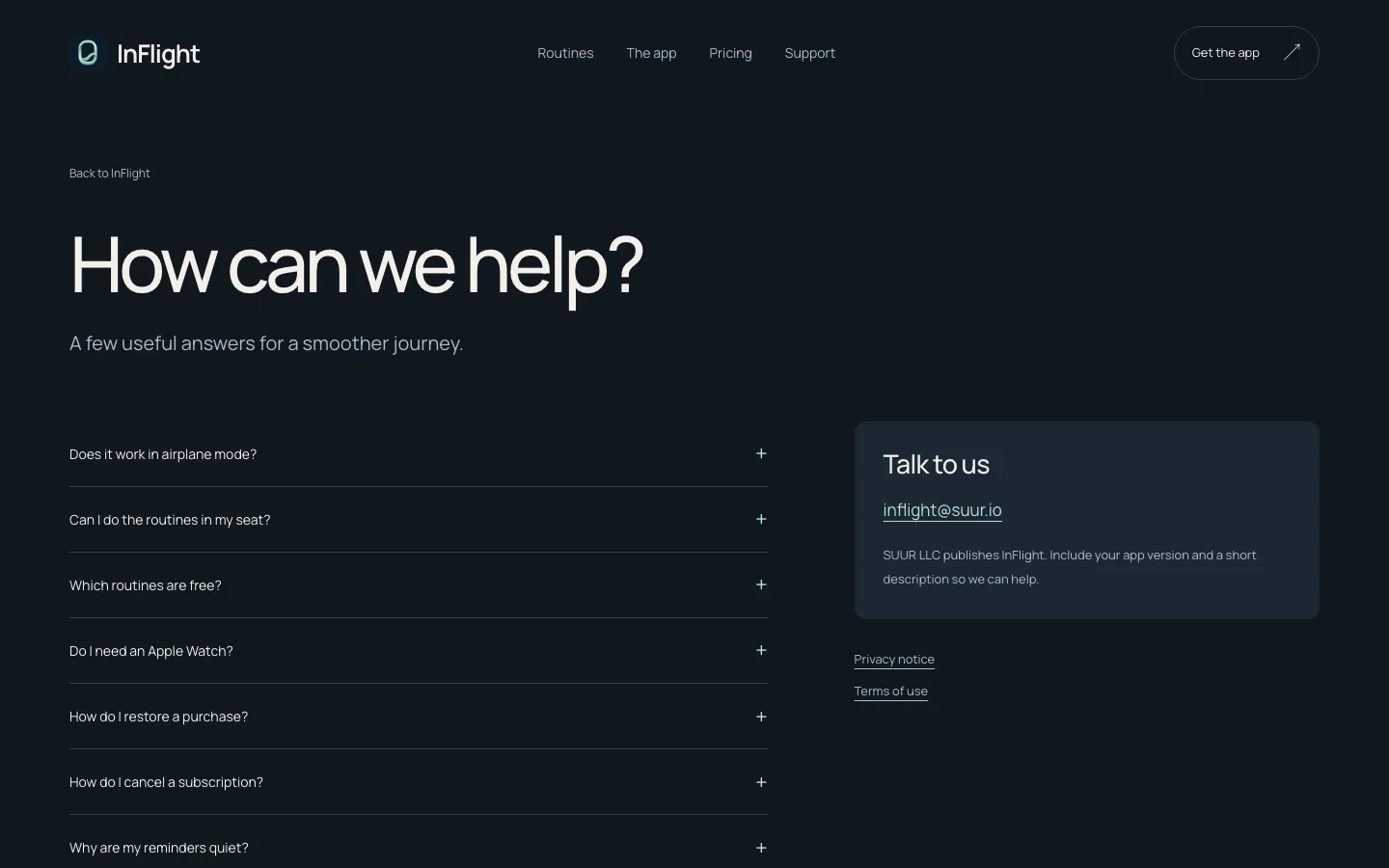
Does it work in airplane mode, how do I restore a purchase, how do I cancel, why are reminders quiet, how do I delete my data, is this medical advice. Each answer was written from the app's actual behaviour, with a monitored address and the publisher named. Privacy and terms are readable documents, not boilerplate.
The rules
Built to be checked.
- The badge waited for Apple. Until Apple's own lookup returned the public release, the site said “coming soon” with a working “Explore the routines” link. The Download on the App Store badge went live the same day the app did, 21 September 2026.
- No waitlist, no form, no backend. There was no delivery mechanism behind one, so there is no form. Purchase intent goes to the app, where the purchase actually happens.
- Structured data without invention. The home page describes a MobileApplication with its verified publisher. No aggregate rating, no review count, no promised rich result.
- Static photos are called photos. The app has 17 coach references and 19 spoken cues; the site says so and does not round them up to videos or dozens of workouts.
- Health claims, none. General movement guidance, move gently, stop if uncomfortable, follow the crew. No circulation or risk-prevention copy anywhere on the site.

Built with intention
Plain HTML, two scripts, no framework.
A Node build script writes four pages of static HTML, the CSS, a small posture-preview script and the sitemap; nothing runs at request time. The home page is 14 KB of HTML. Cloudflare serves it as static assets on its own Worker with a real 404, a four-page sitemap, and a guard that keeps any preview without a confirmed publisher out of the index.
The result
Brief to live site, with the app, in-house.
Designed from the app's own handoff, built, deployed, verified at four widths and instrumented on an isolated analytics property, then published the day the app cleared the store. The app itself is at InFlight. A site like this is the shape of the Landing Page Sprint, at a fixed price.
“Coming soon on the App Store,” with a link that worked, beat a download button that did not. Ten days later the badge went up.
Launching something that deserves a page like this?
A launch page designed and built in days, on a published flat price, that only says what is true.