Evolved into the final
Stack Two pills, one B
The first one that felt like a product instead of a signature. Too generic to ship as drawn, but it carried the idea that stayed: build the letter from parts. The final mark is this direction, rebuilt.
Brand identity Restaurant supply platform
An identity for Biteful, the platform where restaurants, cafes, and bars order from every supplier in one place, built around one logomark. Six directions sketched, five retired, one built to survive a favicon and a shop sign.
The brief: a person, not a procurement tool
Restaurants were ordering from five supplier catalogs, a phone, and a spreadsheet. Biteful puts every order in one place. The category looks like enterprise procurement software. The brand had to look like the most useful person in the kitchen.
Pencil first: two tests, 16 pixels and across the street
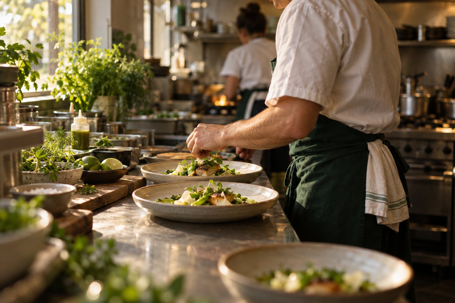
Pages of it. Loops, knots, stacked pills, stripes, folds. Pencil first, fineliner second, no screen until a shape earned it. Two rules the whole way: the letter had to read at 16 pixels, and it had to read from across the street.
Most of the pages failed one of the two tests. That was the point of the pages.
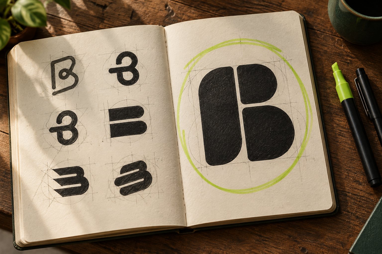
Six logo directions, one kept
Two tests before taste: does it read at 16 pixels, and does it read from across the street.
The first one that felt like a product instead of a signature. Too generic to ship as drawn, but it carried the idea that stayed: build the letter from parts. The final mark is this direction, rebuilt.
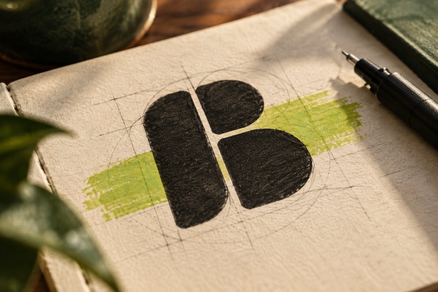
A lowercase b built from three shapes. It came out of the Stack direction, once the pills stopped pretending to be a capital.
See how it is builtTwo wordmarks retired on the way
Three shapes, ten-unit gaps, a 190 by 199 canvas
Three rounded shapes on a 190 by 199 canvas. The gap between them is the same ten units everywhere, so the mark reads as one letter from across the street and as three friendly shapes up close.
The horizontal cut through the bowl is the bite. It is also the reason the mark survives at favicon size: a solid b at 16 pixels is a blob. This one keeps its counter.
The wordmark is lowercase, so the mark is. A lowercase b also keeps its counter at small sizes, where a capital’s two bowls close up.
Restaurant, supplier, platform. Three parties, one order. The brand book says it in one line; the mark says it without one.
A custom lowercase logotype, three lockups
The wordmark is drawn from Termina Bold, lowercase, tracked in until the letters almost touch, then redrawn so the bowls of the b and the e answer the mark. The mark and the word share one voice: rounded, geometric, sitting on the same baseline.
Two colors carry the brand, eight support it
Biteful Green on Forest Green is the whole identity at a glance. Eight supporting colors exist for categories, charts, and campaign tiles. None of them is allowed near the logo. Click any swatch to copy it.
Termina for headlines, Poppins for reading
Termina carries headlines, numbers, and the wordmark: wide, geometric, nine weights, no italics, and it does not need them. Poppins carries everything a person has to read twice: order lines, supplier notes, the fine print on an invoice.
Delegate like a boss.
Delegate like a boss. Order from every supplier in one place, hand the cart to the sous chef, and get the whole week’s deliveries confirmed before the first table sits down.
Sign, label, cards, social, website: one mark
The same three shapes at every size the business touches: the sign by the door, the label on the crate, the card in the pocket, the avatar in the feed, and the website that raised the round.
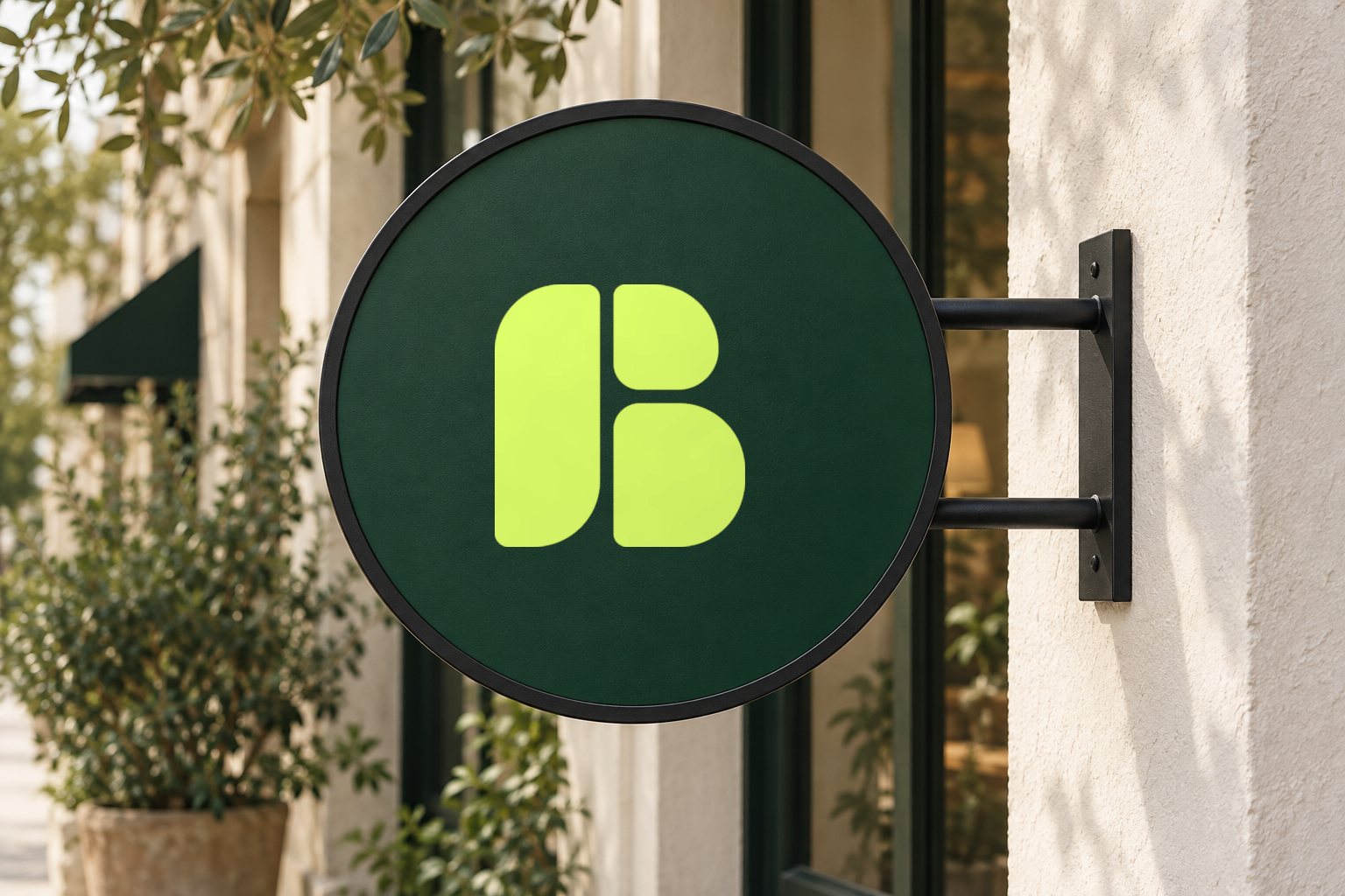
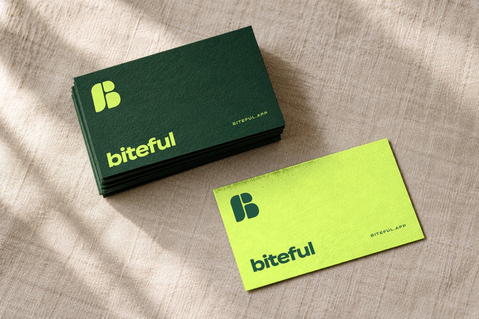
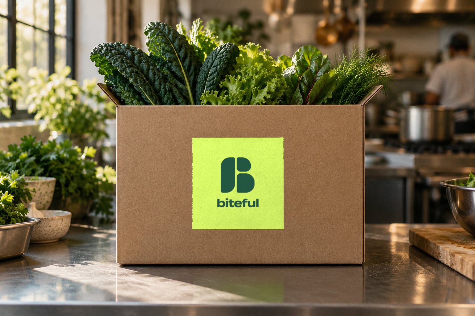
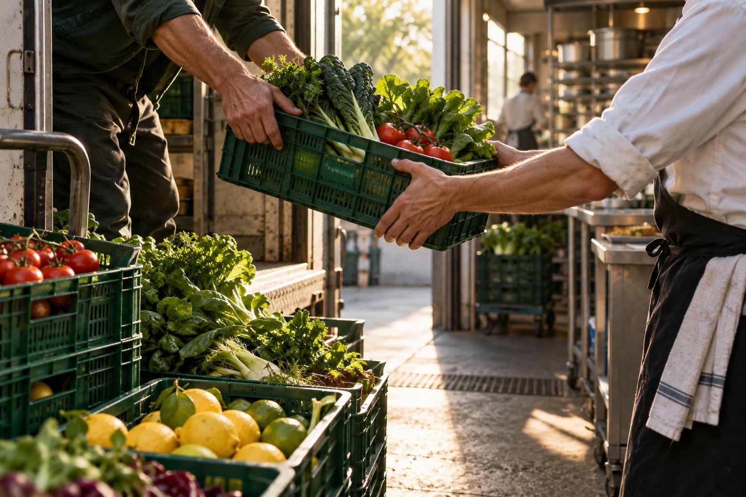
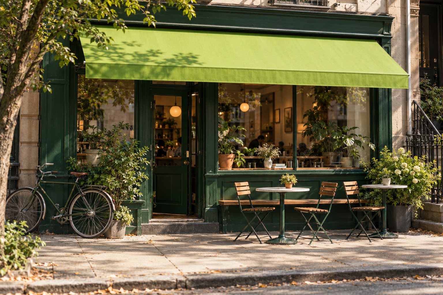
Mockups and concept photography were produced for this study. The marks, lockups, colors, and type are the shipped brand.
Fourteen pages, one brand book
Everything above, written down: the story, three lockups and their clearspace, the palette with print values, both typefaces, the image direction, and the social system. Open any page to read it.
Want a mark that survives a favicon and a shop sign?