SaaS Websites
The Best SaaS Website Designs in 2026
A teardown of 14 of the best SaaS website designs in 2026: Linear, Stripe, Attio, PostHog, Vercel and more. Not a mood board: for each site, the specific hero, pricing, typography, and social-proof decisions worth stealing for your own product.
| Vendor | Pricing | Turnaround | Best for |
|---|---|---|---|
| Stripe | — | — | Steal the category-defining headline and the bento product grid |
| Mercury | — | — | Steal the email-capture hero and founder-portrait testimonials |
| Supabase | — | — | Steal the six-word value proposition |
| Linear | — | — | Steal the numbered-chapter narrative and product-UI-as-hero |
| Attio | — | — | Steal the single testimonial placed above the logo wall |
| Retool | — | — | Steal logos with receipts: every case study carries a dollar figure |
| Loom | — | — | Steal proof-by-demonstration. The product is the page |
| PostHog | — | — | Steal the pricing table on the homepage and the self-aware voice |
| Cal.com | — | — | Steal the friction-removal stack around the signup CTA |
| Ramp | — | — | Steal quantified social proof. Every claim ships with a metric |
| Clay | — | — | Steal the ownable illustration style in a screenshot-saturated market |
| Vercel | — | — | Steal the confidence to reposition the whole site around one bet |
| Resend | — | — | Steal code-as-hero and the agent-readable site layer |
| Railway | — | — | Steal usage numbers as social proof instead of a logo wall |
- Pricing
- —
- Turnaround
- —
- Best for
- Steal the category-defining headline and the bento product grid
- Pricing
- —
- Turnaround
- —
- Best for
- Steal the email-capture hero and founder-portrait testimonials
- Pricing
- —
- Turnaround
- —
- Best for
- Steal the six-word value proposition
- Pricing
- —
- Turnaround
- —
- Best for
- Steal the numbered-chapter narrative and product-UI-as-hero
- Pricing
- —
- Turnaround
- —
- Best for
- Steal the single testimonial placed above the logo wall
- Pricing
- —
- Turnaround
- —
- Best for
- Steal logos with receipts: every case study carries a dollar figure
- Pricing
- —
- Turnaround
- —
- Best for
- Steal proof-by-demonstration. The product is the page
- Pricing
- —
- Turnaround
- —
- Best for
- Steal the pricing table on the homepage and the self-aware voice
- Pricing
- —
- Turnaround
- —
- Best for
- Steal the friction-removal stack around the signup CTA
- Pricing
- —
- Turnaround
- —
- Best for
- Steal quantified social proof. Every claim ships with a metric
- Pricing
- —
- Turnaround
- —
- Best for
- Steal the ownable illustration style in a screenshot-saturated market
- Pricing
- —
- Turnaround
- —
- Best for
- Steal the confidence to reposition the whole site around one bet
- Pricing
- —
- Turnaround
- —
- Best for
- Steal code-as-hero and the agent-readable site layer
- Pricing
- —
- Turnaround
- —
- Best for
- Steal usage numbers as social proof instead of a logo wall
Most "best SaaS website" roundups are screenshot galleries with adjectives (clean, modern, stunning) and nothing you can actually use on Monday. This page is the opposite. We picked 14 SaaS sites that are live right now, verified each one in July 2026, and pulled out the specific, named design decisions that make them work: how the hero is structured, where the social proof sits, what the pricing page does differently, why the typography reads the way it does. Steal the decisions, not the pixels.
The sites are grouped by what they teach: positioning clarity, product-led storytelling, pricing and conversion mechanics, and the developer-tool aesthetic.
What great positioning looks like
The hardest part of a SaaS site isn't visual. It's saying what the product is in one sentence a stranger can repeat. These three do it best.
Stripe
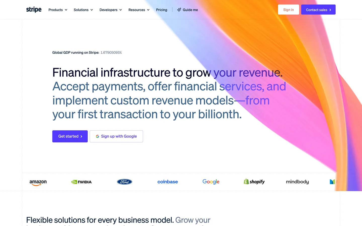
The reference point for SaaS web design for over a decade, and still earning it. Stripe's hero reads "Financial infrastructure to grow your revenue": a headline that defines a category rather than describing features, sitting over the famous animated gradient wave with two CTAs ("Get started" and "Sign up with Google").
Worth stealing: the logo carousel directly under the hero (Amazon, Shopify, Figma, Uber, Anthropic) so credibility lands before a single feature is explained; the bento-grid product section that makes a sprawling product line scannable as tiles instead of a wall of tabs; and the stat block used as a trust section, "135+ currencies, $1.9T processed, 99.999% uptime" does more than any testimonial could for infrastructure buyers.
What to steal: one category-defining sentence up top, and numbers, not adjectives, as the trust layer.
Mercury
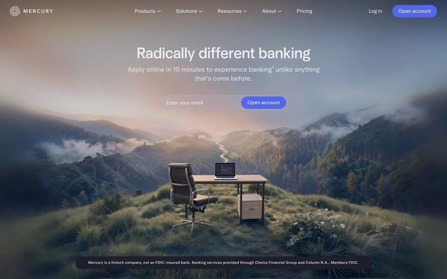
Banking for startups, and the clearest example of conversion-focused restraint on this list. The hero says "Radically different banking" over full-width imagery with an email-capture field placed directly in the hero, Mercury asks for the conversion immediately instead of routing you through a features tour.
Worth stealing: that hero-level capture form (appropriate because Mercury's buyer already knows what a bank account is, no education required); the social-proof section headed "Loved by 300K+ of the most ambitious entrepreneurs," which pairs founder portraits with named companies (Linear among them) so the quotes read as people, not logos; and the alternating image-left/image-right feature blocks that keep a long page calm instead of noisy.
What to steal: when your product needs no explanation, put the conversion in the hero and spend the rest of the page on trust.
Supabase
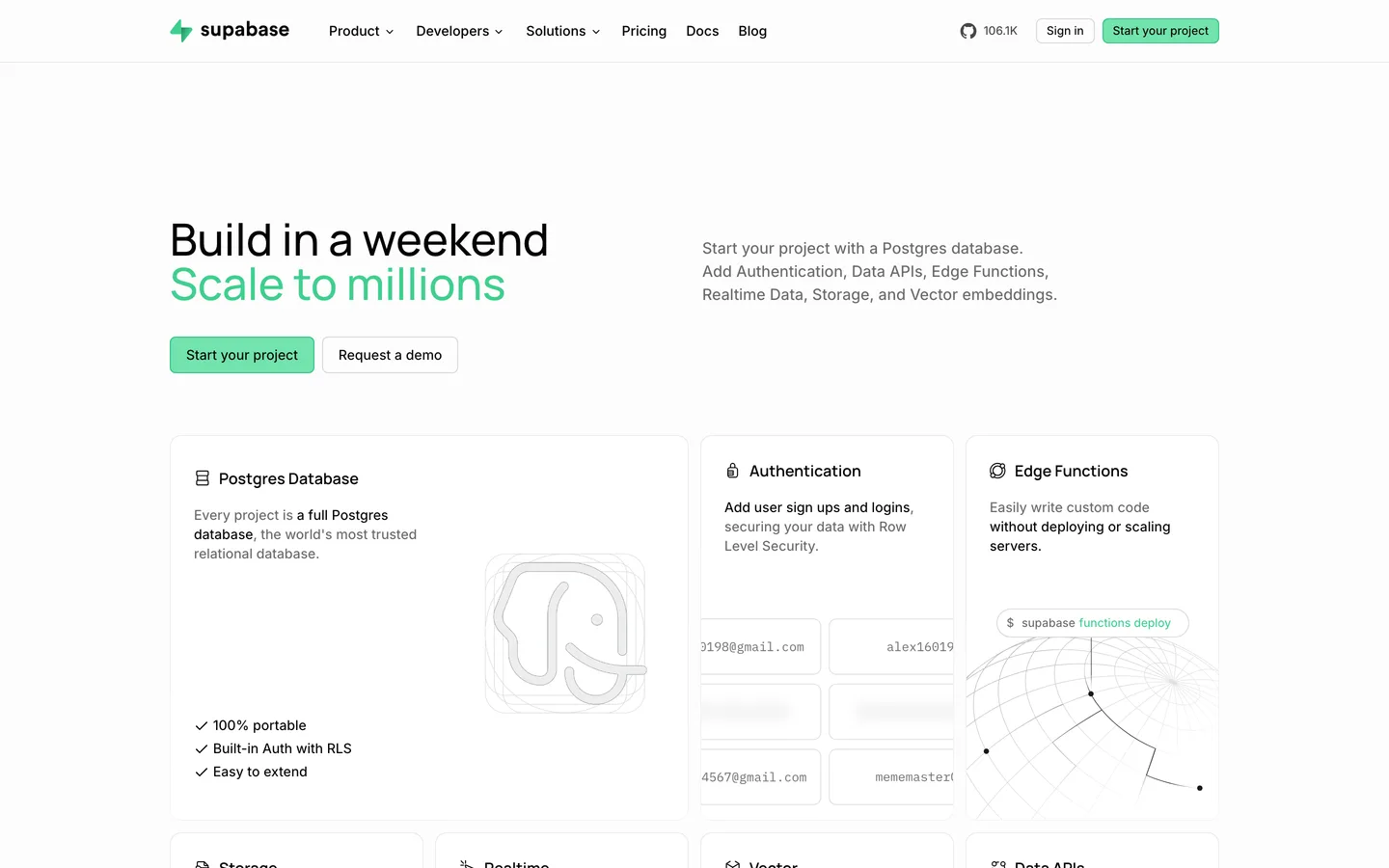
The open-source Firebase alternative, with the best six words in SaaS copywriting: "Build in a weekend. Scale to millions." That headline handles the two objections every developer has (is it fast to start, and will it hold up) before the page has scrolled a pixel.
Worth stealing: the objection-pair headline structure (speed and scale, ease and power, name the tension your buyer feels and resolve both halves); the product grid that presents six primitives (database, auth, storage, functions…) as a composable menu rather than a feature list, which is exactly how developers evaluate platforms; and the decision to lead with "open source" and "built on Postgres": borrowed trust from technologies the audience already believes in.
What to steal: write the headline as an answer to your buyer's two biggest doubts, in that order.
Product-led storytelling
These sites treat the product itself as the main character: real UI, real workflows, minimal abstraction.
Linear
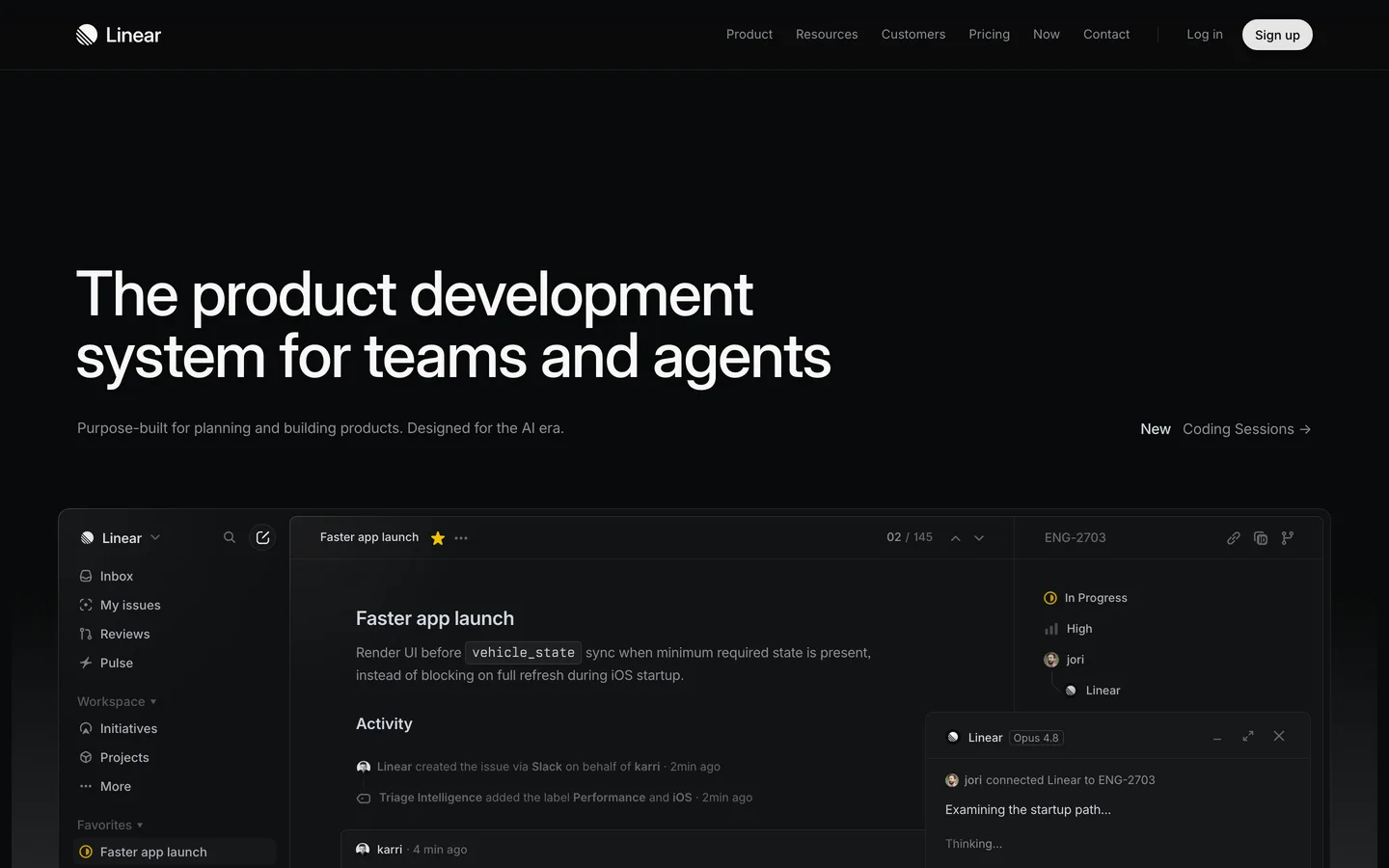
The issue tracker that became design north star for an entire generation of SaaS, and, notably, it keeps evolving instead of coasting. In 2026 the dark, high-contrast homepage leads with "The product development system for teams and agents" (the AI-era repositioning is deliberate) above stacked, real product screenshots.
Worth stealing: the numbered-chapter structure, sections labeled 1.0 Intake, 2.0 Plan, 3.0 Build walk the actual workflow like a spec document, turning a scroll into a narrative with a table of contents; product UI as the only imagery, no illustration anywhere, because for a tool this opinionated the interface is the brand; and testimonials sourced from peak-credibility peers (OpenAI, Ramp, Opendoor) alongside a hard number, "33,000+ product teams."
What to steal: structure the page as a numbered walkthrough of your user's workflow, and let real UI carry the visual load.
Attio
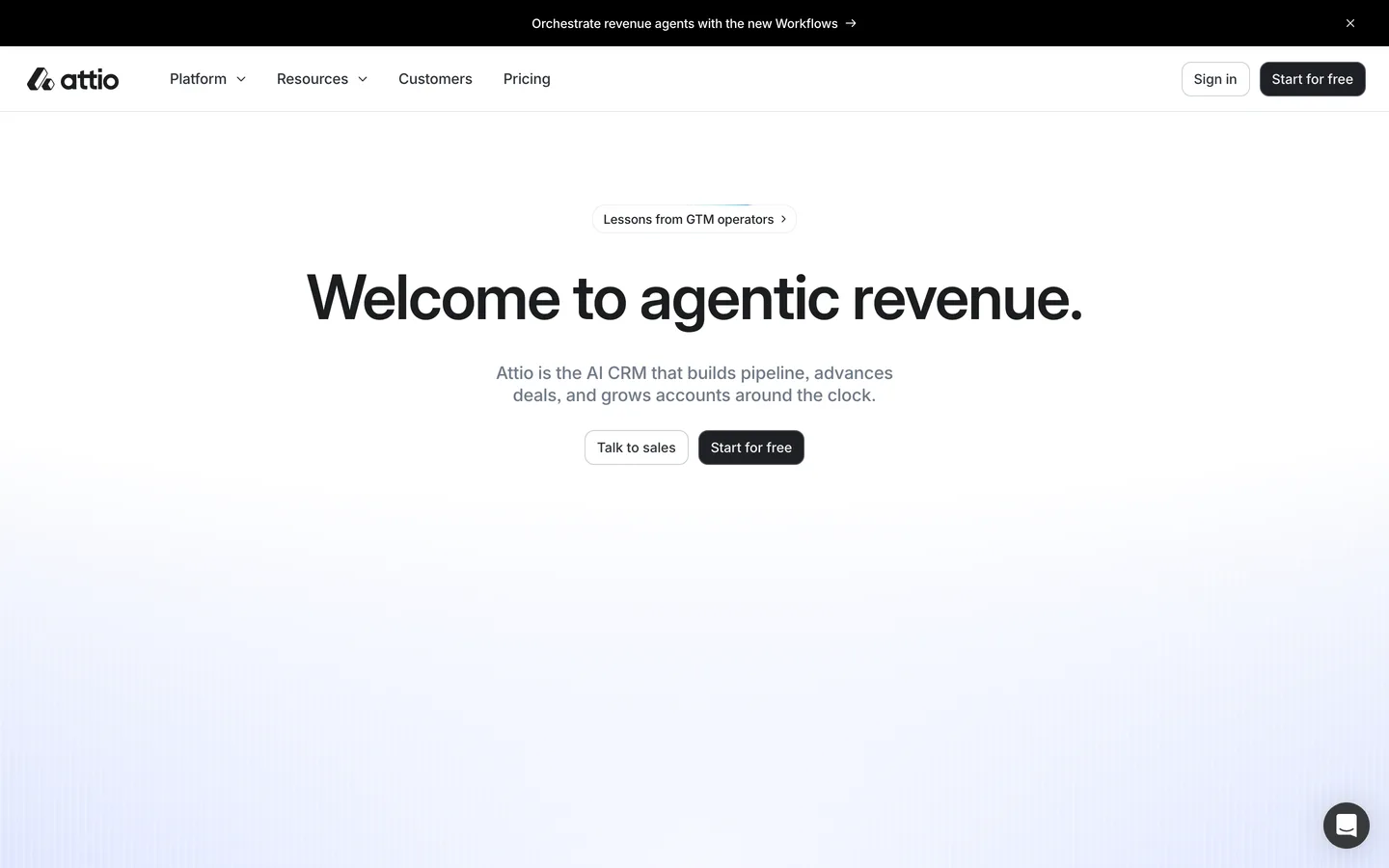
The next-generation CRM, and the current best example of the "screenshot-forward" school done with discipline. The hero, "The revenue platform engineered for scale", sits centered above one large, detailed product screenshot that occupies the entire lower half of the viewport.
Worth stealing: the single high-status testimonial placed above the logo wall ("…I instantly got the feeling this was the next generation of CRM": Margaret Shen, Modal), inverting the usual order so a human voice primes the logos (Stripe, Modal, Railway) that follow; the numbered section markers ([01], [02], [03], [04]) that give a long page editorial rhythm; and interactive product demonstrations embedded mid-page instead of static feature cards.
What to steal: one great quote beats ten mediocre ones, place it before the logos, not after.
Retool
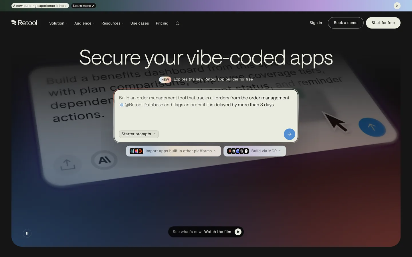
The internal-tools platform, selling to enterprises on a dark, high-contrast page. As of this writing the hero reads "Secure your vibe-coded apps": a headline ripped from this year's discourse, which tells you Retool treats its homepage as a living campaign surface, not a monument.
Worth stealing: logos with receipts. Retool doesn't just show Amazon, Boeing, and DoorDash; its case-study callouts attach figures like "Ramp saved $8M and 20,000+ hours," which is the difference between decoration and evidence; the two-tier logo strategy (a curated row of eight household enterprise names up top, a 20+ logo carousel deeper in); and headlines that name the buyer's actual anxiety (security, governance) rather than the product's features.
What to steal: never show a logo you could be showing a number with.
Loom
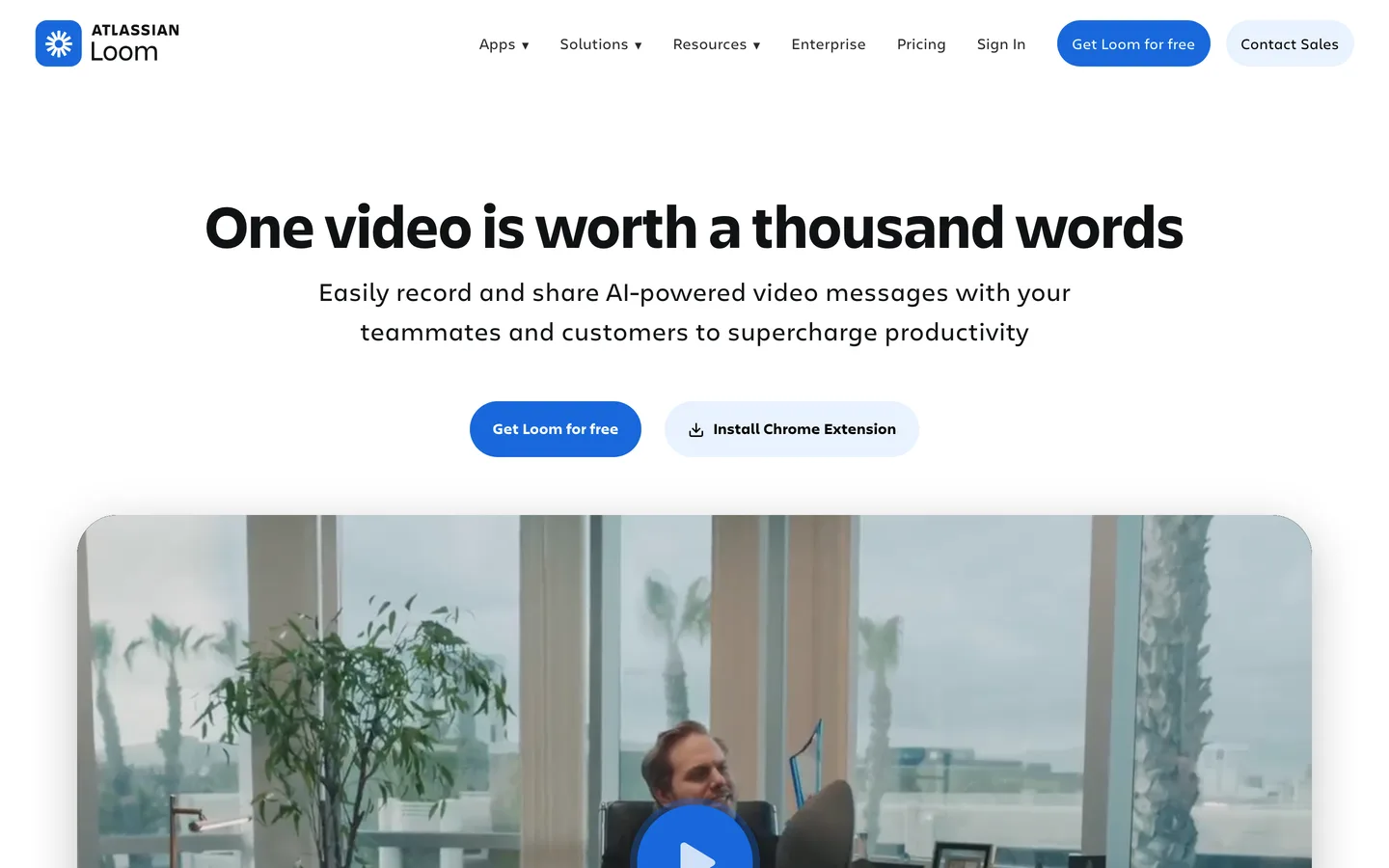
The async video messaging tool ("One video is worth a thousand words"), and the cleanest case of a site that demonstrates instead of describes. Loom's page is threaded with embedded Loom videos, the product proves itself in the medium it sells.
Worth stealing: proof-by-demonstration, if your product produces an artifact (videos, dashboards, documents, emails), embed real ones instead of describing them; the scale line "Millions of people across 400,000 companies" paired with a mainstream logo carousel (Tesla, Disney, Goldman Sachs, Atlassian) that signals "this crossed the chasm"; and use-case cards by team (Sales, Engineering, Support, Design) that let each visitor self-select a narrative instead of reading a generic one.
What to steal: if the product makes something, show the thing it makes, above the fold.
Pricing pages and conversion mechanics
Design that moves the metric: pricing transparency, friction removal, and offers.
PostHog
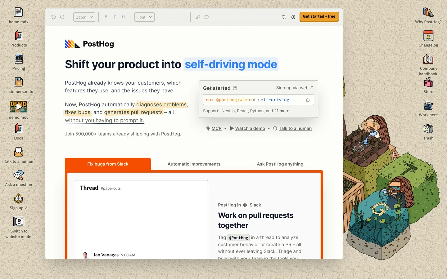
The product-analytics suite with the most distinctive voice in developer marketing: mascot illustrations (a hedgehog, naturally), deliberately un-corporate copy, and radical pricing transparency (how its usage pricing compares with the other models is in B2B SaaS pricing models compared). The positioning line is plain: "We make dev tools for product engineers."
Worth stealing: the pricing table on the homepage itself, free-tier allowances and per-unit costs listed right there, no "Contact us" curtain, which for a developer audience converts skepticism into trust in one scroll; the annotated logo wall, captioned "Yes, they actually use us: no, it's not just some random engineer who tried us out 2+ years ago," which weaponizes honesty against everyone else's inflated logo walls; and a voice so consistent (jokes in the footnotes, self-deprecation in the headers) that the site is unmistakable with the logo covered.
What to steal: transparent per-unit pricing where buyers can see it, and one honest sentence where competitors put boilerplate.
Cal.com
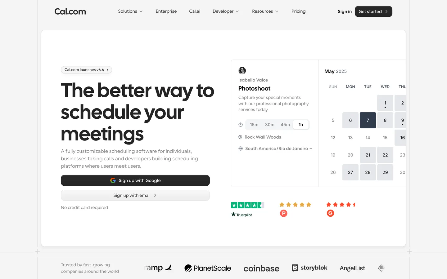
Open-source scheduling infrastructure, "The better way to schedule your meetings", and a masterclass in stripping friction from the signup path rather than decorating around it.
Worth stealing: the friction-removal stack around the CTA, Google SSO and email signup side by side, "No credit card required" printed under the button, and a secondary "Book a demo" for buyers who aren't self-serve; the comparative testimonial ("More elegant than Calendly, more open than SavvyCal") that does competitive positioning through a customer's mouth instead of a comparison table; and an FAQ section on the homepage that quietly handles objections (and earns FAQ rich results) without a sales call.
What to steal: audit every pixel within 100px of your primary CTA. Each one should remove a reason not to click.
Ramp
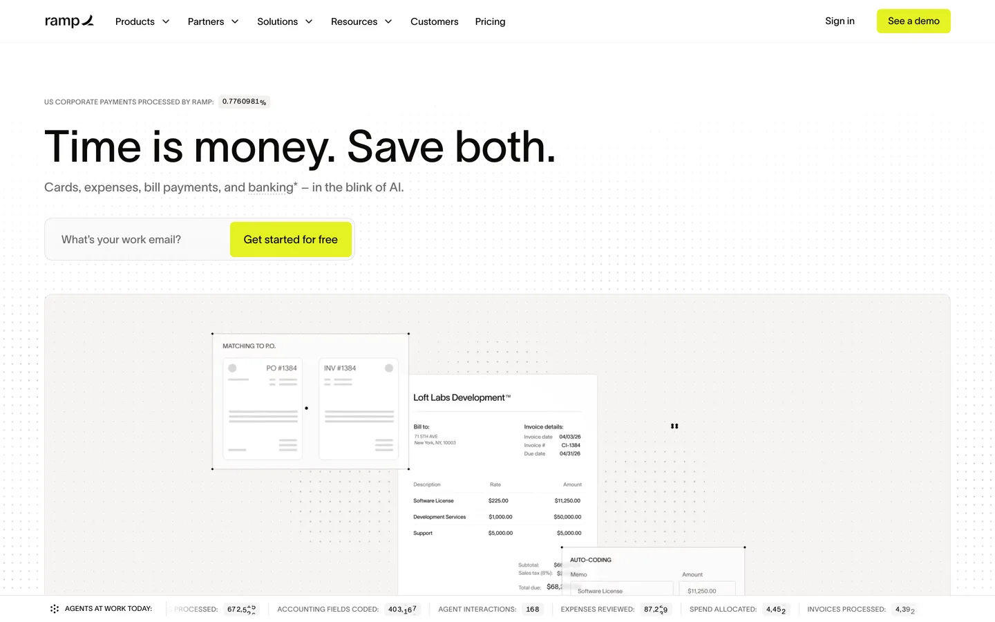
The finance-automation platform whose entire site is an exercise in quantification. Ramp's brand promise is saving time and money, so the page proves it in its own units: "70,000+ businesses," "27M+ hours saved," "75% faster close," "3x more efficient", and a headline acquisition offer, a "$3,100 signup bonus for new customers," treated with e-commerce directness that B2B SaaS usually can't stomach.
Worth stealing: metrics as the message, nearly every section pairs a claim with a number, and case-study citations (Glossier, Quora, 8VC) recur throughout rather than living in a ghetto "Customers" page; the concrete incentive offer in the hero, which reframes signup from a commitment into a deal; and one more thing we verified firsthand: Ramp serves a dedicated machine-readable version of its site to AI agents, positioning it for the growing share of buying research done by LLMs.
What to steal: convert your value proposition into your buyer's KPIs and print the numbers.
Clay
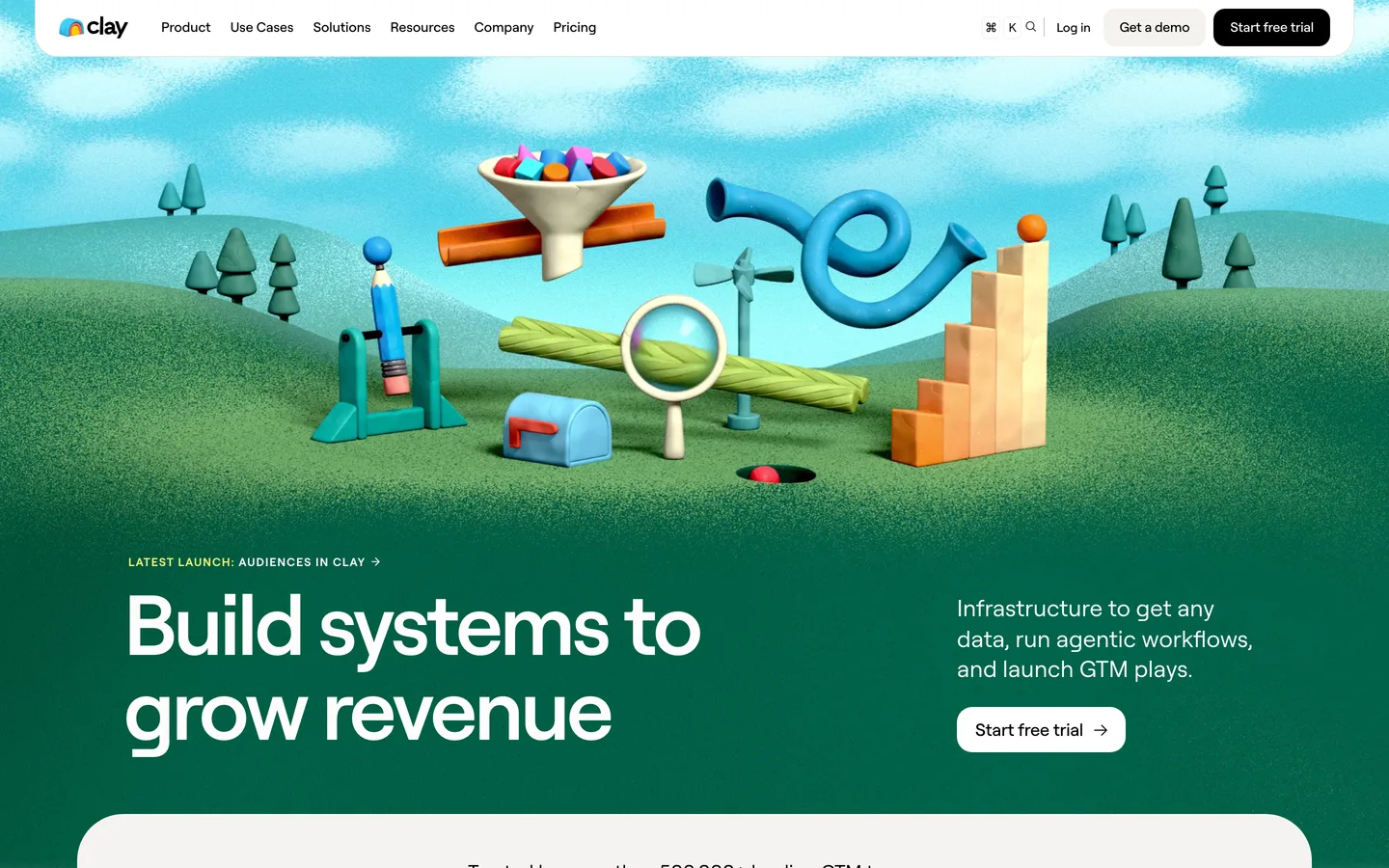
The GTM data-enrichment platform ("Build systems to grow revenue"), and proof that in a sea of dark gradients and product screenshots, owning an illustration style is a moat. Clay's hero pairs left-side copy with a Rube Goldberg-style contraption (tubes, balls, magnets, funnels rolling across green hills) in a bright orange/blue/pink palette no competitor could use without looking like a copy.
Worth stealing: the ownable visual world. Clay is instantly recognizable in a LinkedIn feed thumbnail, which is where B2B sites are actually first seen in 2026; logos with metrics attached ("+140% outbound pipeline" for Intercom, "80%+ enrichment coverage" for Vanta); and tabbed use-case sections that let a complex, horizontal product show five concrete plays instead of one abstract pitch.
What to steal: if every competitor shows screenshots, distinctive illustration is a differentiation strategy (what it costs against stock is in custom illustration vs stock), but only if you commit to it everywhere.
The developer-tool aesthetic
Dark themes, code as imagery, and sites that now speak to machines as well as humans.
Vercel
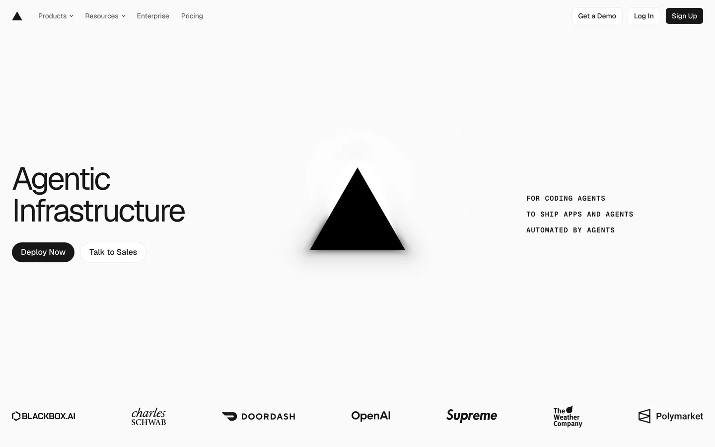
The frontend cloud, mid-repositioning, and unafraid to bet the homepage on it. The 2026 hero is two words, "Agentic Infrastructure," over atmospheric gradient glows, with the dual CTA that defines modern dev-tool go-to-market: "Deploy Now" (self-serve) beside "Talk to Sales" (enterprise).
Worth stealing: the willingness to reposition the entire site around where the market is going rather than where revenue is today, most companies bolt an "AI" badge onto the old site; Vercel rebuilt the story; case studies with operational metrics (Notion "powers millions of agent conversations daily," Zapier "100 million monthly visits," Mintlify "20,000+ companies") that prove scale in the customer's numbers; and true dark/light theming: respecting developer environment preferences rather than choosing for them.
What to steal: the dual CTA. Self-serve and sales are different buyers on different journeys; give each a door.
Resend
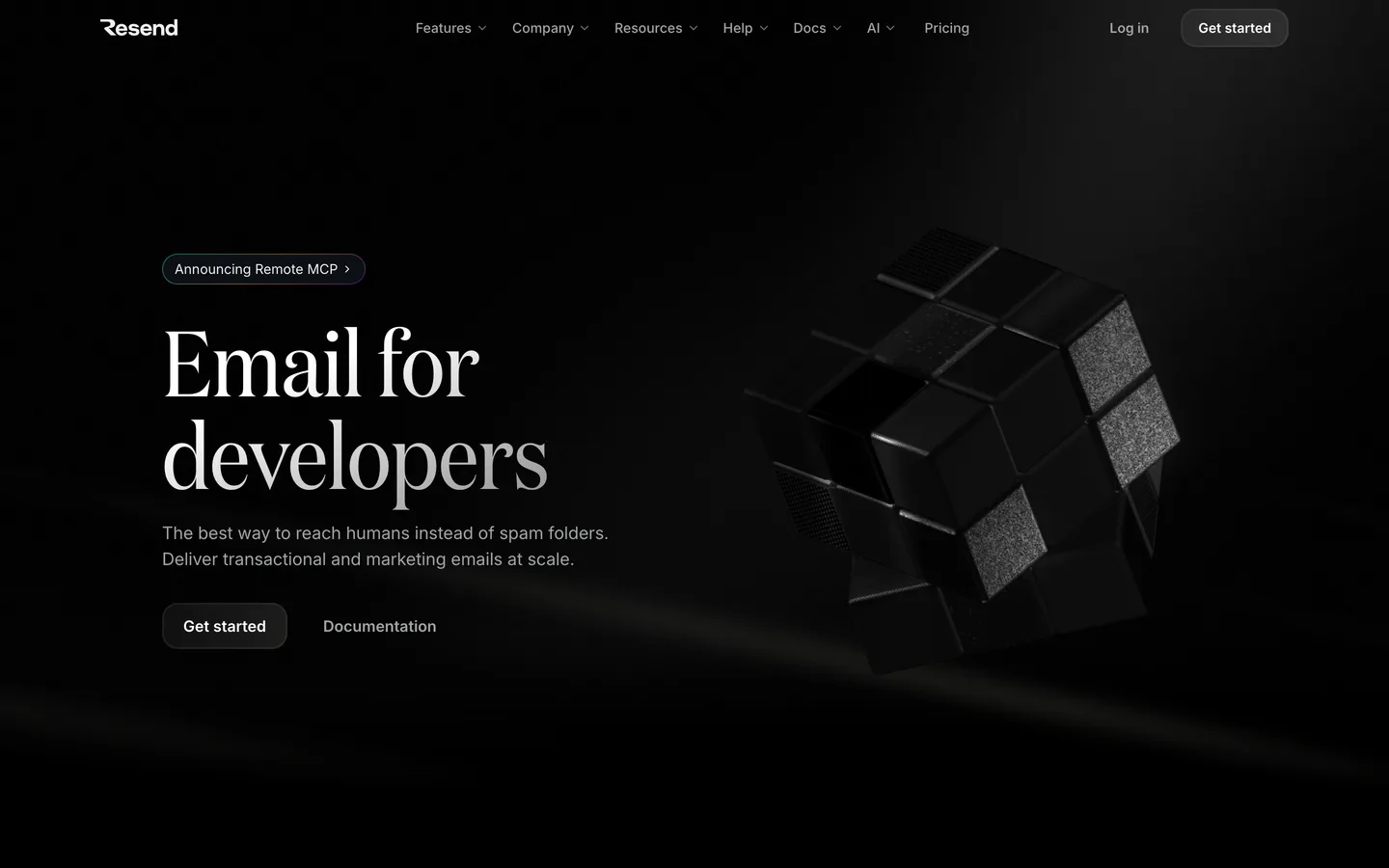
The email API for developers, and the current benchmark for minimalist dev-tool design: a near-black, typography-driven page where a code snippet does the job of a hero image, a few lines showing an email sent, because for this buyer, seeing the API is seeing the product. The positioning sentence is ruthless: "Resend is the email API for developers."
Worth stealing: code-as-hero, if developers are the buyer, the integration experience is the product shot; monochrome restraint that makes the few accent moments land; and the deepest agent-readable layer we found while verifying this list, machine-readable docs, SDK indexes in nine languages, and an MCP server, meaning Resend is legible to the AI coding assistants that increasingly choose the email provider on the developer's behalf.
What to steal: show the three lines of code it takes to use you, and make your site readable to the machines doing your buyer's research.
Railway
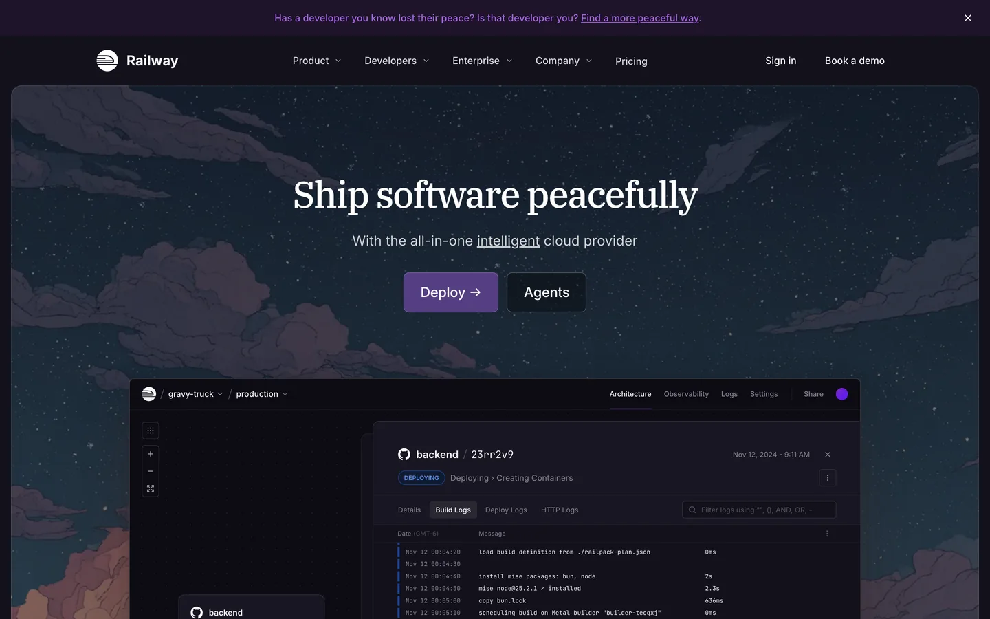
The infrastructure platform ("deploy anything, scale everything"), with a dark, dense, terminal-adjacent aesthetic that treats infrastructure (services, deploys, connections) as something worth visualizing rather than hiding behind abstract cloud illustrations.
Worth stealing: usage numbers as social proof. Railway leans on live-feeling signals like template deploy counts and an enormous template gallery, which for developers is stronger evidence than a Fortune 500 logo wall (developers trust what other developers actually run); the template gallery doubling as programmatic SEO surface and activation path at once. Every template page is a landing page and a one-click start; and, like Ramp and Resend, a dedicated machine-facing briefing for AI agents, which we hit firsthand while verifying this page.
What to steal: if your users are practitioners, show usage, not logos.
Patterns that keep showing up in 2026
Across all 14 teardowns, the same decisions recur often enough to call them the current baseline:
- Product UI is the hero image. Linear, Attio, and Stripe lead with real interface, not illustration. Abstract hero art now signals "we're hiding the product." The exception that proves the rule: Clay's illustration works because it's ownable, not generic.
- The AI-era rewrite is done, not coming. Linear says "teams and agents." Vercel says "Agentic Infrastructure." Retool says "vibe-coded apps." Headlines have already absorbed the platform shift.
- Sites now have a machine audience. Ramp, Railway, Resend, and Supabase all serve machine-readable versions of themselves (we hit them firsthand during verification). As more buying research is delegated to AI agents, being legible to LLMs is becoming a design requirement, like responsive design was in 2013.
- Logo walls need receipts. The bar moved from showing logos to quantifying them: "Ramp saved $8M" (Retool), "+140% outbound pipeline" (Clay), "27M+ hours saved" (Ramp). PostHog even annotates its wall with a disclaimer that the logos are real, active users.
- Numbered narrative structure. Linear's 1.0/2.0/3.0 chapters and Attio's [01]–[04] markers turn long scrolls into documents with a spine, a quiet revolt against the random-section-stack homepage.
- Dual CTAs are standard. Self-serve and sales-led paths side by side (Vercel, Attio, Cal.com). Forcing both buyers through one funnel is a 2019 pattern.
- Dark for dev tools, light for money. Developer products skew dark (Linear, Retool, Resend, Railway); finance and horizontal tools skew light (Stripe, Mercury, Loom, Attio). It's audience signaling, not fashion.
How to apply this to your SaaS site
You don't need 14 lessons; you need the five that fit your situation, applied in order:
- Fix the sentence first. Before any visual work, write a headline that passes the Supabase test: it answers your buyer's two biggest doubts in one breath. If your team can't agree on the sentence, no amount of design will save the page. This is positioning work wearing a design costume.
- Lead with the product if you're proud of it. Real UI in the hero (Attio-style) if the interface sells; a code snippet (Resend-style) if developers buy the integration; an embedded artifact (Loom-style) if the product makes something. Only reach for illustration if you'll commit to owning a style like Clay does.
- Attach one number to your proof. A single "cut onboarding time 40%" with a named customer outperforms a row of grey logos. If you don't have the number yet, get it before you get the redesign.
- Strip friction from the primary CTA. Cal.com's stack (SSO option, "no credit card required," demo alternative) is copyable in an afternoon and usually worth more than a new hero animation.
- Add the machine layer. An llms.txt, clean semantic HTML, structured data, honest meta descriptions. Four of the fourteen sites on this list already treat AI agents as an audience; within a year that will look as basic as mobile responsiveness.
If you'd rather not do this alone: this teardown is the lens we apply in our own SaaS website design work at SUUR. The same playbook helped Biteful's founders raise $125K within six weeks of their redesigned site launching. A full custom redesign typically runs $25,000–$75,000; if you need it compressed, the Product Sprint ($9,000 flat, about 5 business days) designs and ships the site in production code rather than handing you a Figma file. Either way, the patterns above are free, steal them.
The honest bottom line
The best SaaS websites of 2026 aren't the prettiest. They're the clearest. Every site on this list won its spot by making a decision generic sites avoid: Stripe defined a category in a sentence, PostHog put its price list on the homepage, Loom made the product demo itself, Ramp turned its site into a spreadsheet of proof, Clay drew its way out of the screenshot arms race. The common thread is confidence, in the product, in the numbers, in a point of view. Copy the confidence and the reasoning; leave the dark gradients to the template farms.
Frequently asked questions
Four things, in order. First, a positioning headline a stranger can repeat after one read, Stripe's 'Financial infrastructure to grow your revenue' and Supabase's 'Build in a weekend. Scale to millions.' both pass that test. Second, proof the product is real: the best 2026 sites (Linear, Attio) put actual product UI in the hero instead of abstract illustration. Third, social proof with numbers attached: 'Ramp saved $8M' converts; a bare logo wall doesn't. Fourth, one obvious next step: a primary CTA matched to how the product is actually bought (self-serve signup, demo, or both). Aesthetics matter, but they're the fourth thing, not the first.
A template plus your own copy runs $0–$5,000 and is the right answer pre-revenue. A custom SaaS marketing-site redesign by a senior team typically lands between $25,000 and $75,000 depending on page count, animation, and integrations, and concept-to-launch sites for funded startups bundled with brand strategy run $50,000–$150,000. SUUR's own published flat fees sit below that: a landing page at $3,500, a design-only sprint at $6,000, and a Product Sprint at $9,000 flat for roughly a week of senior design plus production code.
Match the audience, not the trend. Developer tools skew dark (Linear, Retool, Resend, Railway) because their users live in dark IDEs and the site signals 'we're one of you.' Finance, ops, and horizontal business tools skew light (Stripe, Mercury, Loom, Cal.com, Attio) because light reads as trustworthy and calm to a broader buyer. Vercel ships both with a theme toggle. The wrong answer is dark mode as a costume, if your buyer is a CFO, a black site with neon accents is working against you.
The 2026 baseline: a one-sentence positioning headline; a subhead that says who it's for; real product UI or a working demo above the fold; a logo row with at least one attached metric or quote; 3–5 sections that walk the core workflow (Linear literally numbers them 1.0, 2.0, 3.0); transparent pricing or an honest 'talk to sales'; an FAQ that doubles as objection handling; and increasingly an llms.txt or machine-readable version of the site, because a growing share of first visits now come from AI agents researching on a buyer's behalf: Ramp, Railway, Resend, and Supabase all serve one already.
With a senior team and a decision-maker in the room: 1–2 weeks for a focused landing page, 4–8 weeks for a full marketing site (positioning, design system, 5–15 pages, build), and 3–6 months when brand strategy, content, and migrations are bundled in. The schedule killer is rarely design. It's copy approval and stakeholder rounds. Compressed formats exist: SUUR's Product Sprint ships a designed, built, deployed site or product in about 5 business days by cutting the review layers, not the craft.
Steal decisions, not pixels. Linear's dark gradient aesthetic has been cloned so widely that 'Linear-style landing page' is now a template category, which means copying it makes you look like everyone else, the opposite of what it did for Linear. What transfers is the reasoning: product UI as proof, one message per section, numbers attached to logos, friction stripped from the CTA. Apply those to your own brand, audience, and buying motion. If a pattern exists on this page, assume your competitors have seen it too.
Want to talk to SUUR directly?
We work with founders shipping product, not just decks.