Restaurant Website Designs
15 Best Restaurant Website Designs, Annotated (2026)
Fifteen restaurant websites checked on 30 September 2026, from Septime to sweetgreen: how each one shows the menu, takes bookings and states its hours.
| Restaurant | Menu on the site | Bookings | What to steal |
|---|---|---|---|
| Septime, Paris | Text with prices on the homepage | Zenchef, plus a note on when bookings open | Everything a guest needs on one page |
| Padella, London | Today's menu is the homepage, dated, every dish priced | Dojo; mostly walk-in | The menu as the front door |
| Dinner by Heston Blumenthal, London | Text with prices on a menus page | SevenRooms | A concept stated in the first screen |
| Qissa, Sevenoaks | Text with prices, plus a PDF | resOS; takeaway ordering separate | A local restaurant with hours and address on the homepage |
| Dishoom, UK | Text with prices, one page per menu | SevenRooms | Storytelling that still ends in View menus and Book a table |
| COTE, New York and three more cities | Text with prices per city; drinks as PDF | Resy in New York and Miami, SevenRooms elsewhere | A luxe group site that keeps hours on the homepage |
| sweetgreen, US | Text with ingredients and nutrition, no prices | No bookings; its own ordering site | Every product card ends in Order now |
| sketch, London | Per-room menus behind buttons | SevenRooms, per room | A venue with several rooms shown as a grid |
| Via Carota, New York | An image of the menu, plus a separate text page | Resy; walk-ins welcome | Illustration and Italian labels as the whole identity |
| Satan's Whiskers, London | None, on purpose: the menu changes daily | Telephone only | A voice strong enough to carry a one-screen site |
| Superiority Burger, New York | None on the site; delivery link only | Resy | Extreme minimalism, and its limit |
| Eleven Madison Park, New York | An image named Spring-Menu-2024 in the homepage gallery | Resy | Photography that does the talking |
| Noma, Copenhagen | None | Tock | A homepage written as a letter |
| Death & Co, five US cities | PDF and PNG on each location page | SevenRooms | Mood and a location switcher for a bar group |
| Lune Croissanterie, Melbourne | An image per store | No bookings; order online by state | One product, shot like a product launch |
- Menu on the site
- Text with prices on the homepage
- Bookings
- Zenchef, plus a note on when bookings open
- What to steal
- Everything a guest needs on one page
- Menu on the site
- Today's menu is the homepage, dated, every dish priced
- Bookings
- Dojo; mostly walk-in
- What to steal
- The menu as the front door
- Menu on the site
- Text with prices on a menus page
- Bookings
- SevenRooms
- What to steal
- A concept stated in the first screen
- Menu on the site
- Text with prices, plus a PDF
- Bookings
- resOS; takeaway ordering separate
- What to steal
- A local restaurant with hours and address on the homepage
- Menu on the site
- Text with prices, one page per menu
- Bookings
- SevenRooms
- What to steal
- Storytelling that still ends in View menus and Book a table
- Menu on the site
- Text with prices per city; drinks as PDF
- Bookings
- Resy in New York and Miami, SevenRooms elsewhere
- What to steal
- A luxe group site that keeps hours on the homepage
- Menu on the site
- Text with ingredients and nutrition, no prices
- Bookings
- No bookings; its own ordering site
- What to steal
- Every product card ends in Order now
- Menu on the site
- Per-room menus behind buttons
- Bookings
- SevenRooms, per room
- What to steal
- A venue with several rooms shown as a grid
- Menu on the site
- An image of the menu, plus a separate text page
- Bookings
- Resy; walk-ins welcome
- What to steal
- Illustration and Italian labels as the whole identity
- Menu on the site
- None, on purpose: the menu changes daily
- Bookings
- Telephone only
- What to steal
- A voice strong enough to carry a one-screen site
- Menu on the site
- None on the site; delivery link only
- Bookings
- Resy
- What to steal
- Extreme minimalism, and its limit
- Menu on the site
- An image named Spring-Menu-2024 in the homepage gallery
- Bookings
- Resy
- What to steal
- Photography that does the talking
- Menu on the site
- None
- Bookings
- Tock
- What to steal
- A homepage written as a letter
- Menu on the site
- PDF and PNG on each location page
- Bookings
- SevenRooms
- What to steal
- Mood and a location switcher for a bar group
- Menu on the site
- An image per store
- Bookings
- No bookings; order online by state
- What to steal
- One product, shot like a product launch
Search "best restaurant website design" and you get galleries of hero images. A restaurant website is judged by a guest on a phone, usually standing outside or deciding between three places, and what that guest needs is not in a hero image. So this page looks at fifteen admired restaurant sites the way that guest does: what the design idea is, how the menu is shown, how you book, and whether the hours are there. Every site was visited on 30 September 2026, every claim was checked in the page source, and each entry says what is worth stealing.
The finding: the design ideas are varied, and the basics are missed in the same few ways. Six of fifteen publish a priced menu as text. Seven show hours on the homepage. Five of the most celebrated rely on an image, a PDF, or no menu. And four greeted a first-time visitor with a pop-up over the whole screen, which we removed for the screenshots and noted in the captions.
The menu as the front door
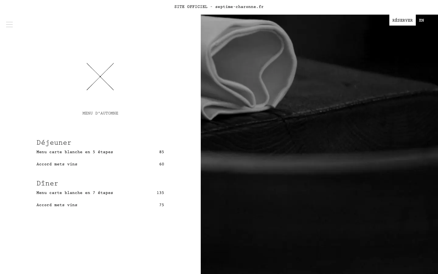
Septime puts the whole restaurant on one typographic page: the menu, what the wine pairing costs, the hours, the address, how far ahead bookings open, and a list of the winemakers they pour. Lunch is a five-course carte blanche at 85 euros, dinner seven courses at 135. It is the best example here of a site that answers every question a guest has without a second click, and it does it with almost no images.
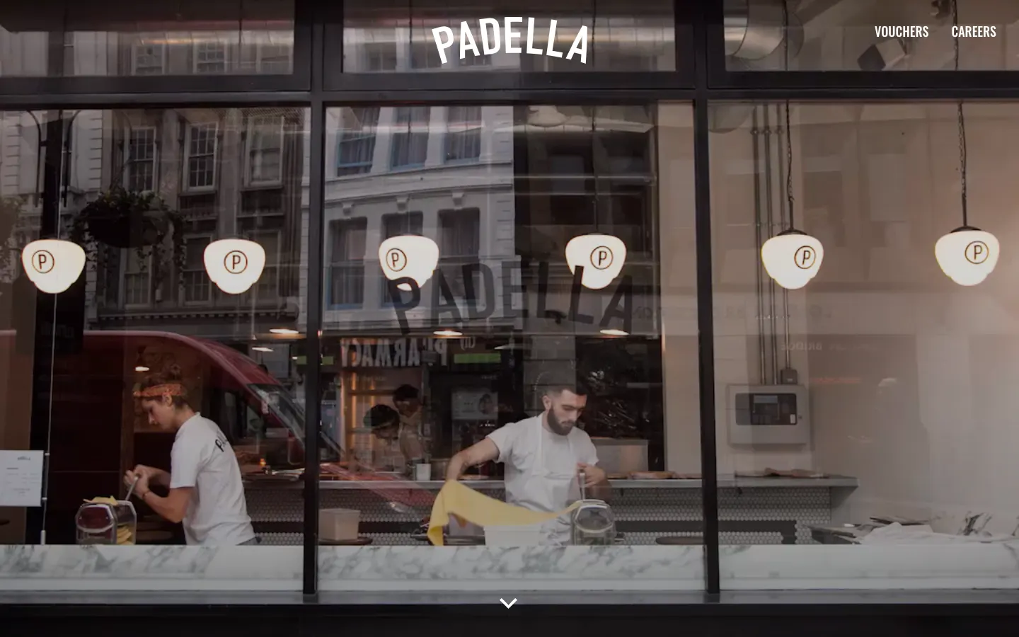
Padella goes one step further: the homepage is today's menu, headed with the date, "Wednesday 30th September," with every dish priced, from "Pici cacio & pepe" at £13.50 down to the wine. A pasta bar with a queue does not need a story; it needs to tell you what is on today. Steal the date. It tells a guest the page is alive, which is the one thing a PDF can never do.
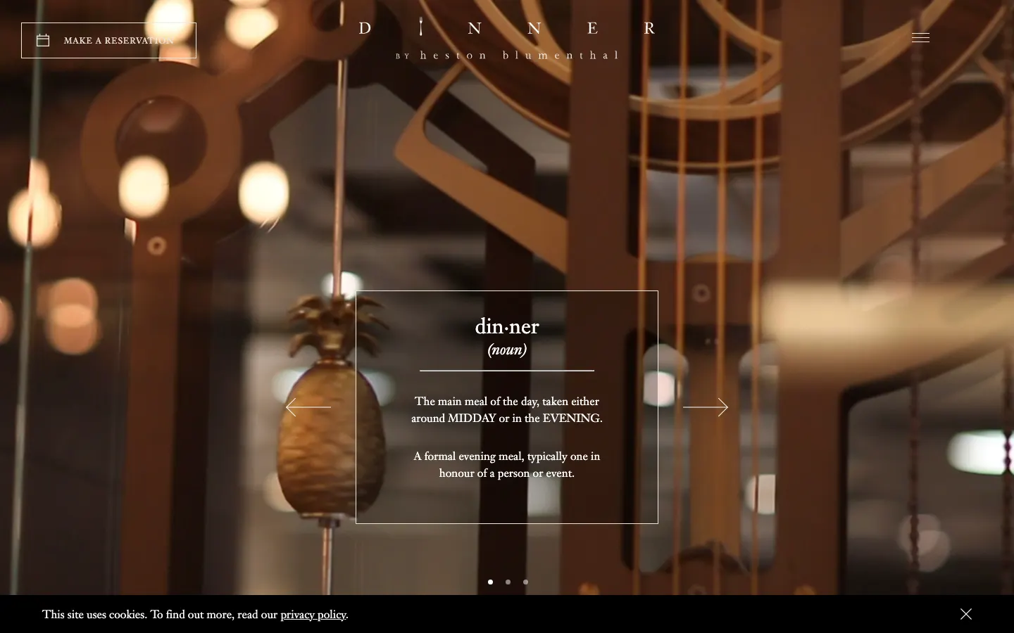
Dinner by Heston Blumenthal, the restaurant inside the Mandarin Oriental Hyde Park, opens with a dictionary definition of the word dinner, which is the concept (historical British recipes) in one screen. The menus page then does the unglamorous part properly: "6 Courses (£155) or 8 Courses (£195)," as text. Most hotel restaurants hide the price; this one prints it.
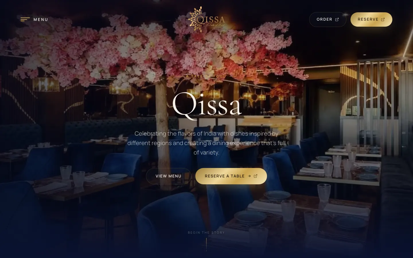
Qissa, an Indian restaurant in Sevenoaks in Kent, is the small-restaurant version done right: an editorial, numbered navigation, a priced text menu, and the hours and address on the homepage, "Monday Closed" included. It was nominated on Awwwards, and it would work just as well if it had not been.
Storytelling that still gets you to a table
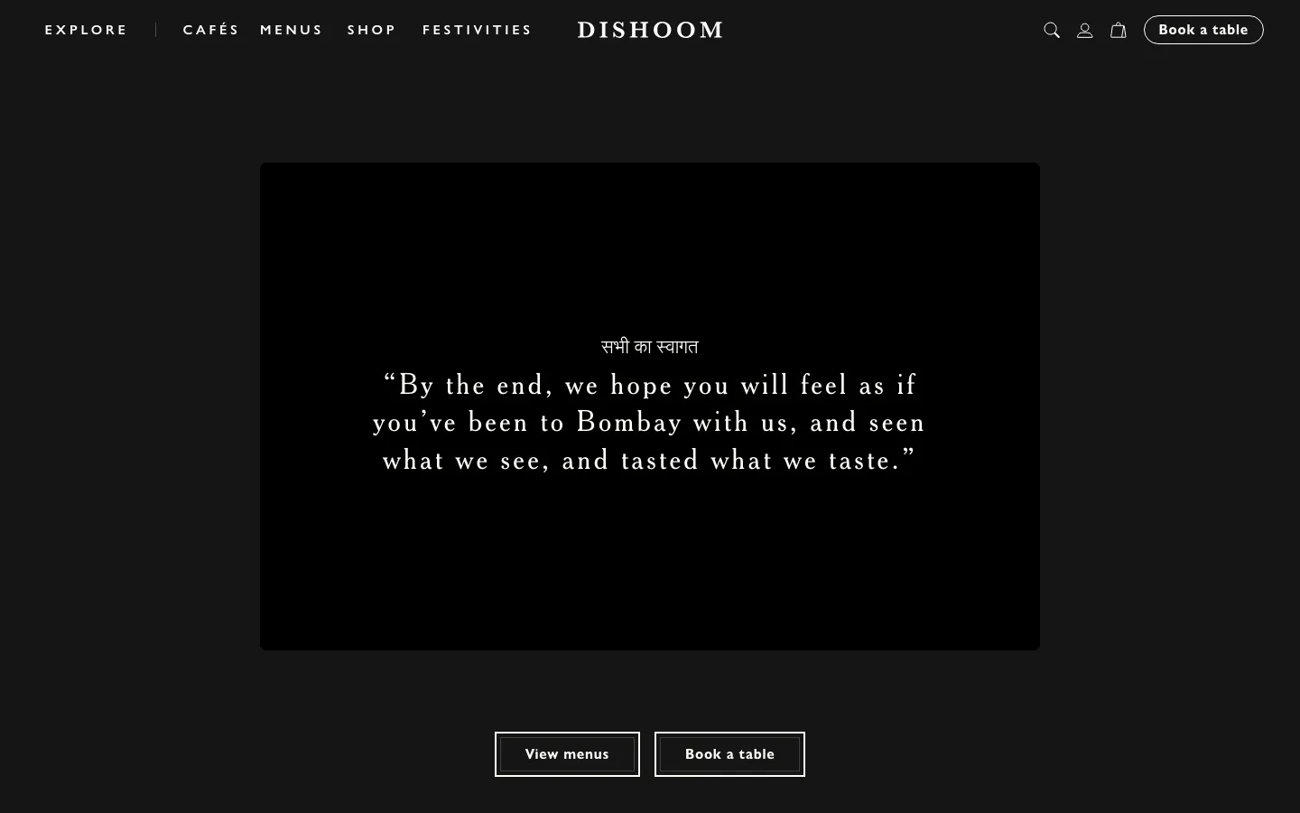
Dishoom is built as "a love letter to Bombay," and the homepage opens on a quotation rather than a dish. What makes it work is the two buttons under the story: View menus and Book a table. The menus are priced text, one page per meal. The cost is weight: the homepage HTML is over a megabyte, and the hours are not on the homepage.
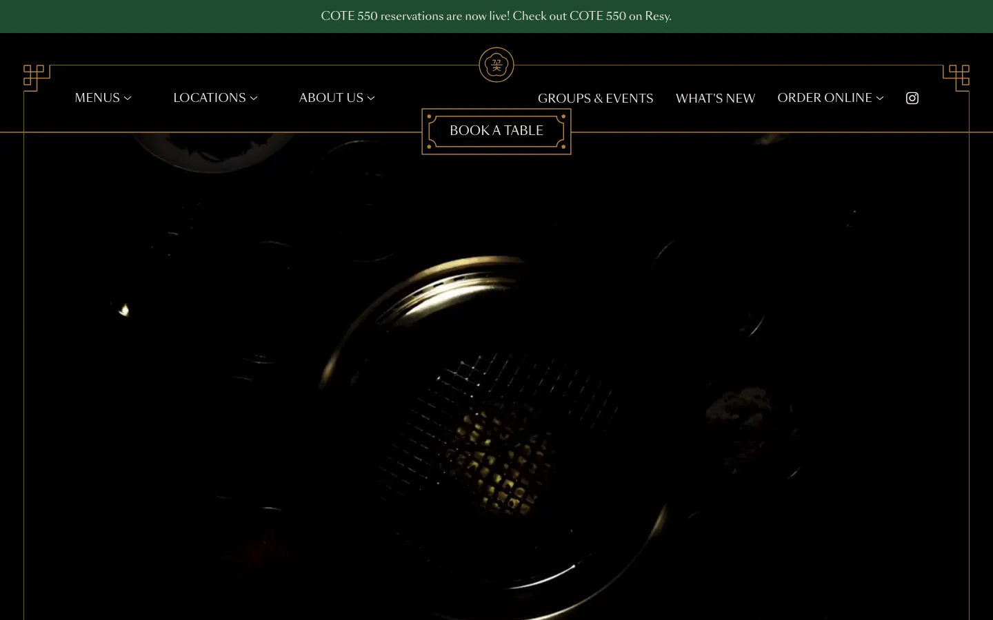
COTE runs four cities from one Webflow site, dark and art deco, and it is the group site that did not give up on the basics: hours on the homepage, priced text menus per city ("Butcher's Feast … 82 per person"), and a booking button that routes to Resy in New York and Miami and SevenRooms in Las Vegas and Singapore. Only the drinks lists are PDFs.
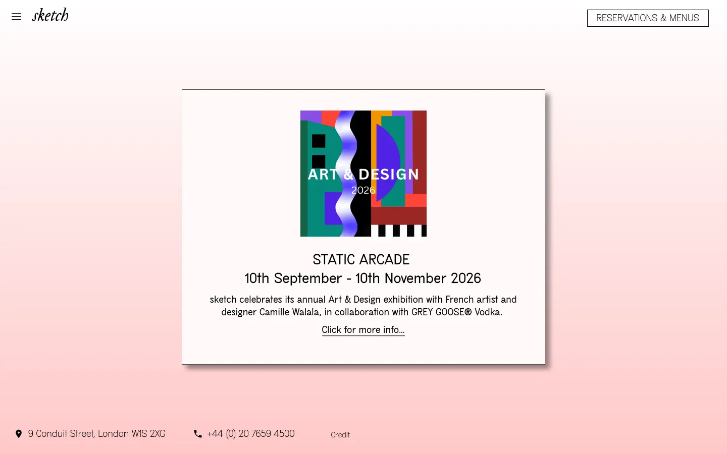
sketch is several restaurants in one building, from a Michelin-starred dining room to a café, and the homepage treats them as a grid of rooms, each with its own service hours and its own Menu and Book buttons. It is the pattern for any venue with more than one room: do not make a guest learn your floor plan before they can book the one they want.
Built to order
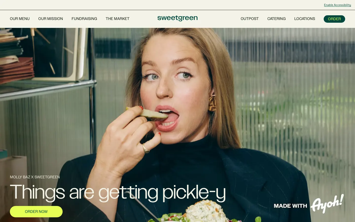
sweetgreen is the one site here designed around ordering, and every product card ends in "Order now" linked to its own ordering site. The menu page lists ingredients, allergens and nutrition as text ("900 Calories 39G Protein"), which is exactly what its guests ask. It shows no prices on the menu page and no hours on the homepage; for a chain whose guests order in an app, that is a defensible trade.
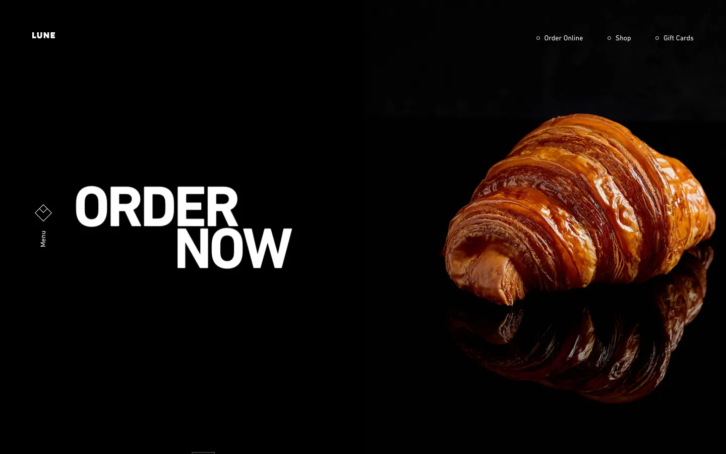
Lune shoots one product like a launch, and "Order Now" is the first thing on the page. The weak points are the ones a bakery can least afford: the site opens with a video intro and a Skip button, each store's menu is an image (a JPEG named for September 2026, at least current), and the hours are not on the homepage.
Voice and minimalism
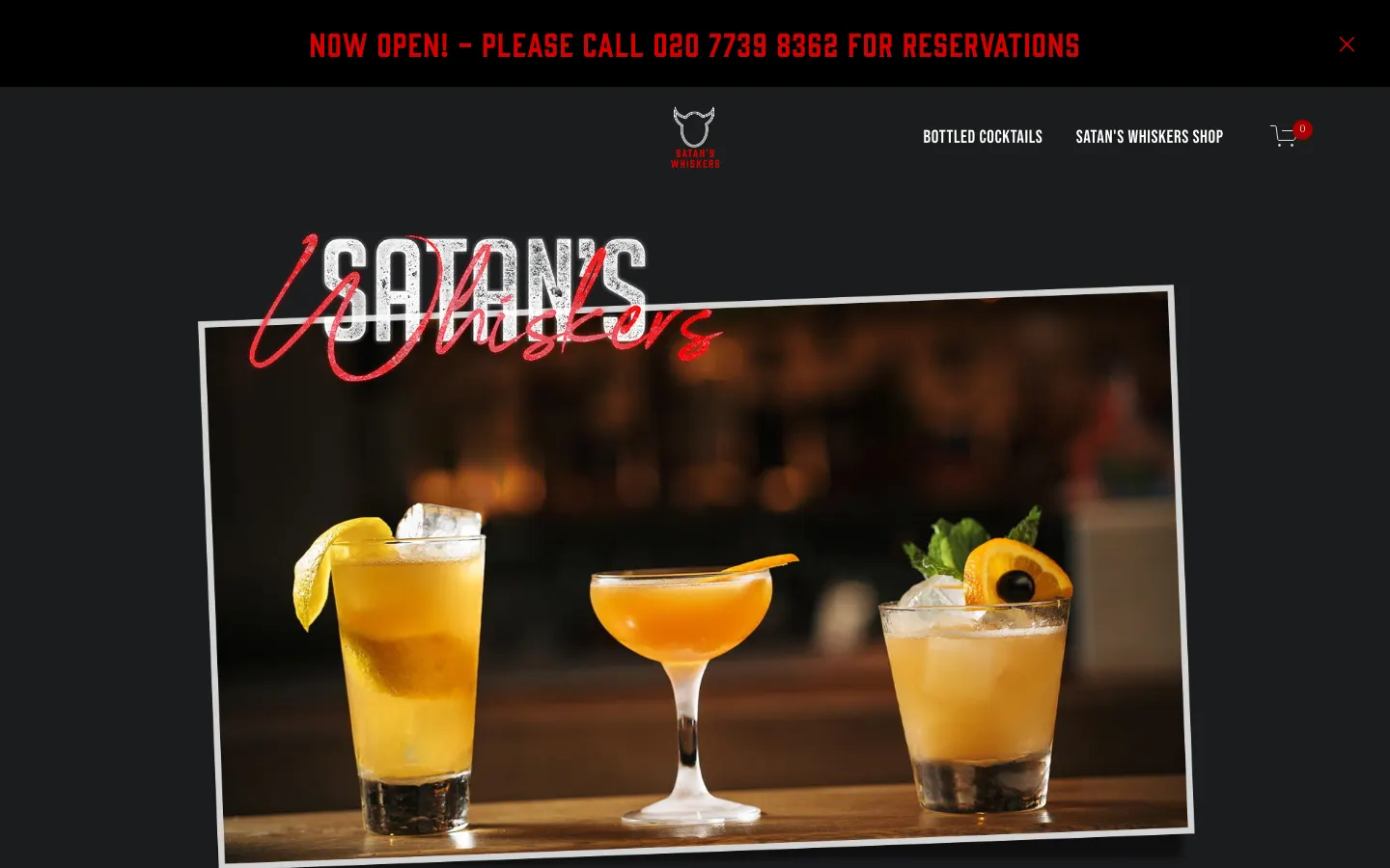
Satan's Whiskers, a cocktail bar in Bethnal Green, is one screen with a voice: it tells you about the "now infamous hip-hop soundtrack," that the menu changes daily, and, in capitals, "WE WELCOME RESERVATIONS, BUT ONLY BY TELEPHONE." Hours and address are on the page. For a neighbourhood bar, that is a complete website, and the phone-only rule is stated before anyone can be annoyed by it.
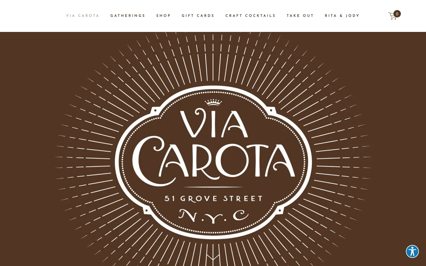
Via Carota is illustration all the way down, with practical labels in Italian, "INDIRIZZO" and "ORARI," and the hours and address are right there. Its menu is a screenshot image with an empty alt attribute, which a screen reader and a search engine both see as nothing. It also publishes a plain text page with every dish and price ("fried rabbit … $29"), which is the fix: keep the designed menu, and give the text version its own address.
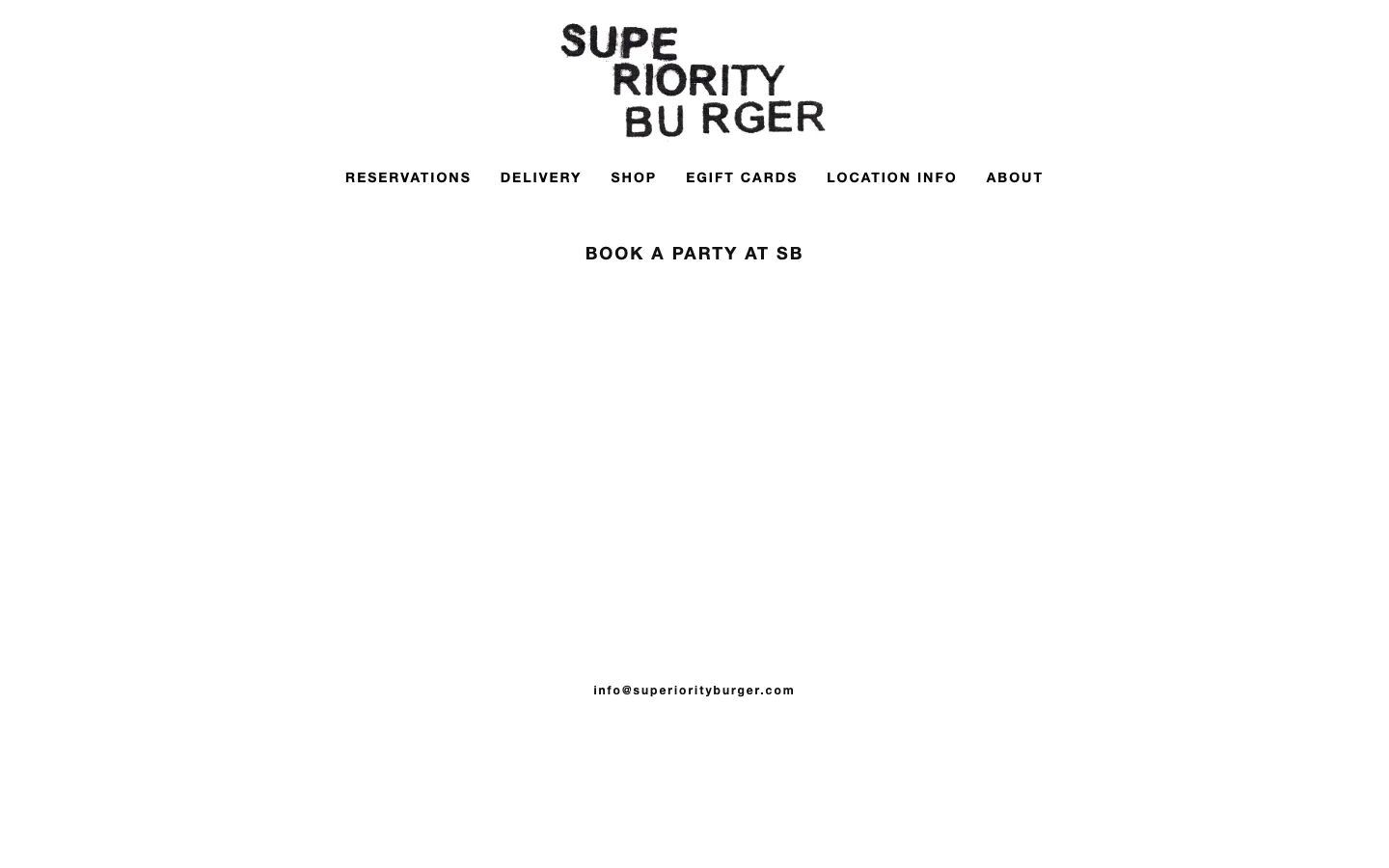
Superiority Burger takes minimalism as far as it goes: the whole homepage is about 225 characters of text. It is memorable, and it has one real cost: there is no menu on the site. The only route to one is the Delivery link, which forwards to Grubhub. Minimal is a style; no menu is a missing page.
Celebrated, and missing a menu
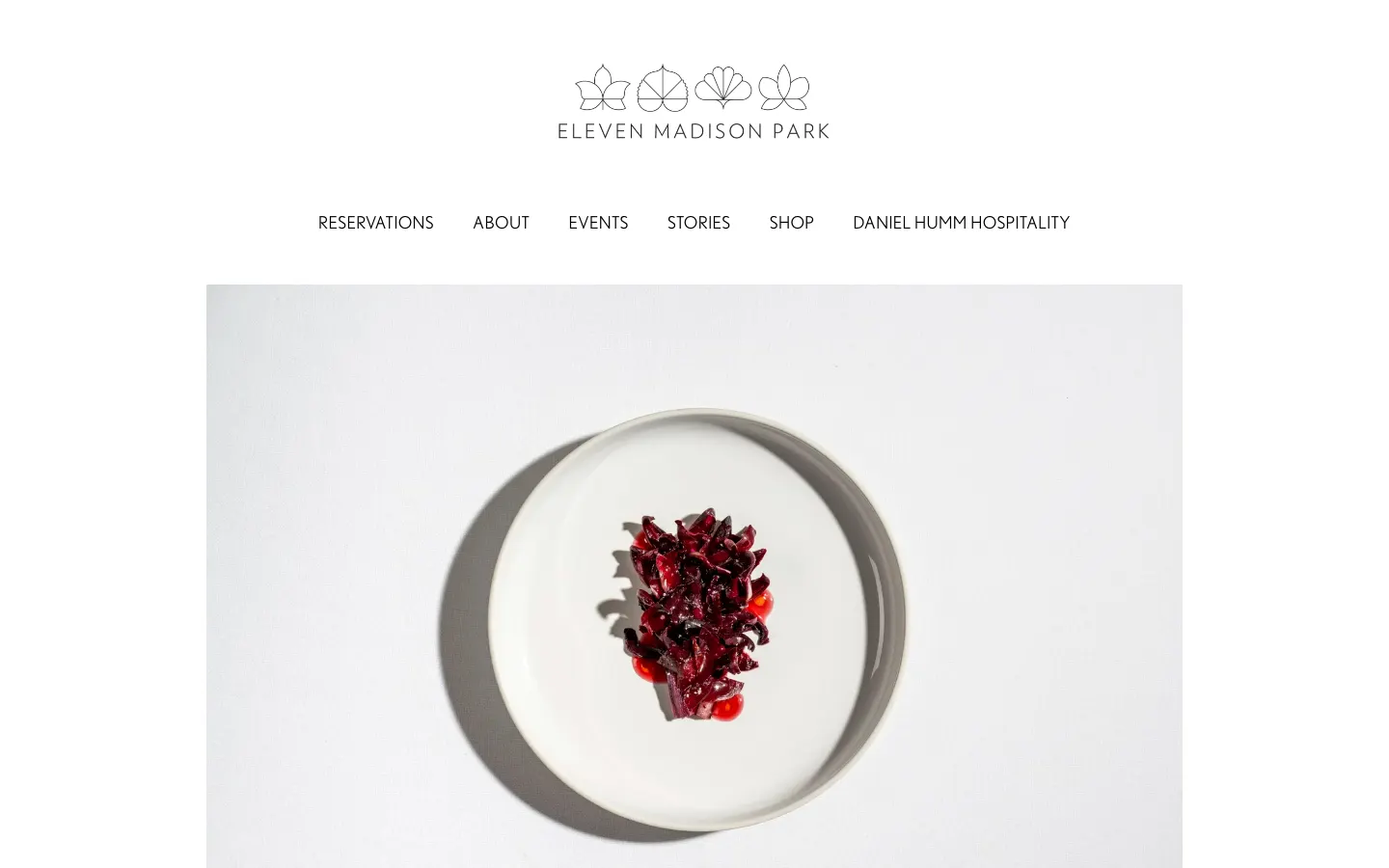
Eleven Madison Park is photography with almost no copy: a gallery of dishes and a Resy button. The only menu on the site is one of the gallery images, a JPEG named "Spring-Menu-2024," and the homepage shows the address but not the hours. A three-star restaurant can afford to let the pictures speak; the fix would still cost an afternoon.
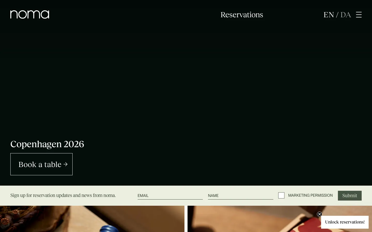
Noma's homepage is written as a letter, "Copenhagen 2026: We're coming home," with a live weather reading and Tock for bookings, and the hours and address sit in the footer as text. There is no menu anywhere on the site; the links near the word lead to its shop. For Noma the scarcity is part of the product. For almost any other restaurant it would just be a missing page.
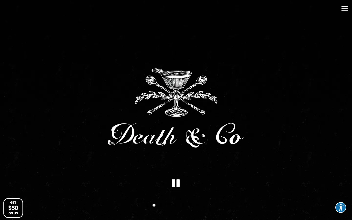
Death & Co runs five cities from one BentoBox site, with a moody photo slideshow and a location switcher. Each location's menu is a PDF or a PNG: the New York menu is a PDF dated June 2026 in its file name, and the East Village food menu is an image. The hours are on the location pages, not the homepage, and its /menus address returns a 404.
What to steal, in order of value
- Put the menu on the page as text, with prices. It reads on a phone, it can be searched, and AI answers can quote it. Keep a designed version if you like; publish the text too, as Via Carota does.
- Put the hours and the address on the homepage. Seven of fifteen did. It is the question most guests arrive with.
- Make the booking button go straight to the booking tool. Most sites here do this well; it is the basic the industry has come closest to solving.
- Date what changes. Padella's dated menu tells a guest the site is current. A file named Spring-Menu-2024 tells them the opposite.
- Skip the pop-up on the first screen. Four of fifteen covered the page before a guest could see it.
- Then design. One page (Septime), a grid of rooms (sketch), a letter (Noma), illustration (Via Carota): the idea can be anything once the basics are there.
Where we fit
We design and build restaurant websites, and the prices are fixed and published on the restaurant website design page. What we would build is the list above: a text menu the restaurant can update in a minute, hours and address on the homepage, a booking button wired to whatever tool you already use, and then the design idea. If a builder is the better fit for your budget, we compared the restaurant website builders on their published prices. And for the same basics applied to hotels, see why Booking.com looks cheaper than the hotel website.
Frequently asked questions
Three things a guest needs in the first ten seconds, then everything else. The menu as text on the page, with prices, so it reads on a phone and shows up in search. Hours and address on the homepage. A booking or ordering button that goes straight to the tool. Of fifteen admired sites checked on 30 September 2026, six had a priced text menu and seven showed hours on the homepage, so even famous restaurants miss these.
No, not as the only version. A PDF is slow to open on a phone, hard to read without zooming, and weaker than text for search engines and AI answers. Death & Co publishes its New York menu as a PDF and a PNG, and Eleven Madison Park shows an image named Spring-Menu-2024. Via Carota shows a menu image but also publishes a plain text page with every dish and price, which is the fix if you want to keep the designed version.
It depends on the city more than the design. Of the fifteen, SevenRooms serves Dinner by Heston, sketch, Dishoom and Death & Co, and part of COTE; Resy serves Eleven Madison Park, Via Carota, Superiority Burger and COTE in New York and Miami; Noma uses Tock; Septime uses Zenchef; Padella uses Dojo; Qissa uses resOS. Satan's Whiskers takes bookings by telephone only, and says so in capitals.
All sorts, and it does not predict quality. Among the fifteen: Squarespace (Eleven Madison Park, Via Carota, Superiority Burger, Satan's Whiskers), WordPress (Noma, Padella, Qissa, Lune), BentoBox (Death & Co), Webflow (COTE), Craft CMS (Dinner by Heston), Next.js (Dishoom), Contentful behind a custom front end (sweetgreen), a custom Vue build (sketch), and a custom static page (Septime). The best and the weakest menus both run on Squarespace.
A builder costs from a few dollars to a few hundred a month; we compared the restaurant builders' published prices in our restaurant website builders guide. A designed site from an agency typically runs from a few thousand dollars for one location to much more for a group with several cities, menus and booking tools. SUUR publishes its fixed prices on the restaurant website design page.
Only if ordering is a real channel. sweetgreen builds its whole site around it, and COTE, Via Carota and Momofuku link a DoorDash storefront. Fine dining rooms such as Noma, Eleven Madison Park and Septime have none. If you add it, link it from every menu item, as sweetgreen does, rather than hiding it in the navigation.
Want to talk to SUUR directly?
We work with founders shipping product, not just decks.