Every wellness app
sounds the same.
Soft gradients. Calming blues. A voice that tells you to just breathe. The category had collapsed into a single, sedating tone, and the people who needed it most had stopped believing it.
The category
Calm. Headspace. Wysa. Woebot. Pastel, gentle, validating. Built to soothe, then forgotten by Day 7.
The opening
A companion that listens without flinching, then tells you the truth and asks what you're going to do about it.
No toxic positivity.
Some ass kicking.
The strategic platform is a single act of refusal. ILTY is not another meditation timer and not an entertainment chatbot. It is the honest voice at 2 a.m. The one that remembers what you said last week and follows through. Warmth and accountability, held in the same hand.
The identity had to carry that tension everywhere: intimate but unsentimental, calm but never soft, a safe space with a spine.
A quiet disc.
A loud full stop.
The mark is a single solid disc with ILTY. reversed out in thin geometric capitals. Wide-set, calm, almost architectural. Against the category's busy logotypes it reads as composure. The period is the one deliberate gesture: it closes the sentence, and it stands for the whole. I Listen To You.
We rejected the wellness blue.
The palette is a refusal of the category and a return to something human. Pure OLED black for a room lit by one lamp. A single warm beige: the color of candlelight, paper, skin, where every competitor reaches for cool, clinical blue. Restraint as the whole point.
The rule
Black holds everything. White is the user's voice and the companion's. Beige is reserved for a single button, a brand moment, a period. The discipline is what makes it feel like luxury rather than therapy.
Why beige
Cool palettes read as clinical. A waiting room. Warm beige reads as intimacy, as a late-night conversation by candlelight. It is the one decision that separates ILTY from every shelf-mate at a glance.
Five voices.
Five colors.
The companions are the brand's most distinctive asset, and the only place color is allowed to be loud. Each personality owns one hue, used exclusively in its presence: in the Aurora it conjures, the accent of its messages, the dot beside its name. Color becomes character.
Mr. Relentless
Stoic Advisor
The Architect
Mindful Guide
Ember
The background
has a pulse.
Aurora is the identity's motion language: a slow mesh of light that reads your mood before a word is said. It is never decoration. It shifts from the companion's color, warms with a rising mood, cools when things are hard. The brand, breathing.
Mood spectrum
A single 1–10 reading paints the room: soft red through warm yellow to a fresh green. The same gesture drives the check-in, the analytics, and the celebration of a lift.
Principles
Functional, never loud. Motion only earns its place when it tells you something: your state, a milestone, the companion you're with.
Honors stillness. Reduce-motion collapses Aurora to a single calm gradient. The brand respects a quiet room.
A serif that speaks.
A sans that serves.
Two faces, two jobs. Fraunces, a high-contrast serif, carries the voice: the statements, the companion's weekly letter, the words on a share card. It sounds human and considered where the category sounds clinical. The native system grotesque carries the interface: chat, analytics, settings. Zero load time, full accessibility, perfect at 2 a.m. on any screen. A monospace cuts the labels. The serif speaks; the sans serves; the mono points.
“That really sucks.
I'm here.
Now. What's one thing
you'll do about it?”
The voice does
- Sit with the truth before fixing it
- Talk like a close friend who actually cares
- Remember, and follow through next time
- Push toward one concrete action
The voice never
- Says “just breathe” or “stay positive”
- Performs clinical, therapy-speak distance
- Claims to treat, diagnose, or replace care
- Deflects with “do you have someone to talk to?”
One identity,
three platforms.
The same grammar holds everywhere: black ground, beige accent, companion color, living Aurora. From the first mood check-in to the share card a user posts at midnight. Built once as tokens, ported byte-for-byte to iOS, Android, and the web.
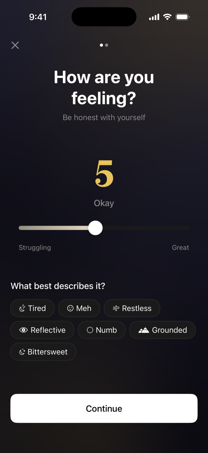
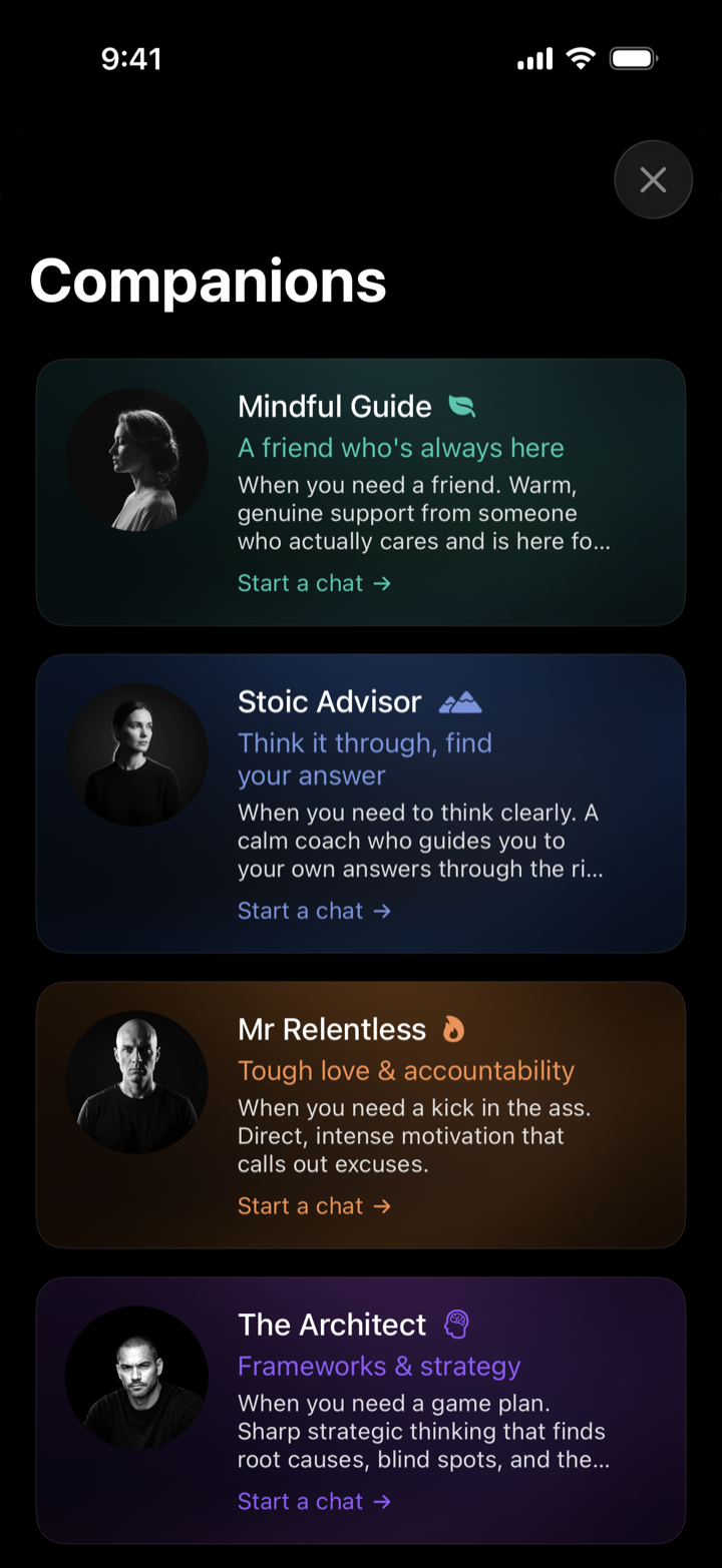
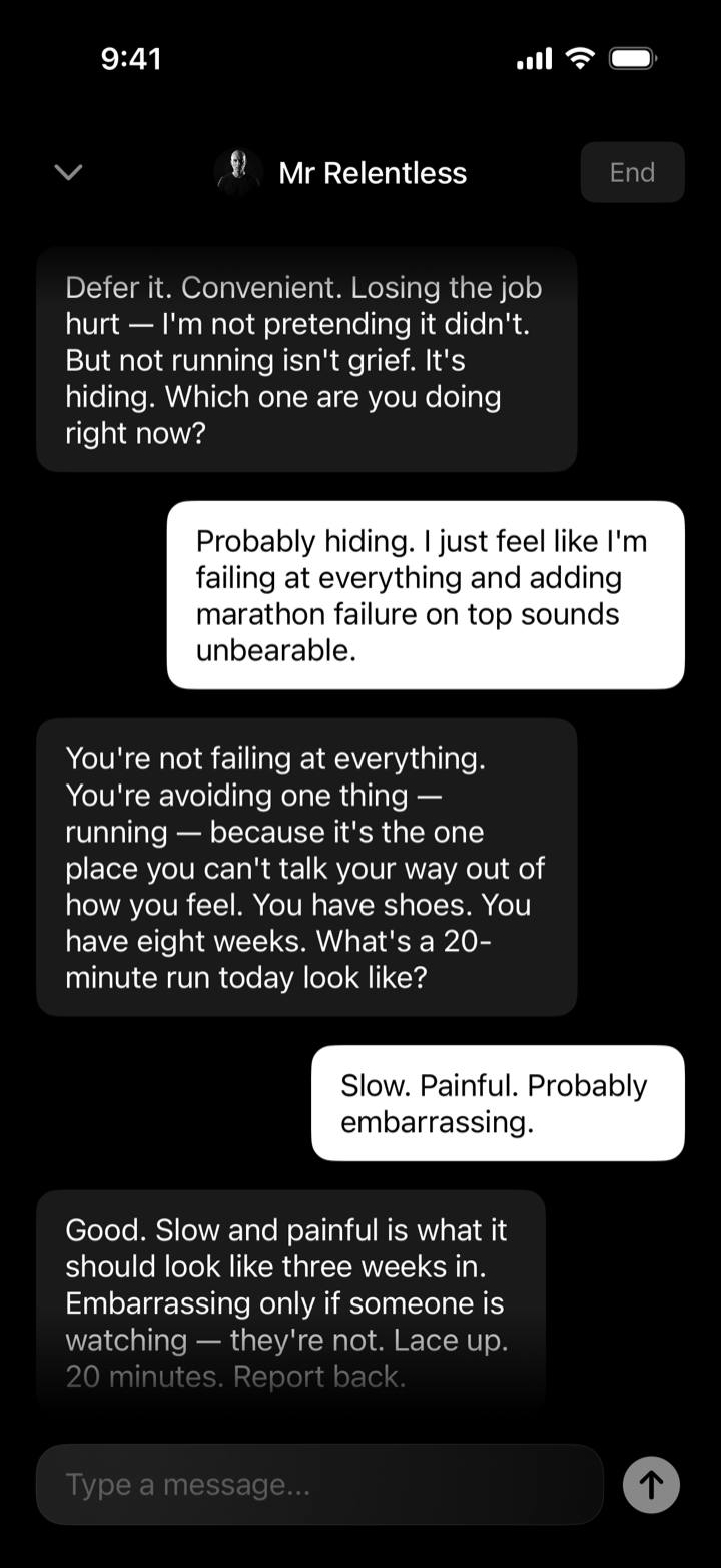
App Icon
On the home screen the disc opens to its purest form: the bare wordmark on absolute black. Thin geometric caps, the full stop intact. No gloss, no gradient. The same restraint that runs through the whole system.
Marketing
‘just breathe’ app.
listens.
Then it
pushes back.
Client
I Listen To You (ILTY)
Fort Collins, Colorado
Discipline
Brand Strategy
Identity · Motion · Digital
Deliverables
Logotype · Color · Type
Companion System · Aurora · Voice
Design
Artyom Sklyarov
In-house · 2025–26