5 Travel Website Designs and What to Learn From Them
A useful travel website connects the reason to visit with the information needed to choose. These five archived examples show different ways to make that connection: activities, occasion, property character, inclusions and assisted planning.
Key Takeaways
- Borrow the decision structure, not just the visual treatment.
- Separate inspiration from the information needed to commit.
- Test availability and booking independently of the homepage.
- These are design observations, not measured conversion results.
The screenshots below were used in the original December 2024 article. They are historical references, not a fresh audit of the current sites. Product terms and live designs may differ. Only the LOVU example is presented here as our own project; the others are external references.
Land of Ride: organize discovery around the activity
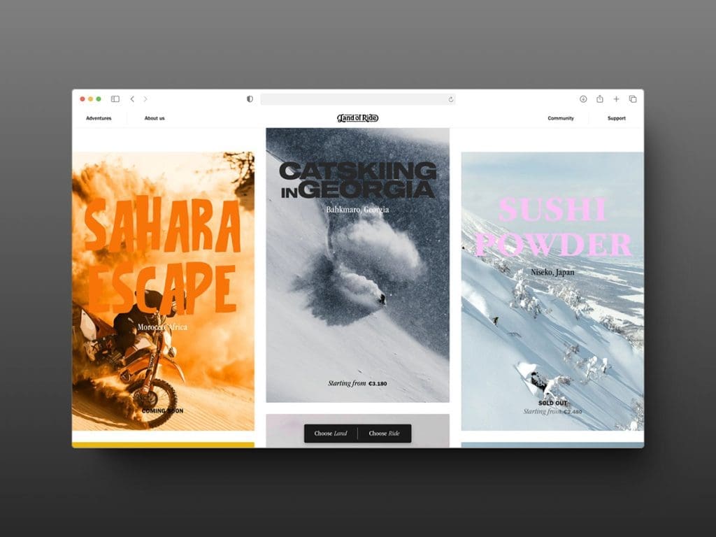
The Land of Ride example organizes travel around the ride and the landscape. That is a useful starting point for a visitor who knows what they want to do before they know where to go.
Borrow the classification principle: a cycling or hiking operator can make activity, difficulty and season visible together. Then check the practical follow-through. A compelling trip card still needs dates, ability requirements, inclusions and a path to availability. The screenshot alone cannot establish that those later steps work.
Honeymoons.com: make the occasion a navigation system
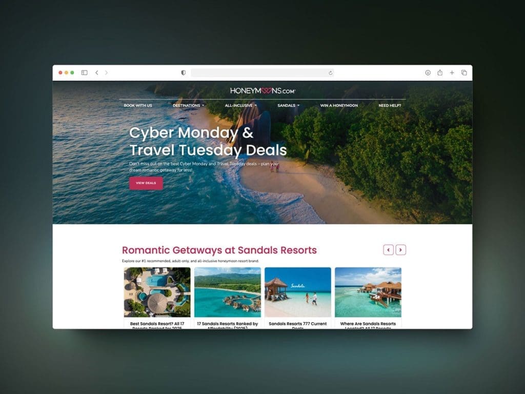
Honeymoons.com narrows the context before the visitor chooses a destination. A honeymoon has planning questions that a generic hotel directory may not prioritize: timing, privacy, inclusions and coordination.
Use that specificity without assuming every couple wants the same trip. Show how recommendations were selected and disclose commercial relationships where they influence presentation. An occasion-led homepage should lead to useful comparisons, not merely repeat the word “romantic.”
Wander: use property imagery to explain the stay
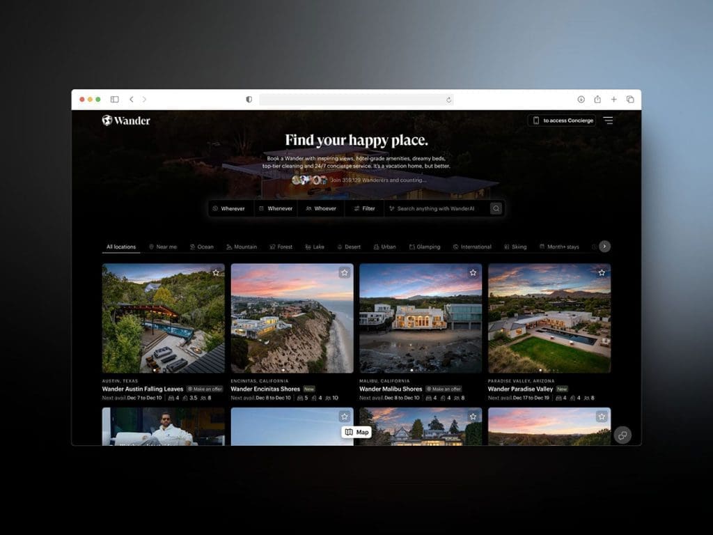
The Wander reference places the property experience at the center. For a distinctive rental, images can explain space and setting more directly than a paragraph of luxury adjectives.
The design lesson is to pair that imagery with comparable facts: occupancy, bedrooms, location and what is included. We have not verified current service promises or a booking uplift. Those need their own evidence.
Hotel Xcaret: explain what the package includes
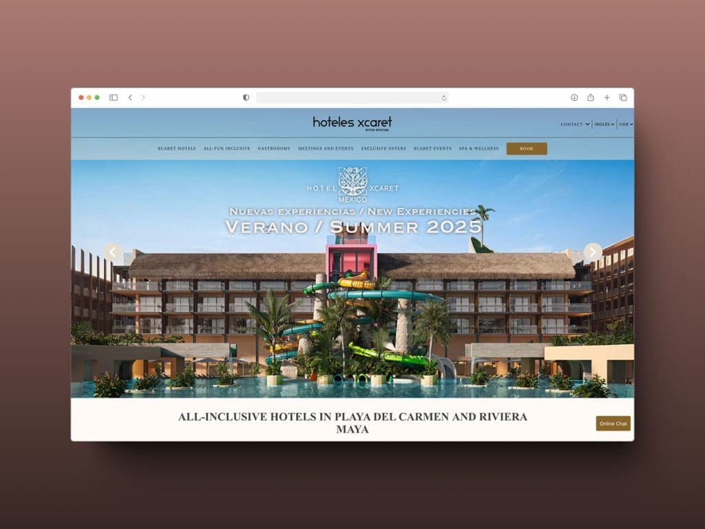
Hotel Xcaret presents the stay as a combination of accommodation and experiences. That creates an information-design problem: guests need to understand the relationship between the room rate and the activities.
Borrow the idea of making inclusions part of the structure. State conditions near the offer, distinguish included access from optional purchases, and make exclusions easy to find. A vivid gallery cannot substitute for an accurate package comparison.
LOVU: support a request before a final booking
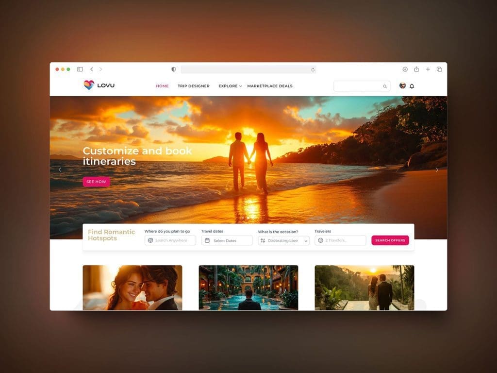
Our LOVU case study documents work on a romance-travel experience. The useful distinction is an assisted-planning path: a visitor may need to communicate preferences before a suitable offer can be prepared.
That flow should explain what is being requested, who responds and what happens next. Do not label an enquiry as a confirmed booking. Current membership, perks and product functionality must be checked on the live service rather than inferred from this archived design.
Apply one lesson to your site
Choose the example closest to your visitor's unresolved question. Sketch the information order, then test whether someone can find a suitable stay, understand its terms and reach the intended next step.
The travel landing-page checklist covers that journey. The user-intent guide helps identify the task; the hotel refresh checks help separate a content problem from a broken booking flow.
Have a product idea?
Designed, built, and shipped in about 5 days.