Startup Brand Design: From Positioning to Handoff
A startup brand needs to make the business recognizable and usable across the places customers encounter it. Start with the audience, offer and distinction, then test the identity on real applications. A logo approved in isolation is not a finished brand.
Key Takeaways
- Set the strategic decision before exploring visual directions.
- Evaluate identity in real sizes, surfaces and content.
- Deliver usable files, rules and examples.
- Keep brand decisions connected to the product's design system.
Write a brief that can reject an attractive idea
A useful brief states who the business serves, the problem it solves, what makes the offer different and what the identity must do. Include competitors for context, not as a mood board to copy.
For an illustrative restaurant-supply startup, “modern and bold” is too vague. “Help busy operators recognize a practical ordering service, distinct from consumer food delivery” gives a direction something to succeed or fail against.
The real Biteful branding case documents six logo directions for a restaurant-supply platform. The selected mark reduces a lowercase b to three shapes and pairs it with a lowercase Termina wordmark. The recorded application test was specific: the mark had to survive at 16 pixels and on a shop sign. That requirement gave the team a reason to reject detail that looked attractive only in a large presentation.
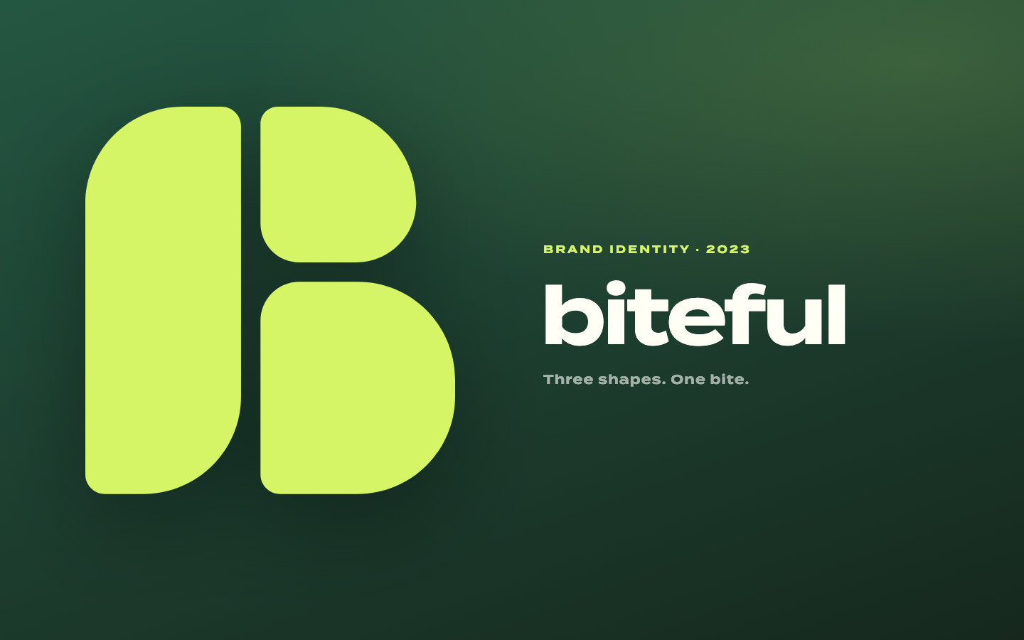
The lime-on-forest palette provides recognition across the identity, while the small mark and wordmark have different jobs. The handoff was a 14-page brand book. These are documented design choices and deliverables, not evidence that the identity increased orders or fundraising. The useful lesson is to define the application before choosing among directions.
Compare directions through applications
Present each direction on the same useful surfaces: a product screen, a small social avatar, a sales page and a document. Do not let one direction win because it received a more flattering mockup.
| Application | Question to answer |
|---|---|
| Small mark | Is it recognizable without delicate detail? |
| Website heading | Does the type support real message length? |
| Product controls | Are state, hierarchy and contrast clear? |
| Document | Can ordinary staff reproduce the system? |
| Monochrome use | Does the identity survive without its accent color? |
Test with relevant people and record what they understood. Preference alone is not the same as comprehension or differentiation.
Build a palette that works in use
Choose colors by role: text, surfaces, action and status. Test actual foreground/background pairs rather than approving swatches separately.
WCAG contrast guidance defines the relevant text requirements and exceptions. The palette worked examples show why a single accent can work on one background and fail on another.
The ILTY branding case began with a different brief: an AI mental-health companion intended to feel like a warm, intimate conversation rather than a clinical interface. Its system uses black backgrounds, warm beige #E8DCC4 for selected primary actions and brand moments, and five distinct companion identities. Strong companion colors appear where that companion is present rather than as general decoration.

That is a concrete tradeoff between expression and consistency. Each companion can be recognizable without making every screen a collection of competing accents. The separate palette analysis shows the consequence for production: purple #8B5CF6 has 4.96:1 contrast against black but 4.11:1 against #1A1A1A, so the same token cannot serve ordinary body text on both surfaces at WCAG AA. The desired atmosphere still has to pass the actual readability check; the brand direction is not evidence of therapeutic benefit.
Hand over decisions, not just exports
Deliver the approved mark variants, color values, type choices and licenses, spacing rules, accessible combinations and representative applications. Explain what not to do using actual likely mistakes.
A useful handoff test is to ask someone outside the project to make a simple new application from the guide. Note every decision they have to guess. Those gaps are more actionable than adding decorative pages to a brand book.
Keep naming, trademark clearance and asset rights with the appropriate responsible people. A visual identity process does not establish legal clearance.
Connect the brand to production
Encode recurring decisions as tokens and components. The startup design-system guide covers that bridge.
Assign an owner for changes and record why exceptions are accepted. A brand can evolve without every new screen inventing a new palette.
This stable URL began as a 2025 trend guide. The revision replaces dated tool prices and trend claims with a reusable process. Choose tools after defining the work; verify their current licenses and pricing directly rather than basing the brand plan on an old subscription table.
Have a product idea?
Designed, built, and shipped in about 5 days.