Responsive Web Design: What Matters in 2026
Responsive web design in 2026 comes down to six things: the correct viewport tag, a small set of breakpoints chosen by your content rather than by device lists, fluid type and spacing between those breakpoints, container queries for components that live in more than one layout, images that ship the right size to each screen, and passing Core Web Vitals on real phones. The thresholds to hit, per web.dev read on 6 October 2026, are Largest Contentful Paint within 2.5 seconds, Interaction to Next Paint of 200 milliseconds or less, and Cumulative Layout Shift of 0.1 or less, measured at the 75th percentile of visits. Most responsive bugs are not exotic. They are an oversized hero image, a tap target too small for a thumb, or a layout measured against the wrong box. Below is each piece, with the numbers from our own site, suur.io, where we have them.
All external facts in this post were read on 6 October 2026 on MDN, web.dev, the W3C and Apple's developer site. The suur.io numbers come from the site's own source and audits.
1. One line of HTML that everything depends on
Without a viewport tag, mobile browsers render the page at a desktop width and shrink it. Every responsive technique after this depends on getting it right:
<meta name="viewport" content="width=device-width, initial-scale=1">
That is exactly what suur.io serves today. Two notes from MDN's viewport reference are worth acting on:
- Never disable zoom. MDN warns that
user-scalable=nostops people with low vision from reading your content, and notes that WCAG requires at least 2x scaling, with 5x as best practice. - Know about
interactive-widget. By default the on-screen keyboard only resizes the visual viewport, not the layout. If a sticky footer or a chat input disappears behind the keyboard,interactive-widget=resizes-contentmakes the layout adapt instead.
2. Breakpoints: fewer than you think
Old guides publish tables of device widths. Devices change every year; your content does not. Pick a breakpoint where the layout actually breaks, and keep the list short.
Our own site defines its breakpoints as tokens in the Tailwind v4 theme in src/app/globals.css: 544px, 768px, 992px and 1170px, with content capped at 1,320px wide. When we counted how often each one is actually used across the site's source on 6 October 2026, the answer was lopsided.
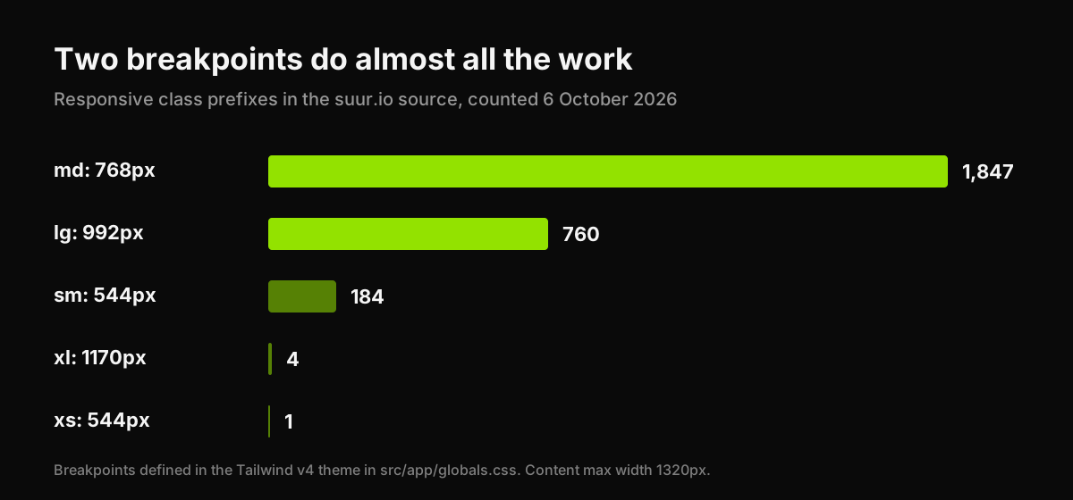
Two breakpoints, 768px and 992px, carry almost the entire site. The widest one is used four times. That is not a flaw. It is what happens when the layout is designed mobile first and only changes when it has to: a single column on phones, a split at tablet width, the full grid on laptops, and fluid sizing in between doing the rest of the work.
If your stylesheet has eight breakpoints, count how often each is used. The rarely used ones are often patching a layout that a fluid value would handle better.
3. Fluid sizing between breakpoints
Breakpoints are steps. Most of a good responsive layout is a slope:
clamp()for type and spacing.font-size: clamp(2rem, 5vw, 4.5rem)scales a headline smoothly between a floor and a ceiling. suur.io usesclamp()in 21 source files.- Dynamic viewport units for full-height sections.
100vhon mobile includes the area behind the browser's address bar, which is why "full screen" heroes get cut off.100dvh(dynamic) or100svh(small) account for the browser chrome. Seven of our stylesheets use them, mostly in the interactive brand guides. - Relative units for text.
remrespects the user's chosen font size; fixed pixel type does not.
4. Container queries: for components, not pages
Media queries ask how wide the screen is. Container queries ask how wide the component's own box is, which is the question you actually care about when the same card sits in a three-column grid on one page and a narrow sidebar on another. MDN lists @container as Baseline widely available.
.card-list { container-type: inline-size; }

@container (min-width: 480px) {
  .card { display: grid; grid-template-columns: 160px 1fr; }
}
Tailwind v4 includes container query variants out of the box: mark a parent with @container and style children with @md: and similar.
In the interest of honesty: suur.io uses zero container queries today. Our components mostly live in one layout each, so media queries have been enough. The moment a component is reused at different widths, a pricing card in a grid and in a sidebar for example, that is where we would reach for them first.
5. Images: where responsive sites actually get slow
On most marketing sites, image payload is the performance problem, not the framework. When we audited our own site on 28 August 2026, three key pages scored between 54 and 66 on Lighthouse mobile with Largest Contentful Paint between 6.8 and 8.5 seconds, while a comparison page on the same stack scored 98 at 1.7 seconds. The culprits were named files: a 776KB JPEG carrying 93% waste, a photograph shipped as a 309KB PNG, a 201KB hero. We wrote that audit up in full in which attribute describes a good landing page experience.
The responsive fixes are well known and still under-used:
srcsetandsizesso a phone downloads a phone-sized file.<picture>when the crop should change, not just the size, for example a tall portrait crop on mobile and a wide one on desktop.- Modern formats such as WebP or AVIF for photographs, SVG for icons and diagrams.
loading="lazy"on images below the fold, and never on the hero, which should load first.- Explicit
widthandheightso the browser reserves space and the layout does not jump.
For a sense of what restraint buys, the InFlight launch site we built scores Lighthouse 98 for performance and 100 for accessibility on mobile at 186 KiB total, photo-led hero included.
6. Touch targets and thumbs
A link that is easy to click with a mouse can be impossible to tap with a thumb. Two current references:
- WCAG 2.2, Success Criterion 2.5.8, Level AA: pointer targets must be at least 24 by 24 CSS pixels, with exceptions for targets that have enough spacing around them, inline text links and a few others.
- Apple's Human Interface Guidelines: the accessibility page lists 44x44 points as the default control size on iOS and 28x28 points as the minimum.
Treat 24px as the legal floor and 44px as the comfortable target for primary actions on phones. And check the order of things on small screens: on the InFlight site, the headline and App Store button come before the photograph on mobile, so the action is never pushed below an image.
7. Core Web Vitals on real phones
Responsive is not only how a page looks at a width. It is how it behaves on the slower devices that use that width. Google's three Core Web Vitals, per web.dev on 6 October 2026:
| Metric | Good | What it measures |
|---|---|---|
| Largest Contentful Paint | 2.5 s or less | When the main content appears |
| Interaction to Next Paint | 200 ms or less (over 500 ms is poor) | How fast the page responds to taps and clicks |
| Cumulative Layout Shift | 0.1 or less | How much the layout jumps while loading |
web.dev recommends judging these at the 75th percentile of page loads, segmented by mobile and desktop. One trap: lab tools such as Lighthouse cannot measure INP, because there is no real user tapping. They report Total Blocking Time as a proxy. Heavy scripts are the usual INP problem, and expressive effects are a common source. We measured one on our own site and wrote it up in Three.js vs WebGL: a WebGL context request alone took 2.5 seconds on a software renderer until we moved it off the loading path.
How to test without a device lab
- Resize, do not just switch presets. Drag the browser from 320px to 1,600px slowly and watch for the width where something breaks. That width is a real breakpoint.
- Use one real, older phone. Throttled desktop emulation misses touch and memory problems.
- Check field data. PageSpeed Insights shows Chrome user experience data where your page has enough traffic.
- Audit on a schedule. A website audit gives you a dated baseline, so you know whether the next redesign made things better or worse.
The short answer
Ship the standard viewport tag and never disable zoom. Use a few breakpoints chosen by your content, and let clamp() and dynamic viewport units handle the space between them. Reach for container queries when a component lives in more than one layout. Send each screen a correctly sized image. Make primary tap targets 44px where you can and never under 24px. Then measure LCP, INP and CLS on real phones against 2.5 seconds, 200 milliseconds and 0.1. If you want a page built to those numbers from the start, our Landing Page Sprint ships designed and coded, mobile first.
Have a product idea?
Designed, built, and shipped in about 5 days.